SparklineEdit Class
Visualizes data in a highly condensed way, allowing end-users to quickly understand and compare values from different sources.
Namespace: DevExpress.XtraEditors
Assembly: DevExpress.XtraEditors.v20.2.dll
NuGet Package: DevExpress.Win.Navigation
Declaration
Remarks
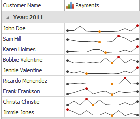
The sparkline type is defined by the SparklineEdit.Properties.View property, which can contain of the following SparklineViewBase class descendants:
- Area (AreaSparklineView)
- Line (LineSparklineView)
- Bar (BarSparklineView)
- Win/Loss (WinLossSparklineView)
Below is an example of a grid control with Line sparklines displayed in its second column.
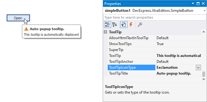
Tooltips
DevExpress controls support regular and super tooltips. If the ShowToolTips option is enabled, tooltips are shown when the mouse pointer hovers the control.
Use the following properties to specify a regular tooltip’s content:
- ToolTip — a regular tooltip’s text. If the text is not specified, the tooltip is not displayed even if the title is specified. You can use line breaks in regular tooltips. Use the AllowHtmlTextInToolTip property to specify whether to parse HTML tags in the text. HTML tags allow you to format the text: size, style, hyperlinks, etc.
- ToolTipTitle — a regular tooltip’s title. If the title is not specified, it is not displayed.
ToolTipIconType — a regular tooltip’s predefined icon. Use the controller’s IconSize property to specify the image size.
To display a custom image in all regular tooltips, use the controller’s ImageList and ImageIndex properties.
To display a custom image in a particular regular tooltip, handle the BeforeShow event. Use the ImageOptions event argument to assign a raster or vector image to the processed tooltip.
To assign a super tooltip to a control, use the SuperTip property. Enable the AllowHtmlText property to use HTML tags in the super tooltip.
To replace regular tooltips with super tooltips, set the ToolTipController.ToolTipType property to SuperTip. The controller automatically converts regular tooltips to super tooltips. To access this property, you can use the DefaultToolTipController component or a custom controller assigned to the ToolTipController property. See Tooltips for more information.
Example
This example demonstrates how to create a sparkline control, fill it with data, choose the way to represent this data, and customize the sparkline appearance.
To do this, you should create a SparklineEdit object and assign the datasource object to its BaseEdit.EditValue property. Then, you need to set the appropriate view instance to the SparklineEdit.Properties.View property and customize view properties to meet your requirements.
Note that in this sample, the AreaSparklineView class is used to display area sparklines. To display other sparklines types, use the BarSparklineView, LineSparklineView or WinLossSparklineView classes instead.
using System;
using System.Drawing;
using System.Windows.Forms;
using DevExpress.Sparkline;
using DevExpress.XtraEditors;

private SparklineEdit CreateSparkline() {
    // Create a Sparkline editor and set its dock style.
    SparklineEdit sparkline = new SparklineEdit();
    sparkline.Dock = DockStyle.Fill;

    sparkline.EditValue = CreateData();

    // Create an Area view and assign it to the sparkline.
    AreaSparklineView view = new AreaSparklineView();
    sparkline.Properties.View = view;

    // Customize area appearance.
    view.Color = Color.Aqua;
    view.AreaOpacity = 50;

    // Show markers.
    view.HighlightStartPoint = true;
    view.HighlightEndPoint = true;
    view.HighlightMaxPoint = true;
    view.HighlightMinPoint = true;
    view.HighlightNegativePoints = true;
    view.SetSizeForAllMarkers(10);

    return sparkline;
}

private double[] CreateData() {
    return new double[] { 2, 4, 5, 1, -1, -2, -1, 2, 4, 5, 6, 3, 5, 4, 8, -1, 6 };
}