BaseControl.ToolTipIconType Property
Gets or sets the type of the tooltip icon.
Namespace: DevExpress.XtraEditors
Assembly: DevExpress.XtraEditors.v20.2.dll
NuGet Package: DevExpress.Win.Navigation
Declaration
[DefaultValue(ToolTipIconType.None)]
[DXCategory("ToolTip")]
public virtual ToolTipIconType ToolTipIconType { get; set; }Property Value
| Type | Default | Description |
|---|---|---|
| ToolTipIconType | **None** | A ToolTipIconType enumeration value. |
Available values:
| Name | Description |
|---|---|
| Application | A tooltip contains the default application icon. |
| Asterisk | A tooltip contains the system asterisk icon. |
| Error | A tooltip contains the system error icon. |
| Exclamation | A tooltip contains the system exclamation icon. |
| Hand | A tooltip contains the system hand icon. |
| Information | A tooltip contains the system information icon. |
| Question | A tooltip contains the system question icon. |
| Warning | A tooltip contains the system warning icon. |
| WindLogo | A tooltip contains the Windows logo icon. |
| None | A tooltip contains no predefined icon. |
Remarks
DevExpress controls support regular and super tooltips. If the ShowToolTips option is enabled, tooltips are shown when the mouse pointer hovers the control.
Use the following properties to specify a regular tooltip’s content:
- ToolTip — a regular tooltip’s text. If the text is not specified, the tooltip is not displayed even if the title is specified. You can use line breaks in regular tooltips. Use the AllowHtmlTextInToolTip property to specify whether to parse HTML tags in the text. HTML tags allow you to format the text: size, style, hyperlinks, etc.
- ToolTipTitle — a regular tooltip’s title. If the title is not specified, it is not displayed.
ToolTipIconType— a regular tooltip’s predefined icon. Use the controller’s IconSize property to specify the image size.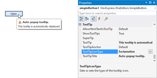
To display a custom image in all regular tooltips, use the controller’s ImageList and ImageIndex properties.
To display a custom image in a particular regular tooltip, handle the BeforeShow event. Use the ImageOptions event argument to assign a raster or vector image to the processed tooltip.
To assign a super tooltip to a control, use the SuperTip property. Enable the AllowHtmlText property to use HTML tags in the super tooltip.
To replace regular tooltips with super tooltips, set the ToolTipController.ToolTipType property to SuperTip. The controller automatically converts regular tooltips to super tooltips. To access this property, you can use the DefaultToolTipController component or a custom controller assigned to the ToolTipController property. See Tooltips for more information.