ControlNavigator Class
Provides a graphical interface for navigating data-aware controls that implement the INavigatableControl interface (this interface is implemented by all DevExpress data-aware container controls).
Namespace: DevExpress.XtraEditors
Assembly: DevExpress.XtraEditors.v20.2.dll
NuGet Package: DevExpress.Win.Navigation
Declaration
Related API Members
The following members return ControlNavigator objects:
Remarks
The ControlNavigator allows an end-user to manipulate records in an external data-aware control. It is derived from the NavigatorBase class, and so it inherits properties and methods common to all data navigation controls.

The ControlNavigator displays built-in buttons that enable a user to scroll forward or backward through records one at a time, go to the first record, go to the last record, insert a new record, post data changes, cancel data changes and delete a record. You can also add custom buttons, when required. To access built-in and custom buttons, use the DataNavigator.Buttons property. To perform custom actions on button clicks, handle the NavigatorBase.ButtonClick event.
For the ControlNavigator to manipulate records in an external control, this external control must implement the DevExpress.XtraEditors.INavigatableControl interface. This interface is implemented by the GridControl, TreeList and VGridControl classes. Use the ControlNavigator.NavigatableControl property to bind such a control to the ControlNavigator.
The ControlNavigator can display a text string that specifies the current record and the total record count in the bound control. Use the NavigatorBase.TextLocation and NavigatorBase.TextStringFormat to customize the display of this text.
The GridControl supports an embedded data navigator, which can be enabled with the GridControl.UseEmbeddedNavigator property. This embedded navigator’s functionality is equivalent to the functionality of the ControlNavigator. So, you can choose to use either the embedded navigator or an external ControlNavigator.
Tooltips
DevExpress controls support regular and super tooltips. If the ShowToolTips option is enabled, tooltips are shown when the mouse pointer hovers the control.
Use the following properties to specify a regular tooltip’s content:
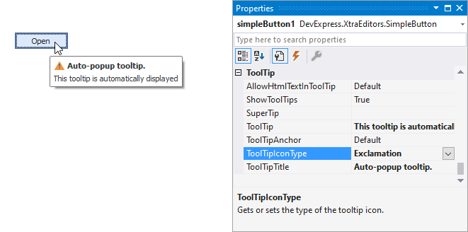
- ToolTip — a regular tooltip’s text. If the text is not specified, the tooltip is not displayed even if the title is specified. You can use line breaks in regular tooltips. Use the AllowHtmlTextInToolTip property to specify whether to parse HTML tags in the text. HTML tags allow you to format the text: size, style, hyperlinks, etc.
- ToolTipTitle — a regular tooltip’s title. If the title is not specified, it is not displayed.
ToolTipIconType — a regular tooltip’s predefined icon. Use the controller’s IconSize property to specify the image size.
To display a custom image in all regular tooltips, use the controller’s ImageList and ImageIndex properties.
To display a custom image in a particular regular tooltip, handle the BeforeShow event. Use the ImageOptions event argument to assign a raster or vector image to the processed tooltip.
To assign a super tooltip to a control, use the SuperTip property. Enable the AllowHtmlText property to use HTML tags in the super tooltip.
To replace regular tooltips with super tooltips, set the ToolTipController.ToolTipType property to SuperTip. The controller automatically converts regular tooltips to super tooltips. To access this property, you can use the DefaultToolTipController component or a custom controller assigned to the ToolTipController property. See Tooltips for more information.