ButtonEdit Class
The text editor that supports built-in buttons in the edit box.
Namespace: DevExpress.XtraEditors
Assembly: DevExpress.XtraEditors.v20.2.dll
NuGet Package: DevExpress.Win.Navigation
Declaration
Related API Members
The following members return ButtonEdit objects:
Remarks
ButtonEdit editors are text editors which allow you to display an unlimited number of buttons in the edit box.
The ButtonEdit class overrides the ButtonEdit.Properties property to return a RepositoryItemButtonEdit object. You should use this object’s RepositoryItemButtonEdit.Buttons property to access the collection of buttons displayed in the editor. Each button is represented by an EditorButton object that provides a number of properties specifying the button’s appearance, shortcut, visibility, hint text, etc.
Handle the RepositoryItemButtonEdit.ButtonClick and RepositoryItemButtonEdit.ButtonPressed events to respond to clicking editor buttons.
Editor buttons use the paint style specified by the RepositoryItemButtonEdit.ButtonsStyle property.
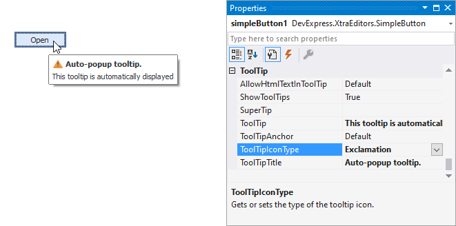
Tooltips
DevExpress controls support regular and super tooltips. If the ShowToolTips option is enabled, tooltips are shown when the mouse pointer hovers the control.
Use the following properties to specify a regular tooltip’s content:
- ToolTip — a regular tooltip’s text. If the text is not specified, the tooltip is not displayed even if the title is specified. You can use line breaks in regular tooltips. Use the AllowHtmlTextInToolTip property to specify whether to parse HTML tags in the text. HTML tags allow you to format the text: size, style, hyperlinks, etc.
- ToolTipTitle — a regular tooltip’s title. If the title is not specified, it is not displayed.
ToolTipIconType — a regular tooltip’s predefined icon. Use the controller’s IconSize property to specify the image size.
To display a custom image in all regular tooltips, use the controller’s ImageList and ImageIndex properties.
To display a custom image in a particular regular tooltip, handle the BeforeShow event. Use the ImageOptions event argument to assign a raster or vector image to the processed tooltip.
To assign a super tooltip to a control, use the SuperTip property. Enable the AllowHtmlText property to use HTML tags in the super tooltip.
To replace regular tooltips with super tooltips, set the ToolTipController.ToolTipType property to SuperTip. The controller automatically converts regular tooltips to super tooltips. To access this property, you can use the DefaultToolTipController component or a custom controller assigned to the ToolTipController property. See Tooltips for more information.
Example
The following code creates a button edit control and places it onto a panel1 panel. The code changes default button kind (ellipsis) into ButtonPredefines.OK and adds another button (ButtonPredefines.Delete) to the button’s collection.
The result of code execution is displayed below:

  ButtonEdit btnEdit1 = new ButtonEdit();
  btnEdit1.Width = 100;
  btnEdit1.Properties.Buttons[0].Kind = ButtonPredefines.OK;
  btnEdit1.Properties.Buttons.Add(new EditorButton(ButtonPredefines.Delete));
  panel1.Controls.Add(btnEdit1);
Related GitHub Examples
The following code snippet (auto-collected from DevExpress Examples) contains a reference to the ButtonEdit class.
Note
The algorithm used to collect these code examples remains a work in progress. Accordingly, the links and snippets below may produce inaccurate results. If you encounter an issue with code examples below, please use the feedback form on this page to report the issue.