ImageListBoxControl Class
The list box control that displays a list of items that a user can select. Can be populated with items from a data source.
Namespace: DevExpress.XtraEditors
Assembly: DevExpress.XtraEditors.v20.2.dll
NuGet Package: DevExpress.Win.Navigation
Declaration
[ImageListBoxControl.ImageListBoxControlCustomBindingProperties]
public class ImageListBoxControl :
    BaseImageListBoxControl,
IBehaviorPropertiesFilterRemarks
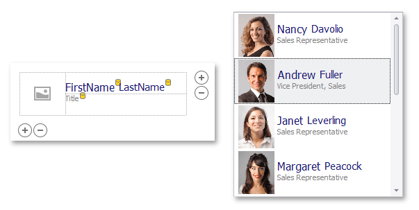
ImageListBoxControl items can be rendered using two paint modes:
Default (basic rendering) - For each item, the control displays one image followed by a text string.
Item Templates (advanced rendering) - This feature helps you paint each listbox item as your needs dictate. Each item can display multiple image and text elements arranged in any manner, and painted using different appearance settings.
See Templated ListBox Items to learn more.
The control’s main members include:
- BaseImageListBoxControl.Items - Allows you to populate the control with items in unbound mode.
- BaseListBoxControl.DataSource - Use this property to populate the control with items from a data source.
- BaseListBoxControl.Templates - This property supports the item templates feature. See Templated ListBox Items to learn more.
- BaseListBoxControl.CustomizeItem - Allows you to dynamically customize templated items.
- BaseListBoxControl.CustomItemTemplate - Allows you to provide a custom template for listbox items.
- BaseListBoxControl.ValueMember - Gets or sets the field name in the bound data source whose contents are assigned to item values.
- BaseListBoxControl.DisplayMember - Gets or sets the name of the data source field that provides display text for listbox items. This property is not supported when listbox items are rendered based on Item Templates.
- BaseImageListBoxControl.ImageMember - Gets or sets the name of the data source field that provides images for listbox items. This property is not supported when listbox items are rendered based on Item Templates.
- BaseImageListBoxControl.ImageIndexMember - Gets or sets the name of the data source field that provides image indexes for listbox items. This property is not supported when listbox items are rendered based on Item Templates.
- BaseListBoxControl.MultiColumn - Gets or sets whether listbox items can be arranged across multiple columns.
- BaseListBoxControl.SelectionMode - Gets or sets whether a single or multiple items can be selected.
- BaseListBoxControl.ContextButtons - Provides access to the collection of context buttons displayed in the control.
- BaseListBoxControl.SelectedIndexChanged - Allows you to respond to item selection.
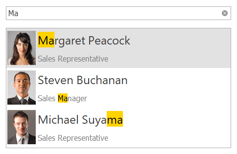
Search and Filtering
You can provide end-users with the ability to filter items in a ImageListBoxControl. For this purpose, attach the ImageListBoxControl to a SearchControl by using the SearchControl.Client property.
When an end-user types a search request into the SearchControl, the ImageListBoxControl automatically filters its items, and highlights the requested string in the filtered items.
Note
If items are formatted using the HTML tags (see BaseListBoxControl.AllowHtmlDraw), the items are filtered, but not highlighted.
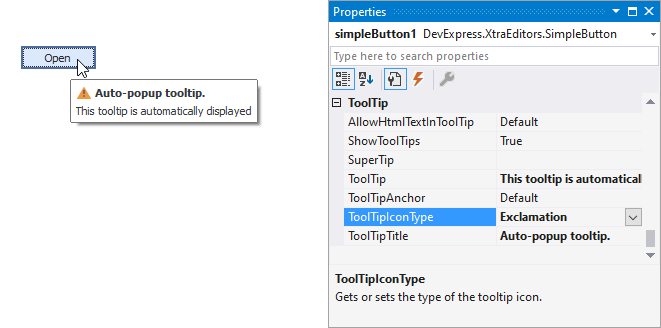
Tooltips
DevExpress controls support regular and super tooltips. If the ShowToolTips option is enabled, tooltips are shown when the mouse pointer hovers the control.
Use the following properties to specify a regular tooltip’s content:
- ToolTip — a regular tooltip’s text. If the text is not specified, the tooltip is not displayed even if the title is specified. You can use line breaks in regular tooltips. Use the AllowHtmlTextInToolTip property to specify whether to parse HTML tags in the text. HTML tags allow you to format the text: size, style, hyperlinks, etc.
- ToolTipTitle — a regular tooltip’s title. If the title is not specified, it is not displayed.
ToolTipIconType — a regular tooltip’s predefined icon. Use the controller’s IconSize property to specify the image size.
To display a custom image in all regular tooltips, use the controller’s ImageList and ImageIndex properties.
To display a custom image in a particular regular tooltip, handle the BeforeShow event. Use the ImageOptions event argument to assign a raster or vector image to the processed tooltip.
To assign a super tooltip to a control, use the SuperTip property. Enable the AllowHtmlText property to use HTML tags in the super tooltip.
To replace regular tooltips with super tooltips, set the ToolTipController.ToolTipType property to SuperTip. The controller automatically converts regular tooltips to super tooltips. To access this property, you can use the DefaultToolTipController component or a custom controller assigned to the ToolTipController property. See Tooltips for more information.