BarCodeControl Class
Displays a bar code.
Namespace: DevExpress.XtraEditors
Assembly: DevExpress.XtraEditors.v20.2.dll
NuGet Package: DevExpress.Win.Navigation
Declaration
Remarks
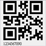
The BarCodeControl supports multiple bar code types. The following images illustrate some of them.
| QR Code | EAN 8 | PDF417 |
|---|---|---|
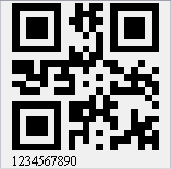 |
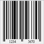 |
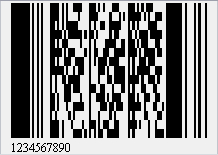 |
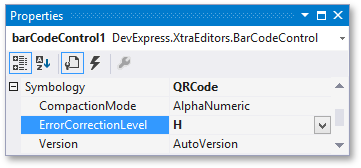
The bar code type is specified by the BarCodeControl.Symbology property.
At design time within Visual Studio, you can set this property using the Properties window.
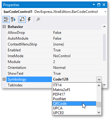
After selecting a bar code type, you can expand the Symbology property to access additional customization options.
To specify the symbology in code, create a specific BarCodeGeneratorBase descendant and assign it to the Symbology property of the BarCodeControl.
A bar code generator object provides access to additional customization properties specific to the selected bar code type.
Some of the main bar code options are described below.
- The bar code is generated from the BarCodeControl‘s Text. To prevent the text from being displayed next to the bar code, use the BarCodeControl.ShowText property.
- To define the orientation of a bar code and its text, use the BarCodeControl.Orientation property.
To specify the width of bars within a bar code, do one of the following.
- Define a specific bar width by using the BarCodeControl.Module property.
- Enable the BarCodeControl.AutoModule property to automatically calculate the bar width according to the BarCodeControl‘s dimensions.
Note
To learn how to ensure a correct rendering and scanning of a bar code, see Bar Code Recognition Specifics.
To specify the alignment of a bar code and/or its text, use the following properties.
Tooltips
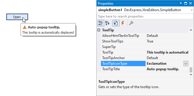
DevExpress controls support regular and super tooltips. If the ShowToolTips option is enabled, tooltips are shown when the mouse pointer hovers the control.
Use the following properties to specify a regular tooltip’s content:
- ToolTip — a regular tooltip’s text. If the text is not specified, the tooltip is not displayed even if the title is specified. You can use line breaks in regular tooltips. Use the AllowHtmlTextInToolTip property to specify whether to parse HTML tags in the text. HTML tags allow you to format the text: size, style, hyperlinks, etc.
- ToolTipTitle — a regular tooltip’s title. If the title is not specified, it is not displayed.
ToolTipIconType — a regular tooltip’s predefined icon. Use the controller’s IconSize property to specify the image size.
To display a custom image in all regular tooltips, use the controller’s ImageList and ImageIndex properties.
To display a custom image in a particular regular tooltip, handle the BeforeShow event. Use the ImageOptions event argument to assign a raster or vector image to the processed tooltip.
To assign a super tooltip to a control, use the SuperTip property. Enable the AllowHtmlText property to use HTML tags in the super tooltip.
To replace regular tooltips with super tooltips, set the ToolTipController.ToolTipType property to SuperTip. The controller automatically converts regular tooltips to super tooltips. To access this property, you can use the DefaultToolTipController component or a custom controller assigned to the ToolTipController property. See Tooltips for more information.
Example
This example illustrates how to use BarCodeControl to display a QR code.
using DevExpress.XtraPrinting.BarCode;
using DevExpress.XtraEditors;

BarCodeControl barCodeControl1 = new BarCodeControl();
barCodeControl1.Parent = this;
barCodeControl1.Size = new System.Drawing.Size(150, 150);
barCodeControl1.AutoModule = true;
barCodeControl1.Text = "1234567890";
QRCodeGenerator symb = new QRCodeGenerator();
barCodeControl1.Symbology = symb;

// Adjust the QR barcode's specific properties.
symb.CompactionMode = QRCodeCompactionMode.AlphaNumeric;
symb.ErrorCorrectionLevel = QRCodeErrorCorrectionLevel.H;
symb.Version = QRCodeVersion.AutoVersion;