BaseControl.BorderStyle Property
Gets or sets the control’s border style.
Namespace: DevExpress.XtraEditors
Assembly: DevExpress.XtraEditors.v20.2.dll
NuGet Package: DevExpress.Win.Navigation
Declaration
[DefaultValue(BorderStyles.Default)]
[DXCategory("Appearance")]
public virtual BorderStyles BorderStyle { get; set; }Property Value
| Type | Default | Description |
|---|---|---|
| BorderStyles | **Default** | A BorderStyles enumeration value specifying the control’s border style. |
Available values:
| Name | Description |
|---|---|
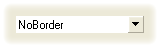
| NoBorder | No border.
|
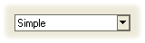
| Simple | Flat border.
|
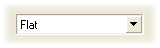
| Flat | Borders are flat.
|
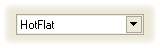
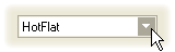
| HotFlat | Flat border. The border and the client area are highlighted when the cursor hovers the editor.
|
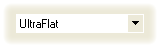
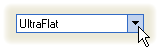
| UltraFlat | Flat border in the Office XP style. Border and the client area are highlighted when the mouse pointer hovers the editor; otherwise, no border.
|
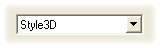
| Style3D | Three-dimensional border.
|
| Office2003 | Office 2003-style border.
|
| Default | The default border style depends on the application skin. |
Remarks
If the BorderStyles property is set to BorderStyles.Default, the border style is controlled by the BaseControl.LookAndFeel property.
To specify an editor’s border style, you can also use the RepositoryItem.BorderStyle property of the editor’s repository item object available via the BaseEdit.Properties property. The RepositoryItem.BorderStyle property value is synchronized with the BorderStyle property value.
Related GitHub Examples
The following code snippets (auto-collected from DevExpress Examples) contain references to the BorderStyle property.
Note
The algorithm used to collect these code examples remains a work in progress. Accordingly, the links and snippets below may produce inaccurate results. If you encounter an issue with code examples below, please use the feedback form on this page to report the issue.