Look and Feel
- 4 minutes to read
The ribbon, bars, and menu’s look and feel depends on the skin applied to the application.

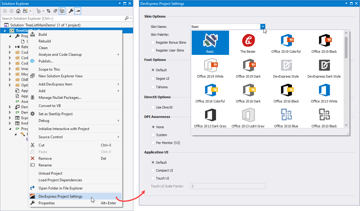
To specify the application skin, use the DevExpress Project Settings window:
- in the Solution Explorer, right-click the project
- in the context menu, click DevExpress Project Settings
- use Skin Name to select a skin
- use Skin Palette to select a color palette (for vector-image-based skins only)
See the following help topic for more information about application settings: Project Settings Page.
Visual Elements and Appearances
Bar and dock controls (ribbons, bars, menus, etc.) consist of multiple visual elements — ribbon pages, application menus, backstage views, etc. The skin specifies each visual element’s appearance settings — background and foreground colors, font face, size and style, etc.
To customize appearance settings for bar and dock controls, you can use controllers. The BarAndDockingController component is a controller that specifies appearance settings for the following controls/components:
- Bars UI (BarManager)
- Ribbon UI (RibbonControl, RibbonForm, RibbonStatusBar, BackstageViewControl, ApplicationMenu)
- Dock panels (DockManager)
- Application UI (Windows UI, Widget UI, Tabbed UI, Native MDI) implemented with the DocumentManager component
- Tabbed MDI windows (XtraTabbedMdiManager)
Use the following components to access controllers:
DefaultBarAndDockingController — a toolbox component that allows you to access the default controller.
The default controller specifies appearance settings for all bar and dock controls/components in the application. You can utilize the controller in the Windows Forms Designer. Use the Controller property to access the default controller.

To access the default controller in code, use the static (Shared in VB) Default property.
BarAndDockingController — a controller that you can assign to a specific control/component. You can use this controller to customize appearance settings for the assigned control/component only.
To assign a controller to a control/component, use a dedicated property. For example, use the BarManager.Controller property to assign a controller to a Bar Manager, or RibbonControl.Controller to assign a controller to Ribbon. The controller specifies appearance settings for all bars that belong to this manager.
You can specify appearance settings for the following visual elements:
- AppearancesBackstageView - Provides the default appearance settings applied to BackstageViewControl controls.
- AppearancesBar - Specifies appearance settings for items in bars and menus in different states.
- AppearancesDocking - Provides the default appearance settings for all dock panels, implemented with the DockManager component.
- AppearancesDocumentManager - Contains the default appearance settings applied to Views of the DocumentManager component.
- AppearancesRibbon - Provides the default appearance settings of the Ribbon Controls and Ribbon Forms.
- LookAndFeel - Provides Look And Feel and Skinning settings for the controls/components included in the XtraBars library.
- PropertiesBar - Contains the default customization settings of the Bars UI (BarManager).
- PropertiesDocking - Provides the default customization settings for the Application UI Manager (DocumentManager) and Dock Manager.
PropertiesRibbon - Provides the default customization properties for the Ribbon UI elements.

Note
Skins use brushes or images to fill the background. The actual behavior depends on the skin. The background color is not in effect if the skin uses an image to fill the background.
See the following help topic for more information about skins and appearance settings: Application Appearance and Skin Colors.
Individual Visual Elements
You can also specify appearance settings for a particular visual element. For example, the Bar.Appearance property allows you to specify appearance settings for a particular bar.
using System.Drawing.Drawing2D;

bFile.Appearance.BackColor = Color.Gray;
bFile.Appearance.BackColor2 = Color.White;
bFile.Appearance.GradientMode = LinearGradientMode.Vertical;
bFile.Appearance.Options.UseBackColor = true;
The table below contains properties that you can use to customize bar and dock controls/components.
Bar and Dock Control/Component | Property | Description |
|---|---|---|
Appearance settings used to paint a specific bar. These settings override the Bar appearance settings. | ||
Appearance settings used to paint a specific bar item. | ||
Appearance settings used to paint a bar dock control. These settings override the Dock appearance settings. | ||
Appearance settings used to paint a specific sub-menu. These settings override the SubMenu appearance settings. | ||
Appearance settings used to paint a specific popup menu. These settings override the SubMenu appearance settings. | ||
Appearance settings used to paint a specific dock panel’s client region. These settings override the Panel appearance settings. | ||
Appearance settings used to paint an MDI client. | ||
Appearance settings used to paint pages that belong to the XtraTabbedMdiManager component. | ||
Appearance settings used to paint ribbon gallery elements. | ||
Appearance settings used to paint an alert window’s contents. |
Skin Editor
You can also use Skin Editor to customize a specific visual element’s appearance.
Tip
To identify a visual element, hold Ctrl and click it.
See the following help topic for more information on how to create a custom skin and apply it to an application: WinForms Skin Editor.