Records
- 9 minutes to read
The vertical grid arranges data into rows and columns. Rows correspond to fields in the underlying data source. Columns correspond to records. This topic explains how records are displayed in different layouts and how to customize their appearance.
Layouts
The vertical grid can display data in three different layouts:
-
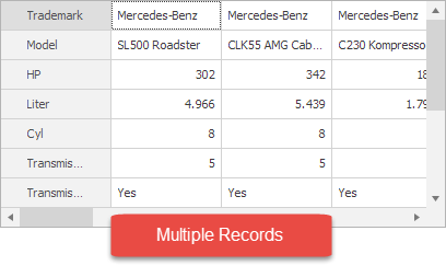
- The grid arranges records in multiple columns.
- The horizontal scrollbar scrolls records.
- The grid displays a vertical scrollbar if rows do not fit in height.
-
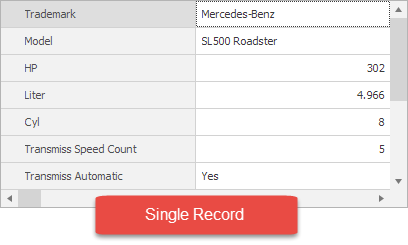
- The grid displays only one record at a time.
- The horizontal scrollbar flips records.
- The grid displays a vertical scrollbar if rows do not fit in height.
- The displayed record is automatically focused.
-
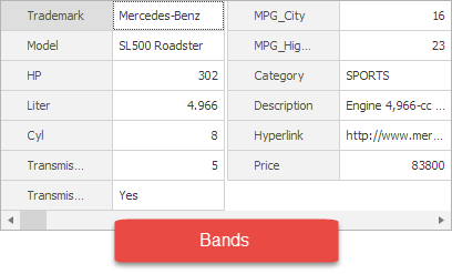
- The grid displays only one record at a time.
- The horizontal scrollbar flips records.
- The grid arranges the record in a band of columns if rows do not fit in height.
- The displayed record is automatically focused.
Refer to the following topics for information on how to manage records in bound mode: Adding and Deleting Records and Focus and Scroll Records. Note that it is not possible to add, delete, or focus records in unbound mode.
Appearance
Use the following properties and events to customize records (columns):
- VGridControlBase.RecordWidth — gets or sets the column width.
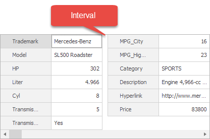
VGridControlBase.RecordsInterval — gets or sets the distance between columns.
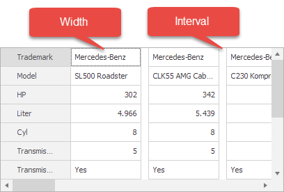
VGridControlBase.BandsInterval — gets or sets the distance between columns in a band.
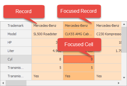
VGridControl.Appearance.RecordValue, VGridControl.Appearance.FocusedRecord and VGridControl.Appearance.FocusedCell — provide access to an element’s appearance settings.
- VGridControlBase.RecordCellStyle fires when a cell is about to be displayed and allows you to customize its appearance. Refer to the following topic for more information: Customizing Appearances of Individual Cells.
- VGridControlBase.CustomDrawRowValueCell fires when a cell is about to be displayed and allows you to draw the cell in a custom manner. Refer to the following topic for more information: Custom Painting.
Record Headers
In Multi-Record view mode (see VGridControl.LayoutStyle), Vertical Grid supports record headers in which you can display formatted field values, hyperlinks, and text. Use the OptionsView.ShowRecordHeaders property to enable record headers.
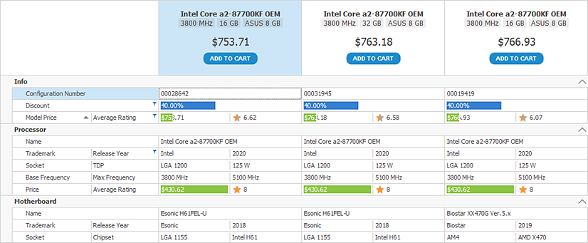
You can specify record header content as follows:
- Set the record header format.
- Handle an event to dynamically supply record header text.
- Custom paint record headers.
Record Header Format
The VGridControl.RecordHeaderFormat property allows you to specify the format string used to generate header text for all records.
The record format supports the following elements:
Static text.
The syntax to insert the display values of text fields:
{FieldName[,alignment]}The optional alignment setting is a signed integer that specifies the preferred width of the resulting string.
Examples:
- {ModelPrice} — Returns the display text of the ‘ModelPrice’ row (field).
- {CategoryID, 10} — Returns the display text of the ‘CategoryID’ row (field) with a 10-character requirement. If the length of the field’s display text is less than 10 characters, the resulting string is padded with leading spaces to meet this requirement.
HTML-inspired formatting tags:
b,i,size,href,image,br, and so on. Enable the OptionsView.AllowHtmlText setting to allow HTML tags.The
brtag requires that you enable word wrap with the VGridControl.Appearance.RecordHeader.TextOptions.WordWrap setting.Do the following to allow users to click hyperlinks, and to respond to these actions:
- Set the OptionsBehavior.HyperlinkClickMode property to Click or CtrlClick.
- Handle the VGridControlBase.HyperlinkClick event to perform actions on hyperlink activation.
Example
The following format string displays a hyperlink, and values of the ‘ProcName’ and ‘ModelPrice’ fields in record headers.

vGridControl1.OptionsView.AllowHtmlText = true;
vGridControl1.Appearance.RecordHeader.TextOptions.WordWrap = DevExpress.Utils.WordWrap.Wrap;
vGridControl1.RecordHeaderFormat = "<br><size=10><b>{ProcName}</b><br><br>" +
    "<size=12>{ModelPrice}</size><br><br>" +
    "<size=7><b><href=shoppingcart>ADD TO CART</href><br><br>";
Example
In the following example, a Vertical Grid’s record headers contain hyperlinks that display employees’ e-mails. The VGridOptionsBehavior.HyperlinkClickMode property is set to CtrlClick to allow users to activate hyperlinks on a mouse click when the CTRL key is pressed down. The VGridControlBase.HyperlinkClick event handler starts a process that opens a clicked hyperlink.

private void Form1_Load(object sender, EventArgs e) {
    BindingList<Message> list = new BindingList<Message>();
    list.Add(new Message() { Date = DateTime.Now, Email = "jheart@dx-email.com", From = "John Heart", PlainText = "Hello All   Please remember that I’ve rescheduled...", Subject = "DevAV Annual Performance Review" });
    list.Add(new Message() { Date = DateTime.Now, Email = "violetb@dx-email.com", From = "Violet Bailey", PlainText = "Good Day Morgan   I’ve been asked by the sales team...", Subject = "Artwork for packaging" });
    vGridControl1.DataSource = list;
    vGridControl1.OptionsView.ShowRecordHeaders = true;
    vGridControl1.OptionsView.AllowHtmlText = true;
    vGridControl1.RecordHeaderFormat = "<b>{From}</b><br><a href=mailto:{Email}>{Email}</a>";
    vGridControl1.Appearance.RecordHeader.TextOptions.WordWrap = DevExpress.Utils.WordWrap.Wrap;
    vGridControl1.RecordWidth = 150;
    vGridControl1.OptionsBehavior.HyperlinkClickMode = DevExpress.Utils.Drawing.HyperlinkClickMode.CtrlClick;
    vGridControl1.HyperlinkClick += VGridControl1_HyperlinkClick;
}

private void VGridControl1_HyperlinkClick(object sender, DevExpress.XtraVerticalGrid.Events.HyperlinkClickEventArgs e) {
    if (e.Link.StartsWith("mailto:"))
        System.Diagnostics.Process.Start(e.Link);
}

public class Message {
    public DateTime Date { get; set; }
    public string From { get; set; }
    public string Email { get; set; }
    public string Subject { get; set; }
    public string PlainText { get; set; }
}
Dynamically Specify Record Header Text
Handle the VGridControl.CustomRecordHeaderDisplayText event to dynamically supply display text for record headers. Use the DisplayText event parameter for this purpose.
The record header text you supply can contain HTML-inspired formatting tags if the OptionsView.AllowHtmlText setting is enabled.
Example
The following example handles the VGridControl.CustomRecordHeaderDisplayText event to assign different text to different record headers. Headers of records that correspond to out-of-stock products display the “Out of stock” string. Other headers display a product’s brand and model information formatted with HTML tags.

vGridControl.OptionsView.ShowRecordHeaders = true;
vGridControl.OptionsView.AllowHtmlText = true;
vGridControl.Appearance.RecordHeader.TextOptions.WordWrap = WordWrap.Wrap;
//...
private void vGridControl_CustomRecordHeaderDisplayText(object sender, Events.CustomRecordHeaderDisplayTextEventArgs e) {
    VGridControl vGrid = sender as VGridControl;
    bool inStock = (bool)vGrid.GetCellValue("InStock", e.Record);
    if (inStock) {
        string maker = (string)vGrid.GetCellDisplayText(erTrademark.Properties, e.Record);
        string model = (string)vGrid.GetCellDisplayText(erName.Properties, e.Record);
        e.DisplayText = $"<size=+1>{maker}<br><size=+2><color=green><b>{model}</b>";
    }
    else
        e.DisplayText = "<color=gray>Out of stock</color>";
}
Custom Paint Record Headers
The VGridControl.CustomDrawRecordHeader event allows you to custom paint record headers.
Example
The following VGridControl.CustomDrawRecordHeader event handler paints the record header element using default settings, and then draws a rounded rectangle with text within the header.

See the following demo for the complete code:
void OnCustomDrawRecordHeader(object sender, Events.CustomDrawRecordHeaderEventArgs e) {
    //skip code...
    // Draw the record header element using default settings.
    e.DefaultDraw();
    // Set the 'Handled' parameter to true to indicate that no default processing is required
    // after the event handler is complete.
    e.Handled = true;
    //...
    int dataSourceRowIndex = vGrid.GetDataSourceRecordIndex(e.Record);
    bool addedToCart = Orders.Contains(dataSourceRowIndex);
    var color = addedToCart ? DXSkinColors.FillColors.Success : DXSkinColors.FillColors.Question;
    e.Cache.FillRoundedRectangle(color, linkRect, new CornerRadius(9));
    using (var format = new StringFormat() { Alignment = StringAlignment.Center, LineAlignment = StringAlignment.Center })
    using (var font = new Font(linkBlock.Font.FontFamily, linkBlock.Font.Size, FontStyle.Bold)) {
        var text = addedToCart ? linkBlock.Text : defaultCartLinkText;
        e.Cache.DrawString(text, font, Brushes.White, linkRect, format);
    }
    //...
}
Record Header Related API
- VGridControl.RecordHeaderHeight — Allows you to set a custom record header panel height.
- VGridOptionsHintEx.ShowRecordHeaderHints — Specifies whether to display hints when a user hovers the mouse pointer over a record header.
- VGridOptionsPrint.PrintRecordHeaders — Specifies whether to print record headers.
- VGridOptionsMenuEx.EnableRecordHeaderMenu — Enables a context menu that allows users to compare records.
Header Appearance
Use the properties exposed by the VGridControl.Appearance object to customize the appearance settings of record headers in different states.
Compare Records
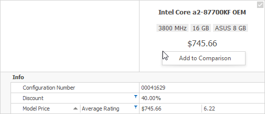
If record headers are enabled, built-in header check boxes and a context menu allow users to select records for comparison, and then compare selected records side-by-side.

Related API
- VGridOptionsView.ShowRecordHeaders
- VGridOptionsBehavior.AllowRecordComparison
- VGridOptionsMenuEx.EnableRecordHeaderMenu
Select/Deselect Records
Do one of the following:
- Toggle a record header’s built-in check box.
- Select the ‘Add to Comparison’/‘Remove from Comparison’ command in the header context menu.
Related API
Show Comparison View
Select the ‘Show Comparison’ command in the header context menu:

As a result, the grid only displays the selected records:

Related API
Hide or Clear Comparison View
Use the following commands to switch back to the normal view:
- Hide Comparison — Switches back to the normal view while keeping the record selection status.
- Clear Comparison — Switches back to the normal view and resets the record selection status.
