Layout Hierarchical Structure
- 2 minutes to read
This topic describes the elements that maintain the layout of controls in the Layout Control and Data Layout Control. To learn about the main features provided by the Layout Controls and layout customization capabilities, see Layout Control.
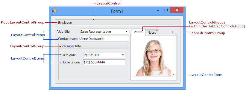
The basic layout building blocks in the Layout Control and Data Layout Control are layout items. These elements display embedded controls along with optional labels.

The Layout Control also provides built-in containers - regular and tabbed groups used to combine items and other groups. The ability to place groups within other groups allows you to create complex layouts.
When the Layout Control is created, it already contains the root group - the bottommost container for all your layout elements. The root group (LayoutControl.Root) cannot be deleted or hidden. It’s only possible to change the visibility of the root group’s caption and borders.

In addition to the layout items, groups and tabbed groups, the Layout Control provides elements to create empty regions, splitters, labels and separators. The following table lists all elements supported by the Layout Control.
| Item | Class | Description |
|---|---|---|
| Layout Item | LayoutControlItem | A layout item. Learn more. |
| Regular Group | LayoutControlGroup | A regular group with or without a header and borders. Learn more. |
| Tabbed Group | TabbedControlGroup | The group that features a tabbed UI. Learn more. |
| Empty Space Item | EmptySpaceItem | Used to insert empty regions in the Layout Control. Learn more. |
| Splitter | SplitterItem | Allows you to resize and optionally collapse/expand adjacent layout items. Not supported in Table Layout and Flow Layout modes. Learn more. |
| Label | SimpleLabelItem | A label. Learn more. |
| Separator | DevExpress.XtraLayout.SimpleSeparator | A separator line. Learn more. |