Day View
- 3 minutes to read
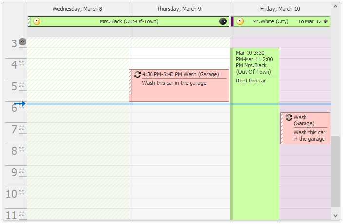
The Day View gives the most detailed view of appointments for a particular day. The view is implemented by the DayView class, accessible by using the SchedulerControl.DayView property. To show the view, set the SchedulerControl.ActiveViewType property to the SchedulerViewType.Day type.

The following table lists the main properties of the DayView class which implement its basic functionality.
| Member Name | Description |
|---|---|
| DayView.AllDayAreaScrollBarVisible | Specifies whether the scrolling of the All-Day Area is enabled, and the corresponding scrollbar is visible. |
| DayView.Appearance | Provides access to the properties that control the appearance of the DayView’s elements. |
| AppointmentDisplayOptions.AppointmentAutoHeight | Specifies whether an appointment should change its height to accomodate the text it contains. |
| DayView.AppointmentDisplayOptions | Provides access to the DayViewAppointmentDisplayOptions class instance containing Day View appointments display options. |
| DayView.DayCount | Gets or sets the number of days that are simultaneously displayed within the Day View. |
| SchedulerControl.SelectedInterval | Gets the time interval currently selected in the scheduler’s active view by an end-user. |
| DayView.ShowAllDayArea | Gets or sets a value which specifies if the All-Day Area is shown when a Scheduler shows its data in the Day view. |
| DayView.ShowDayHeaders | Gets or sets a value which specifies if day headers are shown when a scheduler shows its data in the Day or the Work-Week views. |
| DayView.ShowMoreButtonsOnEachColumn | Gets or sets a value indicating whether to show the more buttons on each column in the Day View. |
| DayView.ShowWorkTimeOnly | Gets or sets a value indicating if the scheduler should show its data only for the working hours in a Day View. |
| AppointmentDisplayOptions.SnapToCellsMode | Specifies whether appointments snap to the time cell borders. |
| DayViewAppointmentDisplayOptionsEx.ShowAllDayAppointmentStatusVertically | Gets or sets whether to display an all-day appointment status strip vertically on the left or horizontally at the top. |
| SchedulerViewBase.StatusDisplayType | Gets or sets how the appointment status is displayed in the Scheduler view. |
| DayView.StatusLineWidth | Gets or sets the status line width. |
| DayView.TimeRulers | Gets the View’s collection of time rulers. |
| DayView.TimeScale | Gets or sets the time interval for the time zones and time slots in the scheduling area. |
| DayView.TimeSlots | Gets the View’s collection of time slots. |
| DayView.VisibleTime | Gets or sets the time of the view’s day interval. |
| SchedulerViewBase.GetVisibleIntervals | Returns a copy of the visible time interval collection for the current view. |
| SchedulerViewBase.SetVisibleIntervals | Fills the visible time interval collection with new items. |
| DayView.WorkTime | Gets or sets the work time interval for a Day View. |
| TopRowTime | Allows you to scroll the Day View down to the required time cell. For instance, if the property value is the TimeSpan(17, 0, 0) object, the first visible time cell is 5 p.m. |
The following table lists events which allow you to customize the View’s layout.
| Event Name | Description |
|---|---|
| SchedulerControl.CustomDrawDayHeader | Allows you to manually paint Day Headers. |
| SchedulerControl.CustomDrawDayViewAllDayArea | Allows you to manually paint All-Day Area. |
| SchedulerControl.CustomDrawDayViewTimeRuler | Allows you to paint a Time Ruler in a custom manner. |
| SchedulerControl.CustomDrawGroupSeparator | Allows you to paint a Group Separator in a custom manner. |
| SchedulerControl.CustomDrawNavigationButton | Allows you to paint Navigation Buttons in a custom manner. |
| SchedulerControl.CustomDrawResourceHeader | Allows you to paint Resource Headers in a custom manner. |
| SchedulerControl.CustomDrawTimeCell | Allows you to paint the Time Cells in a custom manner. |
The following table lists services which allow you to customize the View’s layout.
| Service | Description |
|---|---|
| TimeRulerFormatStringService | Allows you to custom format the text of time labels within the Time Ruler. |
| HeaderCaptionService | Allows you to custom format the header captions. |
| HeaderToolTipService | Allows you to specify custom tooltips for the day headers |