Accordion Control
- 20 minutes to read
The Accordion Control (the AccordionControl class object) is a side navigation control. Accordion items can be organized into groups.

The main Accordion features include:
- Unlimited number of hierarchy levels (AccordionControl.Elements, AccordionControlElement.Elements).
- Items and groups can display images and text in their headers (AccordionControlElementBase.Image, AccordionControlElementBase.ImageIndex, AccordionControlElementBase.Text).
- Items can display custom controls in an expandable area below their headers (AccordionControlElementBase.ContentContainer).
- Hamburger Menu paint style (AccordionControl.ViewType, AccordionOptionsHamburgerMenu.DisplayMode).
- Load item content dynamically (AccordionControl.HasContentContainer, AccordionControl.GetContentContainer).
- Expand multiple elements simultaneously (AccordionControl.ExpandElementMode).
- Context buttons in item and group headers (AccordionControl.ItemContextButtons, AccordionControl.GroupContextButtons, AccordionControl.ContextButtonCustomize).
- Custom controls in item headers (AccordionControlElementBase.HeaderControl).
- Item selection feature (AccordionControl.AllowItemSelection) - Allows you to highlight a clicked item.
- Item and group expand/collapse animation (AccordionControl.AnimationType).
- Built-in search box (AccordionControl.ShowFilterControl) - Allows you to filter items based on the search text.
- Support for an external search box (SearchControl).
Examples
Demos (DevExpress Demo Center)
Items and Groups
To add Accordion Control groups and items, click the “Run Designer” link on the control’s surface and switch to the designer’s “Elements” tab.

Tip
You can drag-and-drop elements in the “AccordionControl Elements” panel to rearrange and categorize them.
Alternatively, you can invoke the control’s smart tag and click the corresponding links:

In code, groups and items are AccordionControlElement class objects with different AccordionControlElement.Style property values. Root groups are stored in the Accordion’s AccordionControl.Elements collection, and individual groups store their child groups and/or items in AccordionControlElement.Elements collections.
Tip
See the following topic for an example: How To: Create AccordionControl in code.
To allow an element to have checked/unchecked states, enable the AccordionControl.AllowItemSelection setting.

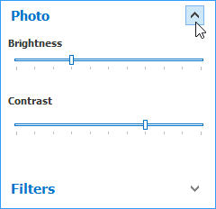
Items with Content Containers
A regular item is a button that raises the AccordionControlElementBase.Click and AccordionControl.ElementClick events when clicked. In addition to these regular items, you can add items with content containers.
Click an item’s smart tag and select “Add ContentContainer”. To populate a content container, drag and drop controls from Visual Studio’s Toolbox onto this container.

Tip
Set a content container’s Padding property to -1 to use paddings based on the applied skin.
To populate a content container in code, specify the AccordionControlElementBase.ContentContainer property…
userControlPhoto uc = new userControlPhoto() { Dock = DockStyle.Fill };
AccordionContentContainer container = new AccordionContentContainer();
container.Controls.Add(uc);
// Assign the required content container to an item
acePhoto.ContentContainer = container;
…or handle the AccordionControl.HasContentContainer and AccordionControl.GetContentContainer events.
// Specify which items should raise the GetContentContainer event
private void accordionControl1_HasContentContainer(object sender, HasContentContainerEventArgs e) {
    if (e.Element.Text == "Photo") e.HasContentContainer = true;
}

// Assign a content container to the item that fired this event
private void accordionControl1_GetContentContainer(object sender, GetContentContainerEventArgs e) {
    if (e.Element.Text == "Photo") {
        userControlPhoto uc = new userControlPhoto() { Dock = DockStyle.Fill };
        AccordionContentContainer container = new AccordionContentContainer();
        container.Controls.Add(uc);
        e.ContentContainer = container;
    }
}
A Content Container does not support DirectX Hardware Acceleration and its opacity differs from the opacity of the Accordion control when displayed in the Fluent Design UI. Place a Layout Control inside the Content Container and dock it to all edges of the Content Container.

Important
- Only items can have content containers.
- Items that already have content containers do not raise the AccordionControl.HasContentContainer event.
Expand and Collapse Elements
API | Description |
|---|---|
Gets or sets whether the element is expanded. | |
Call these methods to expand and collapse all Accordion elements simultaneously. | |
Call these methods to expand/collapse an Accordion element. | |
Call these methods to expand/collapse an Accordion element when the Accordion is minimized. | |
If these settings are enabled, users can click element headers to expand and collapse elements. | |
Handle these events to perform certain actions when the element is about to collapse or expand, and after the element’s state changes. You can handle the AccordionControl.ExpandStateChanging event and clear the Alternatively, you can cancel the AccordionControl.ElementClick event to do the same. Note that the code samples above do not allow users to collapse the Accordion group, but leave this group’s expand/collapse button visible. See the following table row to learn how to hide this button. | |
Use these properties to hide expand/collapse buttons for all items or groups simultaneously. Initially, all groups — even if they are empty — display these buttons. Items show them only when they have content containers assigned. If you need to hide the expand/collapse button for individual elements, handle the AccordionControl.CustomDrawElement event. This event allows you to call various e.Draw… methods; each method paints a specific element part. For instance, the sample below does not call the DrawExpandCollapseButton method for the “Options” group. | |
Gets or sets whether a single element or multiple elements can be expanded simultaneously. | |
Gets or sets whether expandable groups and elements are scrolled (if required) to make their contents visible when they are expanded. |
Control Footer
You can move root Accordion elements (groups and items from the AccordionControl.Elements collection) to the control’s footer. Footer elements act like tabs in a Tabbed UI: when a user clicks a footer element, the Accordion displays this element’s child items in the control’s main area. In the following figure, root items are displayed in the control’s footer. The ‘Mail’ item is active.

To enable this item display style, set the AccordionControl.RootDisplayMode property to Footer.
accordionControl1.RootDisplayMode = DevExpress.XtraBars.Navigation.AccordionControlRootDisplayMode.Footer;
Additional API
- AccordionOptionsFooter.ActiveGroupDisplayMode - Gets or sets whether the accordion control’s main menu displays the active group’s content, but not the header, or both the content and the header.
AccordionControlElement.ControlFooterAlignment - Gets or sets whether the element is aligned at the near or far side of the control footer in the accordion control’s expanded state.
accordionControl1.OptionsFooter.ActiveGroupDisplayMode = DevExpress.XtraBars.Navigation.ActiveGroupDisplayMode.GroupHeaderAndContent;
accordionControlElementSetting.ControlFooterAlignment = AccordionItemFooterAlignment.Far;
- OptionsMinimizing.FooterHeight - Gets or sets the control footer height in the accordion control’s minimized state.
- OptionsMinimizing.AllowFooterResizing - Gets or sets whether users can resize the control’s footer when the Accordion control is minimized.
Search Panel
The embedded search panel allows end users to locate a required element. If the found element belongs to a group, this group is also visible. If the element is a group, it shows its child elements.

When the AccordionControl.ShowFilterControl property equals Always, the search panel is always visible. The Auto value allows end users to press Ctrl+F to invoke the search panel, and Esc to close it.
You can assign a custom filter control to the Accordion. Declare a class that implements the DevExpress.XtraBars.Navigation.IFilterContent interface and assign this class instance to the AccordionControl.FilterControl property.
The AccordionControl.FilterDelay property specifies the delay before filtering is applied. You can use this property to reduce the number of filter operations in the Accordion and allow a user to type several symbols in the search box before a filter operation is executed.
Note
The delay is in effect only for the built-in search panel. If you assign a custom search control to the AccordionControl.FilterControl property, the FilterDelay property is ignored.
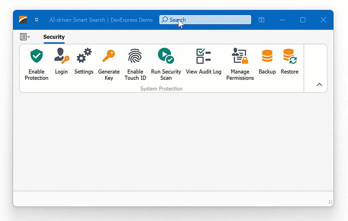
AI-powered Smart Search
Smart Search works alongside traditional search algorithms to offer a more powerful and user-friendly search experience. It offers results that are more aligned with what the user is seeking, even if the input contains misspellings.
When the user pauses typing in the search field within the Ribbon or Accordion control, the control sends the current search query to an AI service that understands context, synonyms, and user intent beyond exact keyword matches. Once the AI service returns its results, the control filters items accordingly.
Play the following animation to see how AI-powered smart search works in the DevExpress WinForms Ribbon control:
Read the following help topic to learn more: AI-powered Smart Search.
Element Header Layout
Accordion groups and items can display four types of content within their headers:
- Icon (the AccordionControlElementBase.Image property)
- Caption (the AccordionControlElementBase.Text property)
- Custom header control (the AccordionControlElementBase.HeaderControl property)
- Context buttons (the AccordionControlElementBase.ContextButtons property)

See the following topic to learn how to rearrange these content blocks: Element Header Layout.
Customize Appearance Settings
You can use the control’s properties (for example, AccordionControl.Appearance, AccordionControlElement.Appearance, and AccordionControlElement.HeaderTemplate) and events (for example, AccordionControl.CustomDrawElement) to customize the contents, layout, and appearance settings of the control’s elements.
Use HTML-CSS Templates to Render UI Elements
AccordionControl allows you to use your knowledge of HTML and CSS markup to render the control’s UI elements. A template’s HTML markup specifies an element’s contents, while the template’s CSS code specifies style, display, and layout settings applied to the element.

AccordionControl exposes a set of properties (accessible from the AccordionControl.HtmlTemplates object) to specify HTML-CSS templates to render the control’s elements:
- AccordionControlHtmlTemplates.Item — Specifies the default HTML-CSS template used to render items.
- AccordionControlHtmlTemplates.ItemContent — Specifies the HTML-CSS template used to render an item’s client area.
- AccordionControlHtmlTemplates.Group — Specifies the default HTML-CSS template used to render a group’s header.
- AccordionControlHtmlTemplates.GroupContent — Specifies the HTML-CSS template used to render a group’s client area (the group’s background that hosts the group’s children).
- AccordionControlHtmlTemplates.FooterElement — Specifies the default HTML-CSS template used to render elements when they are displayed within the control’s footer.
- AccordionControlHtmlTemplates.FooterOverflowButton — Specifies the HTML-CSS template used to render the Overflow button in the control’s footer.
- AccordionControlHtmlTemplates.FooterPanel — Specifies the HTML-CSS template used to render the control’s footer.
- AccordionControlHtmlTemplates.HamburgerHeaderPanel — Specifies the HTML-CSS template used to render the control’s header panel when the Hamburger Menu view style is applied.
- AccordionControlHtmlTemplates.HamburgerMenuButton — Specifies the HTML-CSS template used to render the Menu button in the control’s header when the Hamburger Menu view style is applied.
- AccordionControlHtmlTemplates.MinimizedElement — Specifies the default HTML-CSS template used to render AccordionControl elements when the control is minimized.
- AccordionControlHtmlTemplates.MinimizedGroupPopup — Specifies the HTML-CSS template used to render a group’s popup window (which is displayed on a group click when the control is in the minimized state).
- AccordionControlHtmlTemplates.Separator — Specifies the HTML-CSS template used to render element separators.
Display Element’s Text, Images, and Custom Data
When you specify templates for AccordionControl elements, you can use the data binding syntax (${PropertyName}) to display text, images, and custom values (AccordionControlElementBase.Tag) of these elements.
${Text} — Inserts an element’s text (AccordionControlElementBase.Text).
${Image} — Inserts an element’s image specified in the AccordionControlElementBase.ImageOptions object. Use the img tag to insert an image, for example, as follows: <img src="${Image}".
For example, the following HTML markup defines a div container that displays an element’s image followed by its text:
<div class="item">
    <div class="item_layout">
        <img class="item_image" src="${Image}">
        <div class="item_text">${Text}</div>
    </div>
</div>
You can also use the ${MyField1} syntax to mark an element as bound to a custom data source. The actual data for this element is set in the QueryHtmlElementData event handler.
<div class="acc_item">${MyField1}</div>
private void OnQueryHtmlElementData(object sender, QueryAccordionHtmlElementDataEventArgs e) {
    if (e.FieldName == "MyField1") {
        e.Value = "CustomData";
    }
}
Interaction with Office Navigation Bar
The Office Navigation Bar can show items retrieved from the Accordion Control. Use the OfficeNavigationBar.NavigationClient property to attach an Office Navigation Bar to an Accordion.
Interaction with Fluent Design Form
The FluentDesignForm is a Windows 10-inspired form that includes the following features:
- Embedded Hamburger Menu (AccordionControl with the HamburgerMenu view type)
- Adaptive Layout mode for the Hamburger Menu (automatically switches between Inline, Overlay, and Minimal display modes when you resize the form)
- Acrylic Material effect (a partially transparent texture)
- Reveal Highlight visual effect
See Fluent Design Form for more information.
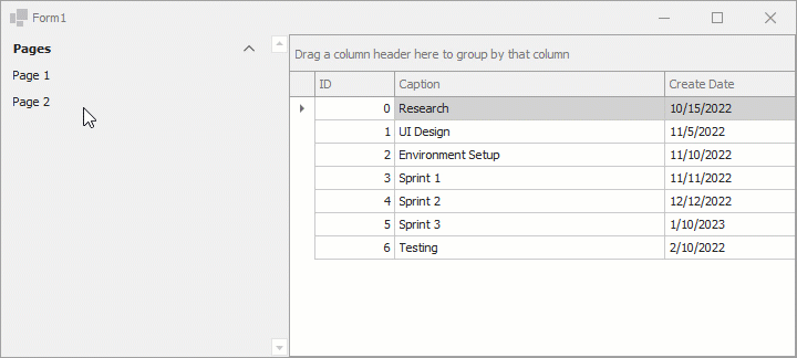
Example - How to Create Side Navigation
This example demonstrates how to use WinForms Accordion and Navigation Frame controls to implement a side navigation.
using System;
using System.Drawing;
using System.Windows.Forms;
using System.Collections.Generic;
using DevExpress.XtraEditors;
using DevExpress.XtraBars.Navigation;
using DevExpress.XtraGrid;

namespace DXApplication {
    public partial class Form1 : XtraForm {
        NavigationFrame navFrame;
        NavigationPage navPage1, navPage2;
        AccordionControl accordion;
        public Form1() {
            InitializeComponent();
            navFrame = new NavigationFrame() {
                Dock = DockStyle.Fill,
            };
            accordion = new AccordionControl(){ Dock = DockStyle.Left};
            this.Controls.AddRange(new Control[] { navFrame, accordion });
            InitNavigationFramePages(navFrame);
            InitAccordion(accordion);
            accordion.SendToBack();
        }
        void InitNavigationFramePages(NavigationFrame frame) {
            // Initializes the first navigation page.
            navPage1 = new NavigationPage(){ Caption = "Tasks" };
            navPage1.Controls.Add(new GridControl() {
                Dock = DockStyle.Fill,
                DataSource = Task.GetSampleData() });
            // Initializes the second navigation page.
            navPage2 = new NavigationPage() { Caption = "Empty", BackColor = Color.Aqua };
            frame.Pages.AddRange(new NavigationPage[] { navPage1, navPage2 });
        }
        void InitAccordion(AccordionControl accordion) {
            AccordionControlElement group = new AccordionControlElement(ElementStyle.Group) {
                Name = "accordionGroup1",
                Text = "Pages",
                Expanded = true
            };
            AccordionControlElement item1 = new AccordionControlElement(ElementStyle.Item) {
                Name = "accordionItem1",
                Text = "Page 1"
            };
            AccordionControlElement item2 = new AccordionControlElement(ElementStyle.Item) {
                Name = "accordionItem2",
                Text = "Page 2"
            };

            item1.Click += new EventHandler(this.accordionElement_Click);
            item2.Click += new EventHandler(this.accordionElement_Click);

            group.Elements.AddRange(new AccordionControlElement[] { item1, item2 });
            accordion.Elements.Add(group);
        }
        void accordionElement_Click(object sender, EventArgs e) {
            AccordionControlElement item = sender as AccordionControlElement;
            navFrame.SelectedPage = item.Text == "Page 1" ? navPage1 : navPage2;
        }
    }
    public class Task {
        int fID;
        public Task(int id) {
            fID = id;
            CreateDate = DateTime.Today;
        }
        public int ID {
            get {
                return fID;
            }
        }
        public string Caption { get; set; }
        public DateTime CreateDate { get; set; }
        public static List<Task> GetSampleData() {
            return new List<Task>() {
            new Task(0){Caption = "Research", CreateDate = new DateTime(2022, 10, 15)},
            new Task(1){Caption = "UI Design", CreateDate = new DateTime(2022, 11, 5)},
            new Task(2){Caption = "Environment Setup", CreateDate = new DateTime(2022, 11, 10)},
            new Task(3){Caption = "Sprint 1", CreateDate = new DateTime(2022, 11, 11)},
            new Task(4){Caption = "Sprint 2", CreateDate = new DateTime(2022, 12, 12)},
            new Task(5){Caption = "Sprint 3", CreateDate = new DateTime(2023, 1, 10)},
            new Task(6){Caption = "Testing", CreateDate = new DateTime(2022, 2, 10)}
        };
        }
    }
}
Example: How to Create a Multi-Level Element Hierarchy
Accordion Control allows you to create an unlimited number of element hierarchy levels. To do that, you need to create group elements, populate them with other groups that have their own child groups, etc.
accordionControl1.Elements.Clear();
// Root level elements
AccordionControlElement gr1 = new AccordionControlElement(ElementStyle.Group) { Text = "Root Group 1" };
AccordionControlElement i1 = new AccordionControlElement(ElementStyle.Item) { Text = "Item 1" };
AccordionControlElement i2 = new AccordionControlElement(ElementStyle.Item) { Text = "Item 2" };
AccordionControlElement gr2 = new AccordionControlElement(ElementStyle.Group) { Text = "Root Group 2" };
AccordionControlElement i3 = new AccordionControlElement(ElementStyle.Item) { Text = "Item 3" };
AccordionControlElement i4 = new AccordionControlElement(ElementStyle.Item) { Text = "Item 4" };
AccordionControlElement gr3 = new AccordionControlElement(ElementStyle.Group) { Text = "Root Group 3" };
AccordionControlElement i5 = new AccordionControlElement(ElementStyle.Item) { Text = "Item 5" };
AccordionControlElement i6 = new AccordionControlElement(ElementStyle.Item) { Text = "Item 6" };

// Level 2 elements
AccordionControlElement gr4 = new AccordionControlElement(ElementStyle.Group) { Text = "Level 2 Group 1" };
AccordionControlElement i7 = new AccordionControlElement(ElementStyle.Item) { Text = "Level 2 Item 1" };
AccordionControlElement i8 = new AccordionControlElement(ElementStyle.Item) { Text = "Level 2 Item 2" };
AccordionControlElement gr5 = new AccordionControlElement(ElementStyle.Group) { Text = "Level 2 Group 2" };
AccordionControlElement i9 = new AccordionControlElement(ElementStyle.Item) { Text = "Level 2 Item 3" };
AccordionControlElement i10 = new AccordionControlElement(ElementStyle.Item) { Text = "Level 2 Item 4" };
AccordionControlElement gr6 = new AccordionControlElement(ElementStyle.Group) { Text = "Level 2 Group 1" };
AccordionControlElement i11 = new AccordionControlElement(ElementStyle.Item) { Text = "Level 2 Item 5" };
AccordionControlElement i12 = new AccordionControlElement(ElementStyle.Item) { Text = "Level 2 Item 6" };

// Level 3 elements
AccordionControlElement gr7 = new AccordionControlElement(ElementStyle.Group) { Text = "Level 3 Group 1" };
AccordionControlElement i13 = new AccordionControlElement(ElementStyle.Item) { Text = "Level 3 Item 1" };
AccordionControlElement i14 = new AccordionControlElement(ElementStyle.Item) { Text = "Level 3 Item 2" };
AccordionControlElement gr8 = new AccordionControlElement(ElementStyle.Group) { Text = "Level 3 Group 2" };
AccordionControlElement i15 = new AccordionControlElement(ElementStyle.Item) { Text = "Level 3 Item 3" };
AccordionControlElement i16 = new AccordionControlElement(ElementStyle.Item) { Text = "Level 3 Item 4" };
AccordionControlElement gr9 = new AccordionControlElement(ElementStyle.Group) { Text = "Level 3 Group 1" };
AccordionControlElement i17 = new AccordionControlElement(ElementStyle.Item) { Text = "Level 3 Item 5" };
AccordionControlElement i18 = new AccordionControlElement(ElementStyle.Item) { Text = "Level 3 Item 6" };

gr7.Elements.AddRange(new AccordionControlElement[] { i13, i14 });
gr8.Elements.AddRange(new AccordionControlElement[] { i15, i16 });
gr9.Elements.AddRange(new AccordionControlElement[] { i17, i18 });

gr4.Elements.AddRange(new AccordionControlElement[] { i7, i8, gr7 });
gr5.Elements.AddRange(new AccordionControlElement[] { i9, i10, gr8 });
gr6.Elements.AddRange(new AccordionControlElement[] { i11, i12, gr9 });

gr1.Elements.AddRange(new AccordionControlElement[] { i1, i2, gr4 });
gr2.Elements.AddRange(new AccordionControlElement[] { i3, i4, gr5 });
gr3.Elements.AddRange(new AccordionControlElement[] { i5, i6, gr6 });

accordionControl1.Elements.AddRange(new AccordionControlElement[] { gr1, gr2, gr3 });
accordionControl1.AllowItemSelection = true;
accordionControl1.ExpandAll();