Main Features
- 2 minutes to read
With the Navigation Bar, you can implement a collapsible sidebar menu, provide switching between application modules, create action lists and display custom controls that perform any functionality.
Tip
The Navigation Bar control is based on legacy UI concepts. If you’re starting a new project, we recommend implementing navigation menus using the modern Accordion Control.
The main component of the Navigation Bar for WPF suite is NavBarControl. This control displays a number of items arranged into groups. Groups can be expanded/collapsed in order to show/hide their contents. In addition, you can display custom controls within groups.
Navigation Bar supports three layout types:
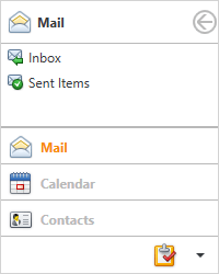
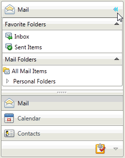
Navigation Pane - Only a single group’s content is visible at one time. Other groups can be expanded by clicking group headers at the bottom of the control. Navigation Pane supports the Expand/Collapse feature that allows end-users to save screen space by temporarily minimizing the NavBar.
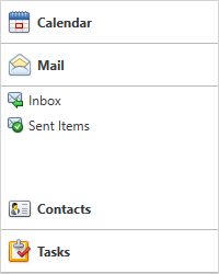
Side Bar View - Only a single group’s content is visible at one time. To expand other groups, you can click their headers at the top or bottom of the control.
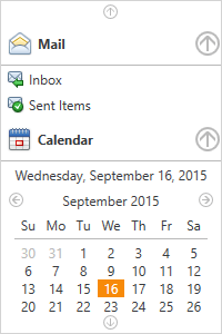
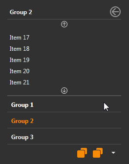
Explorer Bar View - Multiple groups can be expanded simultaneously.
Feature List
Below is the list of the Navigation Bar’s main features:
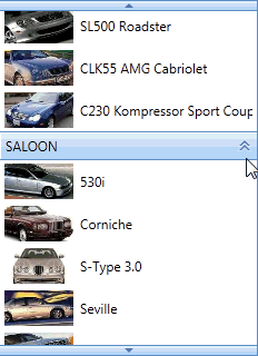
A navbar group can either display a set of items or a custom control (see Group Content Model).

Animation effects when expanding and collapsing groups.
Expanding and collapsing of the Navigation Pane (see Navigation Pane Expand Button).
Horizontal or vertical group arrangements (see View Layout Customization)

Different item arrangement styles

Animated content scrolling support (see the Scrolling topic to learn more).
- Groups and items can be read from a bound data source (see Binding to Data).
- Item selection support (see Clicking and Selecting Items).
Support for integration with the OfficeNavigationBar - a bar (anchored to the bottom of the window) displaying navigation links.

- Save and restore layouts. This feature allows you to persist group expansion states and scrolling between application runs.