v26.1 Release Notes
- 9 minutes to read
Tip
Visit our website to explore new features and capabilities available across the DevExpress product line: What’s New in our Latest Update.
AI Agent Skills
WPF v26.1 introduces AI agent skills, structured knowledge packages that equip AI coding assistants with accurate, product-specific expertise for WPF controls.
Each skill defines the correct NuGet packages, entry-point classes, API patterns, XAML markup, and configuration for a specific WPF control or usage scenario. AI assistants use this knowledge to generate accurate WPF code from the first prompt.
Skills follow the open Agent Skills standard and work with Claude Code, GitHub Copilot (CLI, VS Code, Visual Studio, JetBrains Rider), Cursor, and Gemini CLI.
WPF skills are available in the DevExpress AI Agent Skills repository.
For more information, see Agent Skills for DevExpress WPF Controls.
Fluent Theme (CTP)
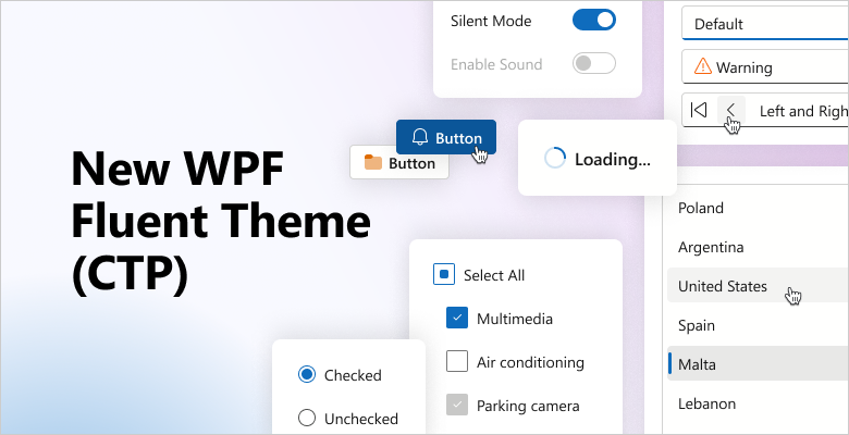
v26.1 introduces a new Fluent Light Theme for DevExpress-powered WPF applications. The new theme incorporates modern design practices inspired by the latest Microsoft 365 applications.
Features include:
- Improved contrast and readability
- Token-based theme customization
- Semantic resource naming
- Unified styling with DevExpress Blazor for Blazor Hybrid applications
Note
In v26.1, Fluent Theme support is available for specific DevExpress WPF controls. Controls that do not support Fluent Theme automatically use the Win11Light theme. Refer to the following help topic for additional information: Lightweight Themes.
WPF AI Chat
AI Agent Integration
The DevExpress WPF AI Chat Control ships with a new IChatResponseProvider abstraction layer. This layer decouples the UI from AI services and allows you to bind the AI Chat Control to different AI backends, including:
IChatClient,AIAgentimplementations- OpenAI Responses API
- Azure AI Projects
- Microsoft Agent Framework (including agents and workflows)
- Custom
IChatResponseProviderimplementations
Prerequisites
Install the following NuGet packages to begin:
DevExpress.AIIntegration.AgentsDevExpress.AIIntegration.Wpf.ChatDevExpress.Wpf.CoreMicrosoft.Agents.AI.OpenAI (1.0.0-rc1)Microsoft.Extensions.AI.OpenAI (10.4.0)
Agent API Demos
Our Demo Center includes new examples that demonstrate real-world AI agent usage scenarios and integration patterns with the DevExpress WPF AI Chat Control.
- Workflow as Agent
Wraps a multi-step workflow behind the
IChatResponseProviderabstraction and exposes it as a chat client.- Group Chat Workflow with Tool Calling Approval
Implements a multi-agent workflow with “Content Reviewer” and “Publisher” agents. Demonstrates human-in-the-loop control.
- Responses API with Reasoning
Connects the AI Chat Control to a reasoning-capable model that processes tasks step by step.
- Workflow with Executors
Implements a deterministic workflow without AI model calls.
- Stream Workflow Responses
Streams intermediate results from a multi-step workflow.
- AG-UI Integration
Connects the AI Chat Control to an external agent server via the AG-UI protocol.
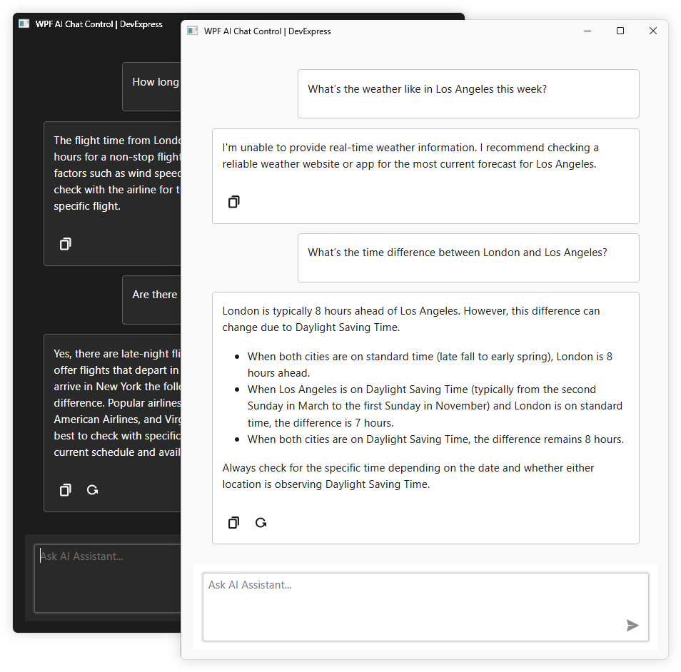
Chat Fluent UI
Our updated Chat UI aligns with modern Fluent design standards.
Enhancements include:
- Simplified layout
- Updated typography
- Refined spacing
Customize Chat Input Placeholder
Use the AIChatControl.InputBoxNullText property to specify placeholder text in the input box:
aiChatControl1.InputBoxNullText = "Ask me anything...";
API Enhancements
We updated message processing APIs and refined naming for consistency.
The MessageSending event replaces MessageSent and includes an e.Cancel parameter. Handle this event to process input before it is added to chat history and sent to the AI service. Set e.Cancel to true to prevent automatic send operations.
async void AiChatControl1_MessageSending(object sender, AIChatControlMessageSendingEventArgs e) {
    // Add a message to chat history without sending it to the AI service.
    await e.Chat.AppendMessageAsync("Translate text to Spanish", ChatRole.System);
}
AI-powered Extensions
Prompt to Expression — WPF Filter Editor and Expression Editor
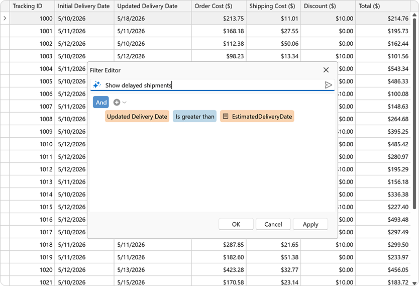
We added AI-powered expression generation to help users create filter and column expressions for DevExpress data-aware WPF controls using natural language.
Users describe the desired logic in plain text. The system sends the prompt to the configured AI service and returns a valid expression. The DevExpress Expression Editor and/or Filter Editor display and validate results immediately.
Supported controls include:
Accessibility Enhancements
WPF Pivot Grid — Filter Panel Keyboard Navigation
Our WPF Pivot Grid includes full keyboard access to the Filter Panel.
Set the PivotGridControl.AllowFilterPanelNavigation property to true to activate Filter Panel keyboard navigation:
<dxpg:PivotGridControl
        AllowFilterPanelNavigation="True">
    <dxpg:PivotGridControl.Fields>
        <dxpg:PivotGridField FieldName="Country" Area="RowArea" AreaIndex="0"/>
        <dxpg:PivotGridField FieldName="Name" Area="RowArea" AreaIndex="1"/>
        ...
    </dxpg:PivotGridControl.Fields>
</dxpg:PivotGridControl>
Use the following keyboard shortcuts to navigate between the WPF PivotGrid control and the Filter Panel:
| Keyboard Shortcut | Action |
|---|---|
| Ctrl + Shift + F | Focus moves to the Filter Panel. |
| Ctrl + Tab | Focus moves from the active data cell to the Filter Panel. |
| Tab | Shifts focus from the last navigable cell in the data region to the Filter Panel. |
| Ctrl + Shift + Tab | Restores focus from the Filter Panel to the previously active data cell. |
Spreadsheet Control — Screen Reader Support
Spreadsheet documents are now accessible to screen readers (Narrator, NVDA). You can navigate through document sheets, rows, columns, and cells. Readers can pronounce all worksheet headings, cell text, comments, text boxes, and alt text for images, charts, and other drawing objects.
PDF/UA-2 Format Support
Our PDF export engine now supports the PDF/UA-2 format (for enhanced accessibility compliance). You can specify PDF/UA-2 conformance for exported documents to meet the latest accessibility standards. The new PDF/UA-2 option is available for the following products:
- WPF Rich Text Editor
- WPF Spreadsheet Control
Set the PdfExportOptions.PdfUACompatibility property to PdfUA2 to specify PDF/UA-2 conformance for exported documents.
WPF Data Grid
Expression Editor for Custom Format Conditions
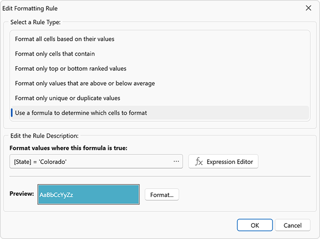
Our Expression Editor (for both the TableView and TreeListView) now supports custom conditional formatting rules. Users can define formatting rules with complex logical expressions beyond predefined rule types.
Use the following properties to enable custom expressions:
- TableView.ConditionalFormattingAllowCustomExpressions
- TreeListView.ConditionalFormattingAllowCustomExpressions
When enabled, our Conditional Formatting Rules Manager displays the Expression Editor button for formula-based rules.
Advanced Column and Band Drag-and-Drop
A new ColumnDragOver event allows you to control column and band drag & drop behavior. Handle this event to validate or modify drop operations. You can execute the following:
- Prevent column reordering
- Restrict drop targets
- Apply drag & drop rules for individual grid columns
<ThemedWindow ...
    xmlns="http://schemas.microsoft.com/winfx/2006/xaml/presentation"
    xmlns:x="http://schemas.microsoft.com/winfx/2006/xaml"
    xmlns:dxg="http://schemas.devexpress.com/winfx/2008/xaml/grid" >

    <dxg:GridControl ItemsSource="{Binding Items}">
        <dxg:GridControl.Columns>
            <dxg:GridColumn FieldName="ID" />
            <dxg:GridColumn FieldName="Name" />
            <dxg:GridColumn FieldName="Date" />
        </dxg:GridControl.Columns>
        <dxg:GridControl.View>
            <dxg:TableView ColumnDragOver="TableView_ColumnDragOver" />
        </dxg:GridControl.View>
    </dxg:GridControl>
</ThemedWindow>
void TableView_ColumnDragOver(object sender, ColumnDragOverEventArgs e) {
    // Cancel the drop operation if the user attempts to drop a column onto a column header area.
    e.Cancel = e.TargetArea == HeaderArea.ColumnHeader;
}
Search Panel Customization
We enhanced Search Panel customization with the following options:
Group Panel Customization
Group Panel customization capabilities include:
Enable the ShowGroupPanelColumnsAsSingleRow option to display grouped column headers in a single line without indentation:
Column Header Customization
New customization options include:
- Display custom sort icons
- Adjust icon size
- Display, hide, or reposition filter icons
- Apply custom templates
Row Indicator Customization
Row Indicator Panel customization options include:
- Specify foreground and background colors
- Display custom UI elements and icons
Expand Button Customization
New options allow you to display custom glyphs/icons within expand/collapse buttons in TreeList layouts, group and master-detail rows.
Filter Panel Customization
New appearance settings allow you to customize Filter Panel UI elements:
- Foreground and background colors for fields, values, and operators
- A color mode that switches between standard appearance and a plain style with transparent backgrounds and inherited text colors
New commands allow you to handle user actions:
- ElementClickCommand: Handle clicks against filter elements (such as fields, values, and operators)
- ClearingFilterCommand: Overrides or extends the “Clear Filter” action
WPF TreeViewControl
API Enhancements
We expanded TreeViewControl API to simplify customization and reduce reliance on implicit styles.
You can now configure view-level settings directly on the control:
- Tooltips (CellToolTipTemplate, CellToolTipBinding)
- Selection and focus visuals
- Scrollbar visibility and focus
- Search (
SearchControl) - Active editor
- Focused row
New methods and events allow you to manage in-place editors as necessary:
- Display, hide, and close editors
- Control editor activation
- Handle keyboard operations
Template Kit
Visual Basic Support
The DevExpress Template Kit now supports Visual Basic. You can create DevExpress-powered WPF applications in VB.NET alongside C# templates.
DateOnly & TimeOnly Support
Charts
The DevExpress WPF Chart Control supports .NET DateOnly and TimeOnly data types.
Use these types for:
- Arguments and values
- Workday and work time settings
- Strips, constant lines, and scale breaks
- Filtering, sorting, and summaries
Pivot Grid
The DevExpress WPF Pivot Grid now supports DateOnly and TimeOnly data types for filtering, grouping, and summary operations in .NET applications.
MVVM Enhancements
Simplified Dependency Injection (DI)
The DevExpress MVVM framework v26.1 includes built-in support for Dependency Injection (DI) directly in XAML.
Use our new IocExtension to resolve objects or services from the configured dependency injection container. The extension uses the global IocServiceProvider.Default service provider to resolve dependencies at runtime.
Monaco-Based Code Editor (Demo)
We created an example that wraps the open source Monaco Editor (v0.55.1). The editor is hosted inside Microsoft WebView2 and exposed through a custom, reusable SyntaxEditor WPF control.
Note
The WPF SyntaxEditor control is available as part of the example. It is not included in the DevExpress WPF UI Control library.
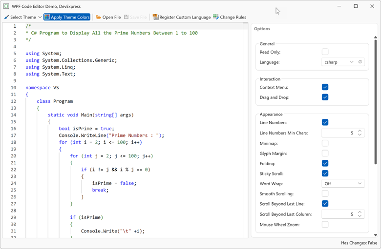
Features include:
- Monaco Editor engine
- WebView2-based hosting with seamless WPF integration
- 50+ built-in languages (C#, JavaScript, Python, SQL, XML, JSON, and more)
- DevExpress theme integration
- Theme token rule editor
- Configurable editor options (line numbers, minimap, folding, word wrap, sticky scroll, tab size, IntelliSense, scrolling, indentation, and more)
- Read-only mode
- Track changes
- Load/save files
Prism 9 Support
We added Prism 9 support to our DevExpress adapters. You can integrate Prism regions into the following DevExpress WPF controls:
LayoutGroupDocumentGroupTabbedGroupLayoutPanelDXTabControlNavigationFrameNavBarControlNavBarGroup
WPF Localization
Simplified Resource Setup
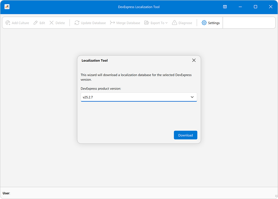
We simplified initial setup for the DevExpress Localization Tool.
When you launch the tool for the first time, our Localization Tool downloads required localization resources from our GitHub repo and configures source, import, and export paths automatically.
Download 30-Day Trial
With numerous new products and dozens of high-impact features, DevExpress UI components allow you to build your best, without limits or compromise. Download our fully-functional 30-day trial today and experience the DevExpress difference today.
Tip
Your Feedback Matters! Take part in the survey on our website: WPF Survey.