TcxvgOptionsView.RowHeaderFilterButtonShowMode Property
Specifies which UI element invokes a filter drop-down window for a row header.
Declaration
property RowHeaderFilterButtonShowMode: TcxFilterButtonShowMode read; write; default fbmDefault;Property Value
| Type | Default | Description |
|---|---|---|
| TcxFilterButtonShowMode | fbmDefault | The active filter button display mode. |
Remarks
Use the RowHeaderFilterButtonShowMode property to switch between a simple dropdown button and smart tag icon in a row header. A vertical grid control can show this UI element either in a hot-tracked row header or in all row headers depending on the ShowRowHeaderFilterButton property value and the state of Touch mode.
Options include:
| Value | Description | Example | Example (Touch Mode) |
|---|---|---|---|
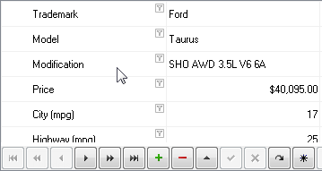
fbmButton |
A row header shows a filter dropdown button. The button size increases in Touch Mode. |  |
 |
| fbmSmartTag | A row header shows an icon that imitates a smart tag. The tag size remains the same in Touch Mode. |  |
 |
| fbmDefault | A row header shows a smart tag icon if Touch Mode is disabled; otherwise – shows a filter dropdown button. | |
|
Default Button
The RowHeaderFilterButtonShowMode property’s default value is fbmDefault.
See Also