Layout View
- 2 minutes to read
A Layout View displays records as cards, in different layouts, including:
Multiple cards arranged into columns, rows, or an ellipse (see Carousel display mode below);
A single card displayed within the View.

To switch the View layout, select the appropriate display mode via the View’s OptionsView.ViewMode property.
The Layout View uses the ExpressLayout Control‘s functionality to provide a comprehensive layout management over the card structure. Using the layout container capabilities, end-users can manually rearrange card rows within cards in the following ways:
Combine card rows into layout groups. These groups in turn can be nested within other groups, allowing a layout hierarchy of any level. Children contained in a group can be tabbed, organized vertically (one under another) or horizontally (across the group).
Span card rows over neighboring rows and layout groups.
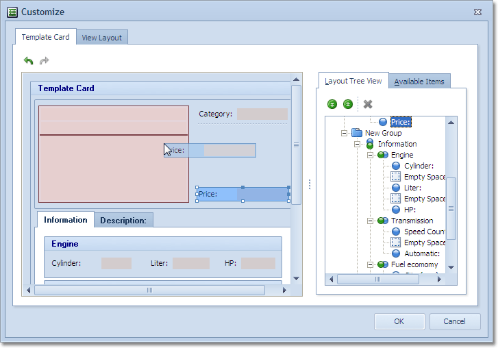
Add auxiliary layout elements (empty regions, separators and labels) to the card from the Customization Form.
Temporarily hide unnecessary card rows and layout elements in the Customization Form, or even permanently delete layout elements created at runtime which will not be further used during the application session.

Carousel Display Mode
In Carousel display mode (the Layout View’s OptionsView.ViewMode property is set to lvvmCarousel), cards are arranged in an ellipse. All cards, except for the current card (also called the foreground card), are visually displayed below it. To create this visual effect, these cards (also called background cards) are painted scaled down, with transparency effects. Scrolling or focusing cards with the scrollbar, pan gestures, arrow keys, or mouse wheel, moves them along a specified elliptical curve with scale and animation effects, to mimic a rolling carousel.

You can adjust the carousel characteristics using the Layout View’s OptionsView.CarouselMode options.
Run the LayoutViewCarouselModeDemo shipped with the ExpressQuantumGrid Suite to see this mode in action.