Elements within Blazor Ribbon
- 4 minutes to read
This topic describes the Ribbon element hierarchy, item types, and core features.
Ribbon Element Hierarchy
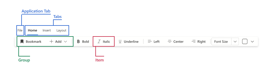
The DxRibbon component organizes items as follows:
- Application Tab (optional, single tab)
- Contains Application Tab Items for global actions (such as Open, Save, Export).
- Tabs
- Top-level categories such as Home or Insert. Tabs can also be contextual.
- Groups
- Logical command blocks inside a tab. In narrow layouts, groups collapse into overflow menus.
- Items
- Interactive items that execute commands or accept input.
- DxRibbon
- DxRibbonApplicationTab (optional)
- DxRibbonApplicationTabItem (optional)
- DxRibbonTab
- DxRibbonGroup
- DxRibbonItem
- DxRibbonItem (optional)
- Template (optional)
- DxRibbonItem (optional)
- DxRibbonToggleItem
- Template (optional)
- DxRibbonToggleGroup
- DxRibbonToggleItem
- Template (optional)
- DxRibbonToggleItem
- DxRibbonComboBoxItem
- DxRibbonSpinEditItem
- DxRibbonColorPaletteItem
- Template (optional)
- DxRibbonItem
- DxRibbonGroup
- DxRibbonApplicationTab (optional)
Ribbon Elements
Application Tab
DxRibbonApplicationTab is a single top-level tab placed first in the Ribbon. It is designed for global commands and can work in two modes:
- Open a drop-down menu with application commands.
- Execute custom logic when a user clicks the tab.
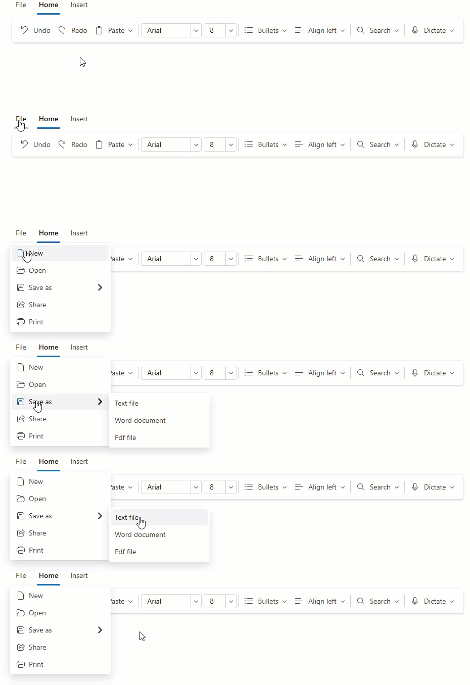
Use the following APIs to customize the application tab:
- Text
- Specifies the application tab text.
- IconCssClass/IconUrl
- Specifies the CSS class or URL used to display an icon in the application tab.
- Click
- Specifies tab click handler.
- DxRibbonApplicationTabItem
- Specifies an item displayed in the Ribbon application menu.
Application Tab Item
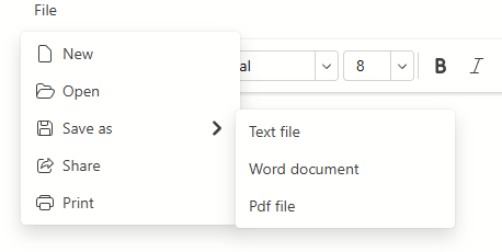
DxRibbonApplicationTabItem is a command inside the application menu. You can nest these items in child content to build submenus.
Tabs
DxRibbonTab is a container that organizes groups.

Use the following APIs to customize Ribbon tabs:
- Text
- Specifies the tab text.
- Contextual
- Specifies if the current tab is contextual.
- Visible (inherited)
- Specifies whether a Ribbon element is visible.
Groups
DxRibbonGroup is a logical command container inside a tab that hosts Ribbon items. In adaptive layouts, groups can collapse into overflow menus.

Use the following APIs to customize Ribbon groups:
- AdaptivePriority
- Specifies the order in which the ribbon group collapses when the Ribbon is resized.
- Text
- Specifies the text of a collapsed Ribbon group.
- IconCssClass / IconUrl
- Specifies the CSS class/URL used to display the icon of a collapsed Ribbon group.
Items (Buttons / Menus)
DxRibbonItem is a command item that acts as a button or a drop-down menu.

Use the following APIs to customize DxRibbonItems:
- Click
- Specifies the item click handler.
- SplitDropDownButton
- Specifies whether the drop-down button item should be split into two buttons.
- Child
DxRibbonItemcollection - Creates hierarchical menus.
- IconCssClass/IconUrl (inherited)
- Specifies the CSS class/URL used to display an icon in the item.
- DropDownCssClass
- Specifies the CSS class for the Ribbon item’s drop-down menu.
- NavigateUrl / Target
- Specify the Ribbon item’s target URL and where to open it (in the current window, a new tab, and so on).
Toggle Items
DxRibbonToggleItem is a two-state item with a persistent selected state.

Use the following APIs to customize DxRibbonToggleItems:
- Checked
- Specifies whether the toggle item is selected.
- CheckedChanged
- Fires when a toggle item selection state changes.
- IconCssClass/IconUrl (inherited)
- Specifies the CSS class/URL used to display an icon in the item.
Toggle Groups
DxRibbonToggleGroup groups multiple toggle items. Only one toggle item in the group can be active at a time.

ComboBox Items
DxRibbonComboBoxItem is an editor item for value selection in Ribbon.

Use the following APIs to customize DxRibbonComboBoxItems:
- Value
- Specifies the edit value.
- ValueChanged
- Fires after the edit value changes.
- AllowUserInput
- Specifies whether users can enter custom values in the edit box of the combo box item.
Spin Editor Items
DxRibbonSpinEditItem is an editor item for numeric input in the Ribbon. Users can type values or use the increment and decrement buttons.

Use the following APIs to customize DxRibbonSpinEditItems:
- Value
- Specifies the edit value.
- ValueChanged
- Fires after the edit value changes.
- Increment
- Specifies the increment value for the spin editor ribbon item.
- MinValue, MaxValue
- Specify the allowed numeric range.
Color Palette Items
DxRibbonColorPaletteItem is an editor item that displays a color palette and allows users to select a color.

Use the following APIs to customize DxRibbonColorPaletteItems:
- Value
- Specifies the selected color value.
- ValueChanged
- Fires when the selected color changes.
- Colors
- Specifies a predefined/custom color collection for the drop-down palette.
- Groups
- Allows you to define multiple color groups via
DxRibbonColorGroup. - AutomaticColor
- Adds an automatic color swatch at the top of the palette.
- AutomaticColorCaption
- Specifies caption text for the automatic color swatch.
- IconCssClass/IconUrl (inherited)
- Specifies the CSS class/URL to display an icon in the item.
Minimal Structure Example
<DxRibbon>
    <DxRibbonApplicationTab Text="File">
        <DxRibbonApplicationTabItem Text="Open" />
        <DxRibbonApplicationTabItem Text="Export" />
    </DxRibbonApplicationTab>

    <DxRibbonTab Text="Home">
        <DxRibbonGroup Text="Clipboard">
            <DxRibbonItem Text="Paste" />
            <DxRibbonItem Text="Copy" />
        </DxRibbonGroup>

        <DxRibbonGroup Text="Alignment">
            <DxRibbonToggleGroup>
                <DxRibbonToggleItem Text="Left" />
                <DxRibbonToggleItem Text="Center" />
                <DxRibbonToggleItem Text="Right" />
            </DxRibbonToggleGroup>
        </DxRibbonGroup>

        <DxRibbonGroup Text="Layout">
            <DxRibbonSpinEditItem Value="100" MinValue="25" MaxValue="400"
                                  Increment="25" Width="100px" />
            <DxRibbonColorPaletteItem Value="#3E6AF8" />
        </DxRibbonGroup>
    </DxRibbonTab>
</DxRibbon>