Selection and Focus in Blazor TreeList
- 33 minutes to read
Focused Row vs. Selection
Focused and selected rows have a lot in common. For example, you can allow users to focus a row and display/update additional information outside of the TreeList component. You can do the same with selected rows - whether you allow single or multiple selection. The key differences between the two features are outlined below:
- The focused row is a navigation feature, while selected rows facilitate operations on data rows. For example, if you navigate to a different page or filter the TreeList, focus can change. Row selection doesn’t change as a result of navigation or data shaping operations.
- Focused row appearance usually has more contrast compared to selected rows.
Selection in Blazor TreeList
The DevExpress Blazor TreeList supports single and multiple (default) row selection. Users can click rows or use a specially-designed column to select/deselect records. You can also manage selection in code.
Note
The TreeList component uses the key field’s values to identify and compare data items. If your data object has a primary key, assign it to the KeyFieldName property. Otherwise, the TreeList uses standard .NET value equality comparison to identify data items.
Single Row Selection
Set the SelectionMode property to Single to allow users to select only one row at a time:
@inject EmployeeTaskService EmployeeTaskService

<DxTreeList Data="TreeListData"
            KeyFieldName="Id"
            ParentKeyFieldName="ParentId"
            SelectionMode="TreeListSelectionMode.Single"
            AllowSelectRowByClick="true">
    <Columns>
        <DxTreeListDataColumn FieldName="Name" Caption="Task" />
        <DxTreeListDataColumn FieldName="EmployeeName" />
        <DxTreeListDataColumn FieldName="StartDate" />
        <DxTreeListDataColumn FieldName="DueDate" />
    </Columns>
</DxTreeList>

@code {
    List<EmployeeTask> TreeListData { get; set; }

    protected override void OnInitialized() {
        TreeListData = EmployeeTaskService.GenerateData();
    }
}
Tip
Use the row focus feature to navigate between TreeList records and perform actions related to the currently focused row.
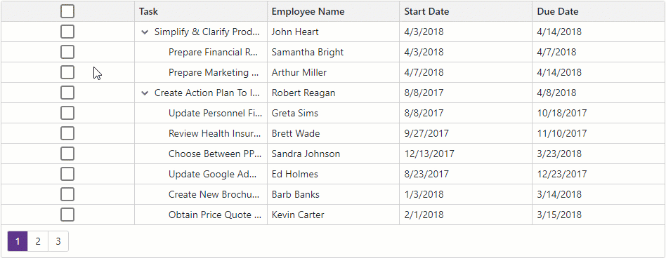
Select Rows in the UI
The TreeList component allows users to select rows in the following ways:
Row Click
Set the AllowSelectRowByClick property to true to allow users to select rows by mouse clicks, tap gestures, and keyboard shortcuts. Note that the selection state of a parent node does not affect selection states of its child nodes and vice versa.
@inject EmployeeTaskService EmployeeTaskService

<DxTreeList Data="TreeListData"
            KeyFieldName="Id"
            ParentKeyFieldName="ParentId"
            AllowSelectRowByClick="true"
            @bind-SelectedDataItems="@SelectedDataItems">
    <Columns>
        <DxTreeListDataColumn FieldName="Name" Caption="Task" />
        <DxTreeListDataColumn FieldName="EmployeeName" />
        <DxTreeListDataColumn FieldName="StartDate" />
        <DxTreeListDataColumn FieldName="DueDate" />
    </Columns>
</DxTreeList>

@code {
    List<EmployeeTask> TreeListData { get; set; }
    IReadOnlyList<object> SelectedDataItems { get; set; }

    protected override void OnInitialized() {
        TreeListData = EmployeeTaskService.GenerateData();
    }
}
The following user operations are available:
| Operation | Description |
|---|---|
| Click | Click a row to select it and clear the selection of all other rows. |
| Ctrl+Click | Hold down the Ctrl key and click a row to add/remove the row to/from selection. |
| Shift+Click | Click the first row in a range, hold down the Shift key, and click the last row in the range to select a range of rows. |
| Ctrl+Shift+Click | Hold down the Ctrl key, click the first row in the range, hold down the Shift key, and click the last row in the range to add the range of rows to the selection. |
| Space | Focus a cell in a row and press Space to select the row and clear the selection of all other rows. |
| Tap | Tap a row to select it and clear the selection of all other rows. |
| Long Tap | Tap a row for an extended period of time to add/remove the row to/from selection. |
| Long Tap+Move | Tap a row for an extended period and move the finger to add a range of rows to the current selection. |
Selection Column
Declare a DxTreeListSelectionColumn object in the Columns template to display the selection column.
@inject EmployeeTaskService EmployeeTaskService

<DxTreeList Data="TreeListData"
            KeyFieldName="Id"
            ParentKeyFieldName="ParentId">
    <Columns>
        <DxTreeListSelectionColumn />
        <DxTreeListDataColumn FieldName="Name" Caption="Task" />
        <DxTreeListDataColumn FieldName="EmployeeName" />
        <DxTreeListDataColumn FieldName="StartDate" />
        <DxTreeListDataColumn FieldName="DueDate" />
    </Columns>
</DxTreeList>

@code {
    List<EmployeeTask> TreeListData { get; set; }

    protected override void OnInitialized() {
        TreeListData = EmployeeTaskService.GenerateData();
    }
}
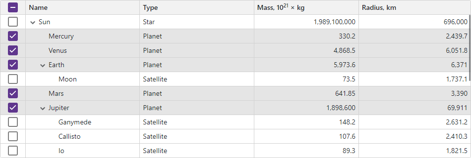
When the SelectionMode property is set to Multiple (the default value), the selection column displays checkboxes. Users can click them to select and deselect individual rows. Note that the selection state of a parent node does not affect selection states of its child nodes and vice versa.

In Multiple selection mode, the selection column displays the Select All checkbox in the column header. A user can click this checkbox to select or deselect rows on the current page or on all TreeList pages depending on the SelectAllCheckboxMode property value. Available property values are as follows:
- Page
- The Select All checkbox does not affect child rows of collapsed items and selects/deselects rows on the current page only.
- AllPages
- The Select All checkbox affects child rows of collapsed items and selects/deselects all rows on all pages.
- Mixed
- The Select All checkbox does not affect child rows of collapsed items and selects/deselects rows on the current page only. An additional drop-down button displays a context menu that allows users to select and deselect all rows on all pages.
<DxTreeList Data="TreeListData"
            KeyFieldName="Id"
            ParentKeyFieldName="ParentId"
            SelectAllCheckboxMode="TreeListSelectAllCheckboxMode.Mixed">
    <Columns>
        @* ... *@
    </Columns>
</DxTreeList>

To hide the Select All checkbox, disable the column’s AllowSelectAll option.
Note
The Select All checkbox functionality has limitations in certain operation modes. To learn more, see the following section: Limitations.
When the SelectionMode property is set to Single, the selection column displays radio buttons. Users can click a button to select one row at a time.
<DxTreeList Data="TreeListData"
            KeyFieldName="Id"
            ParentKeyFieldName="ParentId"
            SelectionMode="TreeListSelectionMode.Single">
    <Columns>
        <DxTreeListSelectionColumn />
        @* ... *@
    </Columns>
</DxTreeList>

You can use the FixedPosition property to freeze the selection column and keep it visible on screen while users scroll the TreeList horizontally.
Select and Deselect Rows in Code
TreeList implements a number of Select* and Deselect* methods that allow you to change row selection in code. The table below lists these methods.
Select* Methods | Deselect* Methods | Description |
|---|---|---|
Set the selection state of a row with the specified visible index. | ||
Set the selection state of rows with the specified visible indexes. | ||
Set selection state of a row that corresponds to the specified data item. | ||
Set selection state of rows that correspond to the specified data items. | ||
Set the selection state of rows on the current visible page. | ||
Set the selection state of all rows in the TreeList. |
Call the ClearSelection() method to clear selection of all rows on all pages, including rows hidden by a filter.
Obtain Selected Data Items
Single Selection Mode
Implement two-way binding for the SelectedDataItem property to access the data item that corresponds to the selected row. When a property value changes, the SelectedDataItemChanged event fires.
@inject EmployeeTaskService EmployeeTaskService

<DxTreeList Data="TreeListData"
            KeyFieldName="Id"
            ParentKeyFieldName="ParentId"
            AllowSelectRowByClick="true"
            SelectionMode="TreeListSelectionMode.Single"
            @bind-SelectedDataItem="@SelectedDataItem">
    <Columns>
        <DxTreeListDataColumn FieldName="Name" Caption="Task" />
        <DxTreeListDataColumn FieldName="EmployeeName" />
        <DxTreeListDataColumn FieldName="StartDate" />
        <DxTreeListDataColumn FieldName="DueDate" />
    </Columns>
</DxTreeList>

<div>
    <p><b>Selected task:</b> @((SelectedDataItem as EmployeeTask)?.Name ?? "(none)")</p>
</div>

@code {
    List<EmployeeTask> TreeListData { get; set; }
    object SelectedDataItem { get; set; }

    protected override void OnInitialized() {
        TreeListData = EmployeeTaskService.GenerateData();
    }
}

Multiple Selection Mode
Implement two-way binding for the SelectedDataItems property to access data items that correspond to selected rows. When a property value changes, the SelectedDataItemsChanged event fires.
@inject EmployeeTaskService EmployeeTaskService

<DxTreeList Data="TreeListData"
            KeyFieldName="Id"
            ParentKeyFieldName="ParentId"
            AllowSelectRowByClick="true"
            @bind-SelectedDataItems="@SelectedDataItems">
    <Columns>
        <DxTreeListDataColumn FieldName="Name" Caption="Task" />
        <DxTreeListDataColumn FieldName="EmployeeName" />
        <DxTreeListDataColumn FieldName="StartDate" />
        <DxTreeListDataColumn FieldName="DueDate" />
    </Columns>
</DxTreeList>

<div>
    <b>Selected tasks:</b>
    @{
        if(SelectedDataItems != null)
            foreach (var task in SelectedDataItems.Cast<EmployeeTask>()) {
                <li>@task.Name</li>
            }
    }
</div>

@code {
    List<EmployeeTask> TreeListData { get; set; }
    IReadOnlyList<object> SelectedDataItems { get; set; }

    protected override void OnInitialized() {
        TreeListData = EmployeeTaskService.GenerateData();
    }
}

The SelectedDataItemsChanged event allows you to get data items that are added to and removed from selection. For this purpose, cast the event handler’s parameter to the ITreeListSelectionChanges interface. The SelectedDataItems and DeselectedDataItems properties return information about selection changes.
<DxTreeList Data="TreeListData"
            KeyFieldName="Id"
            ParentKeyFieldName="ParentId"
            AllowSelectRowByClick="true"
            SelectedDataItems="@SelectedDataItems"
            SelectedDataItemsChanged="OnSelectedDataItemsChanged">
    <Columns>
        @* ...*@
    </Columns>
</DxTreeList>

@code {
    List<EmployeeTask> TreeListData { get; set; }
    IReadOnlyList<object> SelectedDataItems { get; set; }
    string SelectedItemsInfo { get; set; }
    string DeselectedItemsInfo { get; set; }

    void OnSelectedDataItemsChanged(IReadOnlyList<object> newSelection) {
        if (newSelection is ITreeListSelectionChanges changes) {
            SelectedItemsInfo = string.Join(";  ", changes.SelectedDataItems.Cast<EmployeeTask>().Select(p => p.Name));
            DeselectedItemsInfo = string.Join(";  ", changes.DeselectedDataItems.Cast<EmployeeTask>().Select(p => p.Name));
        }
        SelectedDataItems = newSelection;
    }
}
Selection Limitations
When the TreeList component is in virtual scrolling mode:
- The
Pagemode automatically switches toAllPagesmode. - The TreeList component cannot determine the state of the Select All checkbox in
Mixedmode. In such cases, the TreeList sets the checkbox state to indeterminate and displays the checkbox in read-only mode.
When the TreeList component is bound to a GridDevExtremeDataSource or loads data on demand:
Sort and filter operations cancel incomplete “select all” and “deselect all” processes.
The second call to SelectAllAsync or DeselectAllAsync method cancels the operation initiated by the previously called method.
SelectAllAsync and DeselectAllAsync methods load all data to the TreeList and can reduce overall performance and increase memory consumption.
If the SelectAllCheckboxMode property is set to
AllPages, the TreeList component switches it toMixedto improve performance.In virtual scrolling mode, the TreeList component sets the SelectAllCheckboxMode property to
Mixed, sets the Select All checkbox state to indeterminate, and displays the checkbox in read-only mode.
Focused Row
Set the FocusedRowEnabled property to true to allow users to focus individual TreeList rows. The focused row is always visible on the current TreeList page. If you change the current page, the focused row changes.
You can handle the FocusedRowChanged event to react to a focused row change. In the following code snippet, the TreeList component displays additional information about the focused space object:
@inject SpaceObjectDataProvider SpaceObjectDataProvider
<DxTreeList Data="TreeListData"
ChildrenFieldName="Satellites"
FocusedRowEnabled="true"
FocusedRowChanged="TreeList_FocusedRowChanged">
<Columns>
<DxTreeListDataColumn FieldName="Name" />
<DxTreeListDataColumn FieldName="TypeOfObject" Caption="Type" />
<DxTreeListDataColumn FieldName="Mass10pow21kg" Caption="Mass, kg" DisplayFormat="N2">
<HeaderCaptionTemplate>Mass, 10<sup>21</sup> × kg</HeaderCaptionTemplate>
</DxTreeListDataColumn>
<DxTreeListDataColumn FieldName="MeanRadiusInKM" Caption="Radius, km" DisplayFormat="N2" />
<DxTreeListDataColumn FieldName="Volume10pow9KM3" DisplayFormat="N2">
<HeaderCaptionTemplate>Volume, 10<sup>9</sup> × km<sup>3</sup></HeaderCaptionTemplate>
</DxTreeListDataColumn>
<DxTreeListDataColumn FieldName="SurfaceGravity" DisplayFormat="N2">
<HeaderCaptionTemplate>Gravity, m/s<sup>2</sup></HeaderCaptionTemplate>
</DxTreeListDataColumn>
</Columns>
</DxTreeList>
@if (FocusedSpaceObject != null) {
<h5>@FocusedSpaceObject.Name</h5>
<ul>
<li><b>Radius</b>: @FocusedSpaceObject.MeanRadiusInKM.ToString("N2") km</li>
<li><b>Density</b>: @FocusedSpaceObject.Density.ToString("N2") g/cm<sup>3</sup></li>
<li><b>Gravity</b>: @FocusedSpaceObject.SurfaceGravity.ToString("N2") m/s<sup>2</sup></li>
</ul>
}
@code {
object TreeListData { get; set; }
SpaceObject FocusedSpaceObject { get; set; }
protected override async Task OnInitializedAsync() {
TreeListData = SpaceObjectDataProvider.GenerateData();
}
void TreeList_FocusedRowChanged(TreeListFocusedRowChangedEventArgs e) {
FocusedSpaceObject = e.DataItem as SpaceObject;
}
}

Related API
This section contains comprehensive selection and focus-related API references.
| TreeList API member | Type | Description |
|---|---|---|
| AllowSelectRowByClick | Property | Specifies whether users can select and deselect rows by mouse clicks, tap gestures, and keyboard shortcuts. |
| SelectAllCheckboxMode | Property | Specifies whether the Select All checkbox selects all rows on the current page or on all TreeList pages. |
| SelectionMode | Property | Specifies the selection mode. |
| SelectedDataItem | Property | In single selection mode, this property specifies the data item that corresponds to the selected TreeList row. |
| SelectedDataItems | Property | In multiple selection mode, this property specifies data items that correspond to selected TreeList rows. |
| ExportSelectedRowsOnly | Property | Specifies whether the TreeList exports selected rows only. |
| IsDataItemSelected(Object) | Method | Returns whether the row that corresponds to the specified data item is selected. |
| IsRowSelected(Int32) | Method | Returns whether the specified row is selected. |
| ClearSelection() | Method | Clears selection. |
| DeselectAllAsync() | Method | Deselects all rows in the TreeList. |
| DeselectAllOnPage() | Method | Deselects all rows on the currently visible page except for child rows of collapsed items. |
| DeselectDataItem(Object) | Method | Deselects a row that corresponds to the specified data item. |
| DeselectDataItems(IEnumerable<Object>) | Method | Deselects rows that correspond to the specified data items. |
| DeselectRow(Int32) | Method | Deselects a row with the specified visible index. |
| DeselectRows(IEnumerable<Int32>) | Method | Deselects rows with the specified visible indexes. |
| SelectAllAsync(Boolean) | Method | Selects or deselects all rows in the TreeList. |
| SelectAllOnPage(Boolean) | Method | Selects or deselects all rows on the currently visible page except for child rows of collapsed items. |
| SelectDataItem(Object, Boolean) | Method | Selects or deselects a row that corresponds to the specified data item. |
| SelectDataItems(IEnumerable<Object>, Boolean) | Method | Selects or deselects rows that correspond to the specified data items. |
| SelectRow(Int32, Boolean) | Method | Selects or deselects a row with the specified visible index. |
| SelectRows(IEnumerable<Int32>, Boolean) | Method | Selects or deselects rows with the specified visible indexes. |
| SelectedDataItemChanged | Event | In single selection mode, fires when a TreeList row is selected. |
| SelectedDataItemsChanged | Event | In multiple selection mode, fires when the selection in the TreeList changes. |
| Selection Column API member | Type | Description |
|---|---|---|
| AllowSelectAll | Property | Specifies whether the selection column contains the Select All checkbox. |
| CellDisplayTemplate | Property | Specifies a template for selection column cells. |
| FilterRowCellTemplate | Property | Specifies a template for the selection column’s filter row cell. |
| HeaderTemplate | Property | Specifies a template for the selection column header. |
| TreeList API member | Type | Description |
|---|---|---|
| FocusedRowEnabled | Property | Specifies whether row focus is enabled. |
| GetFocusedDataItem() | Method | Returns a data item bound to the focused data row. |
| GetFocusedRowIndex() | Method | Returns the visible index of the focused row. |
| IsDataItemFocused(Object) | Method | Returns whether the row bound to the specified data item is focused. |
| IsRowFocused(Int32) | Method | Returns whether the row with the specified visible index is focused. |
| SetFocusedRowIndex(Int32) | Method | Moves focus to the row with the specified visible index. |
| FocusedRowChanged | Event | Fires when row focus changes. |
Task-Based Examples
This section contains code samples that demonstrate row selection functionality.
Limit the Number of Selected Rows
The SelectedDataItemsChanged event fires when the selection in the TreeList changes. Handle this event to determine the number of selected rows and deselect them if the number of selected rows exceeds a predefined maximum value.
@inject EmployeeTaskService EmployeeTaskService

<DxTreeList @ref=TreeList
            Data ="TreeListData"
            KeyFieldName="Id"
            ParentKeyFieldName="ParentId"
            SelectedDataItems="SelectedItems"
            SelectedDataItemsChanged="TreeList_SelectedDataItemsChanged">
    <Columns>
        <DxTreeListSelectionColumn />
        <DxTreeListDataColumn FieldName="Name" Caption="Task" />
        <DxTreeListDataColumn FieldName="EmployeeName" />
        <DxTreeListDataColumn FieldName="StartDate" />
        <DxTreeListDataColumn FieldName="DueDate" />
    </Columns>
</DxTreeList>

@code {
    ITreeList TreeList;
    int maxSelectedRowCount = 3;
    IReadOnlyList<object> SelectedItems;
    List<EmployeeTask> TreeListData { get; set; }

    void TreeList_SelectedDataItemsChanged(IReadOnlyList<object> newSelection) {
        if (newSelection?.Count > maxSelectedRowCount)
            SelectedItems = newSelection.Skip(newSelection.Count - maxSelectedRowCount).ToList().AsReadOnly();
        else
            SelectedItems = newSelection;
    }

    protected override void OnInitialized() {
        TreeListData = EmployeeTaskService.GenerateData();
    }
}
“Select All” Checkbox: Respond to State Changes
No predefined event fires when the Select All checkbox changes its state. You can create your own template to reproduce the default render and observe the checkbox’s state.
@inject EmployeeTaskService EmployeeTaskService

<DxTreeList Data="TreeListData" KeyFieldName="Id" ParentKeyFieldName="ParentId">
    <Columns>
        <DxTreeListSelectionColumn>
            <HeaderTemplate>
                <DxCheckBox T="bool?"
                            Checked="context.Selected"
                            CheckedChanged="(newValue) => SelectAllCheckboxClicked(newValue, context)" />
            </HeaderTemplate>
        </DxTreeListSelectionColumn>
        <DxTreeListDataColumn FieldName="Name" Caption="Task" />
        <DxTreeListDataColumn FieldName="EmployeeName" />
        <DxTreeListDataColumn FieldName="StartDate" />
        <DxTreeListDataColumn FieldName="DueDate" />
    </Columns>
</DxTreeList>

@code {
    List<EmployeeTask> TreeListData { get; set; }

    protected override void OnInitialized() {
        TreeListData = EmployeeTaskService.GenerateData();
    }
    void SelectAllCheckboxClicked(bool? newValue, TreeListSelectionColumnHeaderTemplateContext context) {
        context.Selected = newValue!.Value;
        // Your actions here
    }
}
Suppress Row Selection When a Certain Element in TreeList is Clicked
When the AllowSelectRowByClick property is set to true, users can click rows to select them. If your TreeList contains links or custom buttons, a click on the element initiates the element-related action, then the RowClick event fires and the row is selected. Use the stopPropagation directive attribute to prevent the click from triggering TreeList events. In this case, clicking these links or buttons does not cause row selection.
<DxTreeListDataColumn FieldName="WikiPage" AllowSort="false" Width="150px">
    <CellDisplayTemplate>
        <a @onclick:stopPropagation href="@context.Value">Open Wikipedia</a>
        @* or *@
        <div @onclick:stopPropagation="true">
            @* Custom buttons *@
        </div>
    </CellDisplayTemplate>
</DxTreeListDataColumn>
Use Custom Checkboxes Inside a Selection Column
To replace selection column editors with custom checkboxes, place the DxCheckBox<T> component in CellDisplayTemplate and implement two-way binding to bind the Checked checkbox property to the context.Selected value.
<DxTreeListSelectionColumn Width="104px">
    <CellDisplayTemplate Context="SelContext">
        <DxCheckBox @bind-Checked="SelContext.Selected"  />
    </CellDisplayTemplate>
</DxTreeListSelectionColumn>