CustomDrawTreeButtonEventArgs.Expanded Property
Gets a value indicating whether the painted button’s corresponding row is expanded.
Namespace: DevExpress.XtraVerticalGrid.Events
Assembly: DevExpress.XtraVerticalGrid.v25.2.dll
NuGet Packages: DevExpress.Win.Navigation, DevExpress.Win.VerticalGrid
Declaration
Property Value
| Type | Description |
|---|---|
| Boolean | true if the painted button’s corresponding row is expanded; otherwise, false. |
Remarks
Clicking a tree button results in expanding/collapsing its corresponding row. By default, tree buttons that correspond to expanded or collapsed rows display ‘-‘ and ‘+’ characters respectively. When performing your own tree button painting, use the Expanded property to determine the row’s state and then paint the button accordingly.
Example
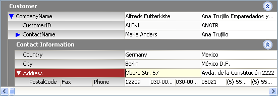
The following sample code shows how to use the VGridControlBase.CustomDrawTreeButton event to paint tree buttons. Custom painting is not applied to category expand buttons, these buttons are painted in their default manner. The result is shown in the image below:

using DevExpress.XtraVerticalGrid;
using DevExpress.XtraVerticalGrid.Events;

private void vGridControl1_CustomDrawTreeButton(object sender,
CustomDrawTreeButtonEventArgs e) {
   VGridControl grid = sender as VGridControl;
    if(e.TreeButtonType == TreeButtonType.ExplorerBarButton) return;

    Color bkColor = e.Row == grid.FocusedRow ? Color.White : Color.Blue;
    if(e.Expanded)
        e.Cache.FillPolygon(new Point[]{ e.Bounds.Location,
    new Point(e.Bounds.Right, e.Bounds.Y),
    new Point(e.Bounds.X + e.Bounds.Width / 2, e.Bounds.Bottom) }, bkColor);
    else
        e.Cache.FillPolygon(new Point[]{ e.Bounds.Location,
    new Point(e.Bounds.Right, e.Bounds.Y + e.Bounds.Height / 2),
    new Point(e.Bounds.X, e.Bounds.Bottom) }, bkColor);
    e.Handled = true;
}