XtraTabPage Class
A tab page.
Namespace: DevExpress.XtraTab
Assembly: DevExpress.XtraEditors.v26.1.dll
Declaration
public class XtraTabPage :
    XtraPanel,
    IXtraTabPageExt,
    IXtraTabPage,
    IToolTipControlClient,
    IAnimatedItem,
    ISupportXtraAnimation,
    ISupportAdornerElementEx,
    ISupportAdornerElement,
    IUpdateAdornerUI,
    ISupportDXSkinColorsEx,
ISupportDXSkinColorsRelated API Members
The following members return XtraTabPage objects:
Remarks
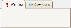
Tab pages display UI controls. A tab page has a header that can display an image and text.

The XtraTabControl stores tab pages in the XtraTabControl.TabPages collection. Use index notation to access specific tab pages.
Text and Image
| Property Name | Description |
|---|---|
| Text | Specifies the tab header text. |
| ImageOptions | Contains image-related settings. |
| StartAnimation() | Starts the GIF animation. |
| StopAnimation() | Stops the GIF animation. |
Display Settings
| Setting | Property Name |
|---|---|
| Visibility | PageVisible |
| Availability | PageEnabled |
| Appearance | Appearance / XtraTabControl.AppearancePage (general settings) |
Example
The following code snippet creates a PersonViewModel class, a BindingSource with generic data, and an XtraTabControl with two tab pages. Each page contains DevExpress WinForms data editors bound to the corresponding properties of the shared data source.
using System.ComponentModel;
using System.Windows.Forms;
using DevExpress.XtraEditors;
using DevExpress.XtraTab;

namespace DXTabControlDemo {
    public partial class Form1 : XtraForm {
        public Form1() {
            InitializeComponent();
            // Create and configure BindingSource.
            BindingSource bindingSource = new BindingSource();
            bindingSource.DataSource = new PersonViewModel { Id = 1, Name = "John Doe", Email = "john@example.com" };

            // Create XtraTabControl.
            XtraTabControl tabControl = new XtraTabControl { Dock = DockStyle.Fill };

            // Create the first tab page.
            XtraTabPage tabPage1 = new XtraTabPage { Text = "General" };
            TextEdit textEditId = new TextEdit { Dock = DockStyle.Top };
            TextEdit textEditName = new TextEdit { Dock = DockStyle.Top };
            textEditId.DataBindings.Add("EditValue", bindingSource, nameof(PersonViewModel.Id));
            textEditName.DataBindings.Add("EditValue", bindingSource, nameof(PersonViewModel.Name));
            tabPage1.Controls.Add(textEditName);
            tabPage1.Controls.Add(textEditId);

            // Create the second tab page.
            XtraTabPage tabPage2 = new XtraTabPage { Text = "Contact" };
            TextEdit textEditEmail = new TextEdit { Dock = DockStyle.Top };
            textEditEmail.DataBindings.Add("EditValue", bindingSource, nameof(PersonViewModel.Email));
            tabPage2.Controls.Add(textEditEmail);

            // Add tab pages to the Tab control
            tabControl.TabPages.Add(tabPage1);
            tabControl.TabPages.Add(tabPage2);

            // Add the Tab control to the Form.
            Controls.Add(tabControl);
        }
    }
    // ViewModel
    public class PersonViewModel : INotifyPropertyChanged {
        int id;
        string name;
        string email;

        public int Id {
            get => id;
            set { id = value; OnPropertyChanged(nameof(Id)); }
        }

        public string Name {
            get => name;
            set { name = value; OnPropertyChanged(nameof(Name)); }
        }

        public string Email {
            get => email;
            set { email = value; OnPropertyChanged(nameof(Email)); }
        }

        public event PropertyChangedEventHandler PropertyChanged;
        void OnPropertyChanged(string propertyName) =>
            PropertyChanged?.Invoke(this, new PropertyChangedEventArgs(propertyName));
    }
}
Implements
Inheritance
See Also