KanbanGroupFooterButtonOptions Class
Provides options to customize Kanban group footer buttons.
Namespace: DevExpress.XtraGrid.Views.Tile
Assembly: DevExpress.XtraGrid.v26.1.dll
Declaration
Related API Members
The following members return KanbanGroupFooterButtonOptions objects:
Remarks
You can access KanbanGroupFooterButtonOptions class objects via the TileView.OptionsKanban.GroupFooterButton and KanbanGroup.FooterButton properties. Use the TileView.OptionsKanban.GroupFooterButton property to enable and customize footer buttons for all Kanban group. Use the KanbanGroup.FooterButton property to show/hide and customize footer buttons for certain Kanban groups.
The following list covers the main settings of group footer buttons.
- KanbanGroupFooterButtonOptions.Text - Specifies the button text.
- KanbanGroupFooterButtonOptions.Visible - Specifies the button visibility.
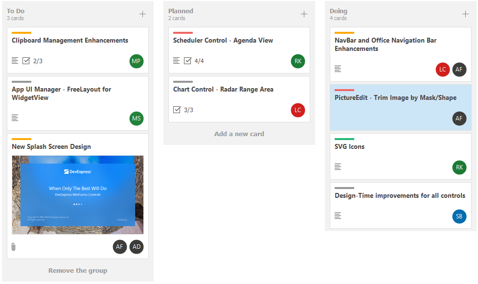
The code snippet below shows how to display Kanban group footer buttons and specify the button text (“Add a new card”). Then, the code locates the group with the GroupValue property value equal to ToDo and sets the button text to Remove the group. The Doing group is hidden.
 tileView.OptionsKanban.GroupFooterButton.Visible = DefaultBoolean.True;
 tileView.OptionsKanban.GroupFooterButton.Text = "Add a new card";

 //...
  tileView.OptionsKanban.Groups.Where(group => group.GroupValue.ToString() == "ToDo").FirstOrDefault().FooterButton.Text = "Remove the group";
  tileView.OptionsKanban.Groups.Where(group => group.GroupValue.ToString() == "Doing").FirstOrDefault().FooterButton.Visible = DevExpress.Utils.DefaultBoolean.False;