BarCheckItem Class
Represents a bar item with toggle button functionality.
Namespace: DevExpress.XtraBars
Assembly: DevExpress.XtraBars.v19.1.dll
Declaration
Related API Members
The following members return BarCheckItem objects:
Remarks
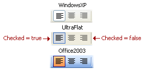
This class represents a bar button item with the check style applied. It introduces the BarCheckItem.Checked property that determines the item’s pushed (check) state. A checked item’s link appears sunken or highlighted relative to the other links. The appearance of a checked item’s link is determined by the BarAndDockingController’s look and feel settings which are accessible via the BarAndDockingController.LookAndFeel property.
Note
If you create Bar Items in code, note that these objects may not function properly without being associated with a BarManager or RibbonControl. To create a Bar Item, use a Bar Item constructor that has the BarManager parameter. When creating a Bar Item in code for use within a RibbonControl, use a Bar Item constructor that has the BarManager parameter, and pass the RibbonControl.Manager object as this parameter.
Related GitHub Examples
The following code snippet (auto-collected from DevExpress Examples) contains a reference to the BarCheckItem class.
Note
The algorithm used to collect these code examples remains a work in progress. Accordingly, the links and snippets below may produce inaccurate results. If you encounter an issue with code examples below, please use the feedback form on this page to report the issue.