BarButtonItem Class
Represents a toolbar button or menu item.
Namespace: DevExpress.XtraBars
Assembly: DevExpress.XtraBars.v19.1.dll
Declaration
[SmartTagAction(typeof(BarButtonItemActionsProvider), "AddDropDownMenu", "Add Dropdown Menu", SmartTagActionType.RefreshAfterExecute)]
[SmartTagAction(typeof(BarButtonItemActionsProvider), "AddDropDownPopupControlContainer", "Add Dropdown PopupControlContainer", SmartTagActionType.RefreshAfterExecute)]
[SmartTagAction(typeof(BarButtonItemActionsProvider), "AddGalleryDropDown", "Add Dropdown Gallery", SmartTagActionType.RefreshAfterExecute)]
[SmartTagFilter(typeof(BarButtonItemFilter))]
public class BarButtonItem :
    BarBaseButtonItem,
ISupportCommandBindingRelated API Members
The following members return BarButtonItem objects:
Remarks
The BarButtonItem class implements the functionality of the DevExpress Ribbon, Menu and Docking Library. It is visually represented by the BarButtonItemLink control. The BarButtonItem component can have several visual representations. Each of them represents a BarButtonItemLink class instance. In other words, numerous links are used to represent one item in different toolbars and menus.
You can customize both a link and an item. If you customize the BarButtonItem component, all changes are applied to all its link - but link customization only affects a BarButtonItemLink class instance.
Another great feature of the BarButtonItem component is its BarButtonItem.ButtonStyle property. It allows you to change the BarButtonItem component’s look & feel.
The Check style allows the BarButtonItem component to be checked. This results in the display of a blue rectangle around the item and setting its BarBaseButtonItem.Down property to true.
Since there are two types of item containers supported by the DevExpress Ribbon, Menu and Docking Library, there are also two types of button representation.
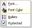
within a popup or dropdown menu:
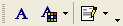
within a toolbar:
The DropDown style allows the BarButtonItem component to display a Dropdown control. Specify the BarButtonItem.DropDownControl to assign a Dropdown control to the item. To specify the property, you must have a PopupControlContainer or PopupMenu component within the project.
The Default style specifies a simple toolbar button or menu item. It can contain a descriptive image and caption.
Note
If you create Bar Items in code, note that these objects may not function properly without being associated with a BarManager or RibbonControl. To create a Bar Item, use a Bar Item constructor that has the BarManager parameter. When creating a Bar Item in code for use within a RibbonControl, use a Bar Item constructor that has the BarManager parameter, and pass the RibbonControl.Manager object as this parameter.
Example
The following code shows how to create bars and bar items in code.
In the example two bars are created - a main menu (a bar that is stretched to match the form’s width), and a regular bar. The main menu will contain three sub-menus (File, Edit and View), each having its own bar items. The second bar will display the Output button, which is also available via the View submenu of the first bar:

Bars are added to the BarManager.Bars collection. Bar items are added to bars via the Bar.AddItem and Bar.AddItems methods.
To avoid flickering while adding and customizing bars and bar items, the code that performs the customization is enclosed with the BarManager.BeginUpdate and BarManager.EndUpdate method calls.
To respond to clicking bar items, the BarManager.ItemClick event is handled.
using DevExpress.XtraBars;

private void Form1_Load(object sender, EventArgs e) {
    BarManager barManager = new BarManager();
    barManager.Form = this;
    // Prevent excessive updates while adding and customizing bars and bar items.
    // The BeginUpdate must match the EndUpdate method.
    barManager.BeginUpdate();
    // Create two bars and dock them to the top of the form.
    // Bar1 - is a main menu, which is stretched to match the form's width.
    // Bar2 - is a regular bar.
    Bar bar1 = new Bar(barManager, "My MainMenu");
    Bar bar2 = new Bar(barManager, "My Bar");
    bar1.DockStyle = BarDockStyle.Top;
    bar2.DockStyle = BarDockStyle.Top;
    // Position the bar1 above the bar2
    bar1.DockRow = 0;
    // The bar1 must act as the main menu.
    barManager.MainMenu = bar1;

    // Create bar items for the bar1 and bar2
    BarSubItem subMenuFile = new BarSubItem(barManager, "File");
    BarSubItem subMenuEdit = new BarSubItem(barManager, "Edit");
    BarSubItem subMenuView = new BarSubItem(barManager, "View");

    BarButtonItem buttonOpen = new BarButtonItem(barManager, "Open");
    BarButtonItem buttonExit = new BarButtonItem(barManager, "Exit");
    BarButtonItem buttonCopy = new BarButtonItem(barManager, "Copy");
    BarButtonItem buttonCut = new BarButtonItem(barManager, "Cut");
    BarButtonItem buttonViewOutput = new BarButtonItem(barManager, "Output");

    subMenuFile.AddItems(new BarItem[] { buttonOpen, buttonExit});
    subMenuEdit.AddItems(new BarItem[] { buttonCopy, buttonCut});
    subMenuView.AddItem(buttonViewOutput);

    //Add the sub-menus to the bar1
    bar1.AddItems(new BarItem[] {subMenuFile, subMenuEdit, subMenuView });

    // Add the buttonViewOutput to the bar2.
    bar2.AddItem(buttonViewOutput);

    // A handler to process clicks on bar items
    barManager.ItemClick += new ItemClickEventHandler(barManager_ItemClick);

    barManager.EndUpdate();
}

void barManager_ItemClick(object sender, ItemClickEventArgs e) {
    BarSubItem subMenu = e.Item as BarSubItem;
    if (subMenu != null) return;
    MessageBox.Show("Item '" + e.Item.Caption + "' has been clicked");
}