Panes Appearance
- 2 minutes to read
This document describes the ways in which the appearance of panes can be customized. Before reading this text, you may wish to review the basics of using panes in XtraCharts. To learn how additional panes can be created, refer to Adding Panes.
With XtraCharts, it’s possible to individually customize the appearance of panes, with no regard whether a pane is the default or an additional pane. To do this, you can use the properties described below.
- To show or hide the pane in the chart’s diagram, while maintaining it in its panes’ collection, use the XYDiagramPaneBase.Visibility property.
- To rename the pane, use its ChartElementNamed.Name property.
To define the pane’s background, use the XYDiagramPaneBase.BackColor, XYDiagramPaneBase.FillStyle and XYDiagramPaneBase.BackImage properties.

To define the look of the pane’s borders, use the XYDiagramPaneBase.BorderVisible and XYDiagramPaneBase.BorderColor properties.

To customize the pane’s shadow, use the XYDiagramPaneBase.Shadow property.

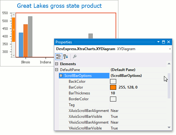
If axes scrolling is available for both the diagram and the pane to which the axis belongs, you can access the scroll bar options via the XYDiagramPaneBase.ScrollBarOptions property. To learn more, refer to Visual Ranges and Whole Ranges .
The following image demonstrates a customized scroll bar.

Note that the scrolling is synchronous for panes if they share the axis which is being scrolled. This means than when you scroll one pane which has the same axis, the second pane will be scrolled, as well. To provide independent panes scrolling, use secondary axes.
For a step-by-step tutorial on using the scroll bar options, refer to How to: Customize the Appearance of a Pane’s Scroll Bar (Runtime Sample).