Alert Windows Overview
- 8 minutes to read
DevExpress alert windows display toast-style notifications with customizable content and click-through functionality.
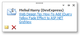
When using an alert window, you can customize the following settings:
- Content and appearance (use built-in customization settings or specify an HTML and CSS template)
- Positioning, display duration, and animation
- Predefined and custom buttons
Get Started
Use the AlertControl component to customize alert settings and display/hide alert windows.
Add an AlertControl to the form:
Customize alert settings. The following code snippet specifies location, visibility duration, and closing animation style:
using DevExpress.XtraEditors; using DevExpress.XtraBars.Alerter; namespace DXApplication2 { public partial class Form1 : XtraForm { AlertControl alert1; public Form1() { InitializeComponent(); alert1 = new AlertControl(); alert1.AutoFormDelay = 2000; alert1.HideAnimationType = AlertFormShowingEffect.SlideHorizontal; alert1.FormLocation = AlertFormLocation.TopRight; } } }Call the AlertControl.Show method to display an alert window and specify text content. The following code snippet displays an alert window on a button click:
Key Settings
Setting | Description |
|---|---|
Specifies an alert’s visibility duration. | |
Specifies the corner of the screen where alert windows are displayed. | |
Specifies the opening/closing animation effect. | |
Specifies the opening animation effect. Has priority over AlertControl.FormShowingEffect. | |
Specifies the closing animation effect. Has priority over AlertControl.FormShowingEffect. | |
Specifies whether HTML tags can be used to format an alert window’s caption and text. | |
Provides access to the button collection. |
Alert Window Content
Use the AlertControl.Show method’s parameters to specify the caption, image, and text.
Appearance
Use the AlertControl.LookAndFeel property to apply a DevExpress skin or custom look and feel to alert windows. When UserLookAndFeel.UseDefaultLookAndFeel is set to true, alert windows use the application-wide default look and feel instead.
Use the following property groups to customize alert window content:
- AlertControl.AppearanceCaption
- Specifies caption appearance settings.
- AlertControl.AppearanceText
- Specifies text appearance settings.
- AlertControl.AppearanceHotTrackedText
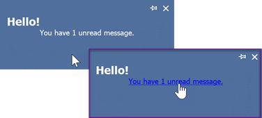
- Specifies text appearance settings when the mouse pointer hovers over the text.
The following code snippet specifies caption font, text alignment, and text color on hover:
using DevExpress.XtraBars.Alerter;
using DevExpress.Utils;
using System.Drawing;

alertControl1.AppearanceCaption.Font = new Font("Tahoma", 12F, FontStyle.Bold);
alertControl1.AppearanceText.TextOptions.HAlignment = HorzAlignment.Center;
alertControl1.AppearanceHotTrackedText.TextOptions.HAlignment = HorzAlignment.Center;
alertControl1.AppearanceHotTrackedText.ForeColor = Color.Blue;
Additional Customization Options
HTML and CSS
AlertControl can use HTML and CSS templates to render alert windows. A template’s HTML markup specifies alert window contents, while the template’s CSS code specifies style, display, and layout settings applied to window elements. See the following help topic for more information: Alert Windows with HTML Templates.
You can also format alert window content with HTML tags. Activate the AlertControl.AllowHtmlText property to parse HTML tags in alert window text.
Important
We do not recommend using HTML Text Formatting and HTML & CSS Templates features together.
BeforeFormShow Event
Handle the AlertControl.BeforeFormShow event to dynamically customize an alert window before it is displayed on-screen.
Use the following event parameters to change alert window main settings:
e.AlertForm.Info- An object that allows you to access and change an alert window caption, description, and other display options.
e.AlertForm.OpacityLevel- The window’s opacity level. Alert windows appear on-screen with a fade-in effect (in addition to any other animation effect you might apply). The
OpacityLevelparameter specifies the final opacity level of the fade-in effect. The 0 value means the window is transparent, and 1 makes the window opaque. e.AlertForm.Size- The window’s size.
e.Location- The window’s location. The default window location is specified by the AlertControl.FormLocation property.
e.HtmlPopup- The window’s HTML template.
The following code snippet makes the alert window semi-transparent if its caption is “Hello!”:
private void AlertControl1_BeforeFormShow(object sender, AlertFormEventArgs e) {
    if (e.AlertForm.Info.Caption == "Hello!") {
        e.AlertForm.OpacityLevel = 0.5;
    }
}
Alert Window Buttons
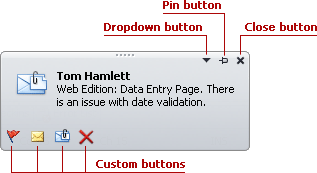
Alert windows support the following predefined buttons:
- Pin
 (default)
 - A click on the Pin button forces the window to stay on-screen regardless of the AlertControl.AutoFormDelay property value. The AlertControl.ShowPinButton property controls button visibility.
- Close
 (default)
 - A click on the Close button closes the alert window. The AlertControl.ShowCloseButton property controls button visibility.
- Dropdown

- This button appears if you assign a PopupMenu to the AlertControl.PopupMenu property. A click on the button opens the assigned menu.
To display additional custom buttons, populate the AlertControl.Buttons collection with AlertButton objects. For example:
using DevExpress.XtraEditors;
using DevExpress.XtraBars.Alerter;

namespace DXApplication2 {
    public partial class Form1 : XtraForm {
        public Form1() {
            InitializeComponent();
            AlertButton snoozeButton = new AlertButton();
            snoozeButton.Name = "snooze";
            snoozeButton.Hint = "Snooze";
            snoozeButton.ImageOptions.SvgImage = svgImageCollection1[0];
            alertControl1.Buttons.Add(snoozeButton);
        }
    }
}
Custom buttons can be regular or check buttons. The AlertButton.Style property controls the button type.
Respond to User Actions
Alert window text functions as a hyperlink. When this text is hot-tracked, it is underlined, and a user can click this text. To process clicks on the text, handle the AlertControl.AlertClick event.
To handle clicks on custom buttons, handle the AlertControl.ButtonClick event (for regular buttons) or the AlertControl.ButtonDownChanged event (for check buttons).
Example: Handle Clicks on Custom Buttons
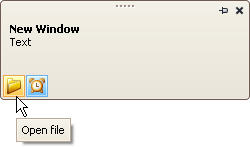
The following example adds two custom buttons to an AlertControl and handles events to process clicks on these buttons.
The first button is a regular button. A click on this button triggers the AlertControl.ButtonClick event.
The second button has checked and unchecked states (AlertButton.Style = AlertButtonStyle.CheckButton). A click on this button triggers the AlertControl.ButtonDownChanged event.
Note
alertControl1 and svgImageCollection1 were added to the form at design time.
The following image shows the resulting alert window:
using DevExpress.XtraEditors;
using DevExpress.XtraBars.Alerter;

namespace DXApplication2 {
    public partial class Form1 : XtraForm {
        public Form1() {
            InitializeComponent();
            CreateCustomButtons();
            // Subscribe to button click events
            alertControl1.ButtonClick += AlertControl1_ButtonClick;
            alertControl1.ButtonDownChanged += AlertControl1_ButtonDownChanged;

            this.Load += Form1_Load;
        }

        private void Form1_Load(object? sender, EventArgs e) {
            // Show an alert window (for demonstration purposes)
            alertControl1.Show(this, "Hello!", "You have 1 unread message.");
        }

        private void CreateCustomButtons() {
            // Create a custom regular button
            AlertButton btn1 = new AlertButton();
            btn1.Hint = "Open file";
            btn1.Name = "buttonOpen";
            btn1.ImageOptions.SvgImage = svgImageCollection1["open"];
            btn1.ImageOptions.SvgImageSize = new Size(16, 16);
            // Create a custom check button
            AlertButton btn2 = new AlertButton();
            btn2.Style = AlertButtonStyle.CheckButton;
            btn2.Down = true;
            btn2.Hint = "Alert On";
            btn2.Name = "buttonAlert";
            btn2.ImageOptions.SvgImage = svgImageCollection1["time"];
            btn2.ImageOptions.SvgImageSize = new Size(16, 16);
            // Add buttons to the AlertControl
            alertControl1.Buttons.Add(btn1);
            alertControl1.Buttons.Add(btn2);
        }

        private void AlertControl1_ButtonDownChanged(object sender, AlertButtonDownChangedEventArgs e) {
            if (e.Button.Name == "buttonAlert")
                MessageBox.Show($"The Alert button is {(e.Button.Down ? "up" : "down")}");
        }

        private void AlertControl1_ButtonClick(object sender, AlertButtonClickEventArgs e) {
            if (e.Button.Name == "buttonOpen")
                MessageBox.Show("The Open button was clicked");
        }
    }
}