How to: Create Excel 2016 Charts in the WinForms Spreadsheet Control
- 8 minutes to read
Microsoft Excel 2016 introduced several chart types that help you visualize financial, statistical, and hierarchical data:
- Box and Whisker
- Waterfall
- Histogram
- Pareto
- Funnel
- Sunburst
- Treemap
This topic describes how to use the Spreadsheet API to create and customize these chart types in your applications.
Basics
You can add an Excel 2016 chart to a worksheet in the same manner as any other chart type. Call the Worksheet.Charts.Add method and pass a ChartType enumeration member.
See how to create and position charts in the Spreadsheet control.
Refer to the sections below for details on each Excel 2016 chart type (available options and code samples).
Box and Whisker
Use the chart’s Series.LayoutOptions.BoxAndWhisker property to define options for a Box and Whisker data series.
| Property | Description |
|---|---|
| BoxAndWhiskerSeriesOptions.ShowInnerPoints | Specifies whether to show inner data points that lie between the lower and upper whisker lines. |
| BoxAndWhiskerSeriesOptions.ShowOutlierPoints | Specifies whether to show outlier data points that lie either below the lower whisker line or above the upper whisker line. |
| BoxAndWhiskerSeriesOptions.ShowMeanLine | Specifies whether to display a line that connects the means of boxes in the series. |
| BoxAndWhiskerSeriesOptions.ShowMeanMarkers | Specifies whether to show the mean markers. |
| BoxAndWhiskerSeriesOptions.QuartileCalculationMethod | Defines the quartile calculation method. |
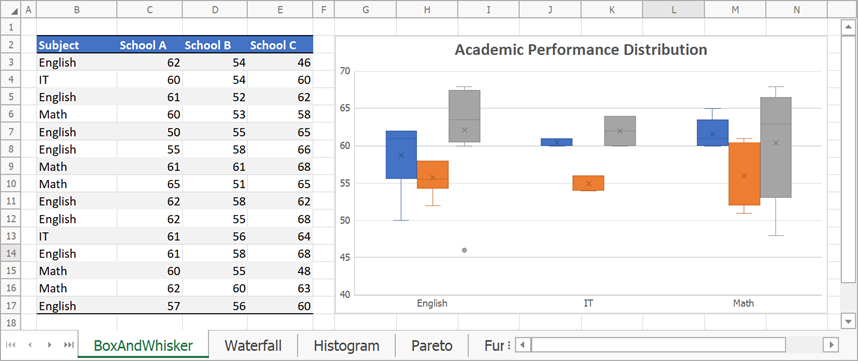
// Create a box and whisker chart and specify its location.
Chart chart = worksheet.Charts.Add(ChartType.BoxAndWhisker, worksheet["B2:E17"]);
chart.TopLeftCell = worksheet.Cells["G2"];
chart.BottomRightCell = worksheet.Cells["N17"];

// Set the minimum and maximum values for the value axis.
Axis axis = chart.PrimaryAxes[1];
axis.Scaling.AutoMax = false;
axis.Scaling.Max = 70;
axis.Scaling.AutoMin = false;
axis.Scaling.Min = 40;

// Specify series options.
foreach (Series series in chart.Series)
{
    var options = series.LayoutOptions.BoxAndWhisker;
    options.ShowInnerPoints = true;
    options.ShowMeanLine = false;
    options.ShowOutlierPoints = true;
    options.ShowMeanMarkers = true;
    options.QuartileCalculationMethod = QuartileCalculationMethod.ExclusiveMedian;
}

// Add the chart title.
chart.Title.Visible = true;
chart.Title.SetValue("Academic Performance Distribution");
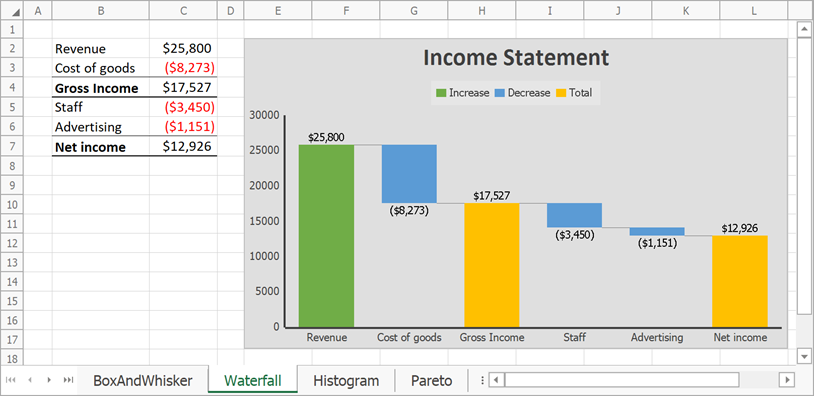
Waterfall
Use the chart’s Series.LayoutOptions.Waterfall property to specify options for a Waterfall data series.
| Property | Description |
|---|---|
| WaterfallSeriesOptions.ShowConnectorLines | Specifies whether to display connector lines between data points. |
| WaterfallSeriesOptions.SubtotalDataPoints | Returns a collection of total points. |
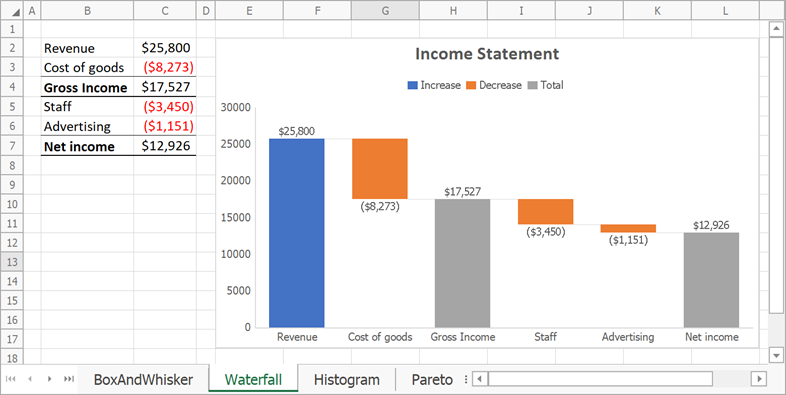
// Create a waterfall chart and specify its location.
Chart chart = worksheet.Charts.Add(ChartType.Waterfall, worksheet["B2:C7"]);
chart.TopLeftCell = worksheet.Cells["E2"];
chart.BottomRightCell = worksheet.Cells["L17"];

// Hide the major gridlines for the value axis.
chart.PrimaryAxes[1].MajorGridlines.Visible = false;

// Specify series options.
var options = chart.Series[0].LayoutOptions.Waterfall;
options.ShowConnectorLines = true;
// Set the third data point as total.
options.SubtotalDataPoints.Add(2);
// Set the last data point as total.
options.SubtotalDataPoints.Add(5);

// Add the chart title.
chart.Title.Visible = true;
chart.Title.SetValue("Income Statement");
Histogram
Use the chart’s Series.LayoutOptions.Histogram property to specify options for a Histogram data series.
| Property | Description |
|---|---|
| HistogramSeriesOptions.BinType | Specifies how to calculate bins for a histogram. |
| HistogramSeriesOptions.BinCount | Defines the number of histogram bins. |
| HistogramSeriesOptions.BinWidth | Defines the bin size. |
| HistogramSeriesOptions.OverflowType, HistogramSeriesOptions.OverflowValue |
Allow you to create a bin for all values that are above a specific value. |
| HistogramSeriesOptions.UnderflowType, HistogramSeriesOptions.UnderflowValue |
Allow you to create a bin for all values that are below or equal to a specific value. |
| HistogramSeriesOptions.IntervalClosedSide | Specifies the bin closed side. |
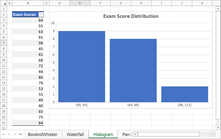
// Create a histogram chart and specify its location.
Chart chart = worksheet.Charts.Add(ChartType.Histogram, worksheet["B2:B21"]);
chart.TopLeftCell = worksheet.Cells["D2"];
chart.BottomRightCell = worksheet.Cells["K18"];

// Specify histogram series options.
var options = chart.Series[0].LayoutOptions.Histogram;
options.BinType = HistogramBinType.BinWidth;
options.BinWidth = 24;
// Specify the gap width.
chart.Series[0].GapWidth = 10;

// Add the chart title.
chart.Title.Visible = true;
chart.Title.SetValue("Exam Score Distribution");
Pareto
Use the chart’s Series.LayoutOptions.Histogram property to specify bin options for a Pareto data series.
See histogram series options.
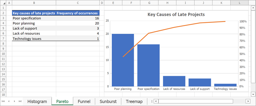
// Create a Pareto chart and specify its location.
Chart chart = worksheet.Charts.Add(ChartType.Pareto, worksheet["B2:C7"]);
chart.TopLeftCell = worksheet.Cells["E2"];
chart.BottomRightCell = worksheet.Cells["L17"];

// Specify series options.
var options = chart.Series[0].LayoutOptions.Histogram;
options.BinType = HistogramBinType.ByCategory;
// Specify the gap width.
chart.Series[0].GapWidth = 15;

// Add the chart title.
chart.Title.Visible = true;
chart.Title.SetValue("Key Causes of Late Projects");
Funnel
Funnel charts do not include type-specific options.
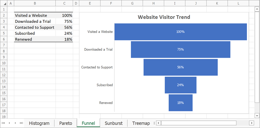
// Create a funnel chart and specify its location.
Chart chart = worksheet.Charts.Add(ChartType.Funnel, worksheet["B2:C6"]);
chart.TopLeftCell = worksheet.Cells["E2"];
chart.BottomRightCell = worksheet.Cells["L18"];

// Add the chart title.
chart.Title.Visible = true;
chart.Title.SetValue("Website Visitor Trend");
Sunburst
Sunburst charts do not include type-specific options.
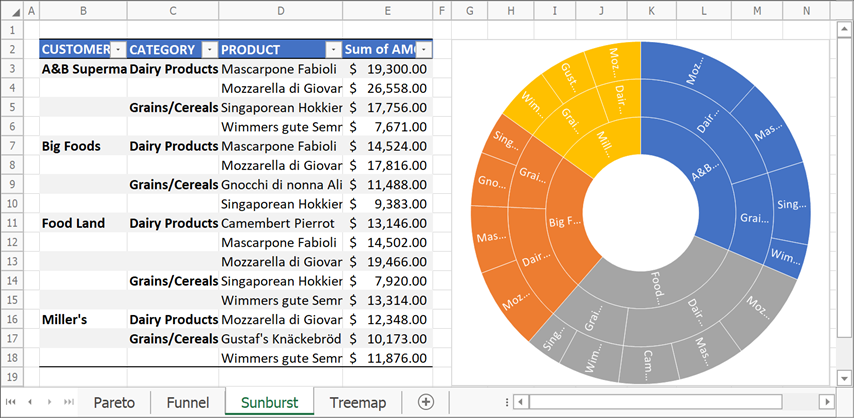
// Create a sunburst chart and specify its location.
Chart chart = worksheet.Charts.Add(ChartType.Sunburst, worksheet["B2:E18"]);
chart.TopLeftCell = worksheet.Cells["G2"];
chart.BottomRightCell = worksheet.Cells["N19"];

// Hide the chart title.
chart.Title.Visible = false;
Treemap
Use the chart’s Series.LayoutOptions.Treemap property to specify options for a Treemap data series.
| Property | Description |
|---|---|
| TreemapSeriesOptions.ParentLabelLayout | Defines the layout of parent labels. |
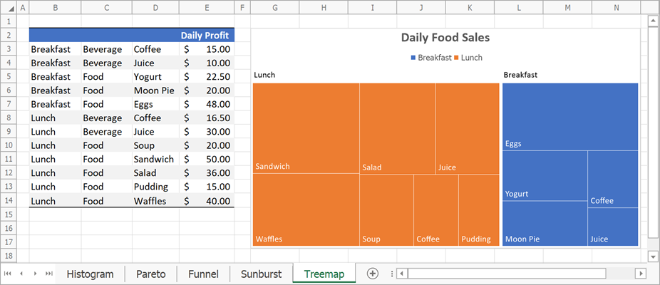
// Create a treemap chart and specify its location.
Chart chart = worksheet.Charts.Add(ChartType.Treemap, worksheet["B2:E14"]);
chart.TopLeftCell = worksheet.Cells["G2"];
chart.BottomRightCell = worksheet.Cells["N17"];

// Specify series options.
var options = chart.Series[0].LayoutOptions.Treemap;
options.ParentLabelLayout = TreemapParentLabelLayout.Banner;

// Add the chart title.
chart.Title.Visible = true;
chart.Title.SetValue("Daily Food Sales");
Chart Style and Colors
You can use the following style and color customization API to change the appearance of Excel 2016 charts:
| Property | Description |
|---|---|
| Chart.Style | Specifies the chart style. Several predefined styles are available for Excel 2016 charts: Style1 … Style9. |
| Chart.ColorPalette | Defines a color palette for an Excel 2016 chart. |
| ChartObject.LoadStyle | Allows you to apply a custom style to an Excel 2016 chart. |
The example below demonstrates how to create a Waterfall chart and specify its colors and style.
// Create a waterfall chart and specify its location.
Chart chart = worksheet.Charts.Add(ChartType.Waterfall, worksheet["B2:C7"]);
chart.TopLeftCell = worksheet.Cells["E2"];
chart.BottomRightCell = worksheet.Cells["L17"];

// Hide the major gridlines for the value axis.
chart.PrimaryAxes[1].MajorGridlines.Visible = false;

// Specify series options.
var options = chart.Series[0].LayoutOptions.Waterfall;
// Display connector lines.
options.ShowConnectorLines = true;
// Set the third data point as the total.
options.SubtotalDataPoints.Add(2);
// Set the last data point as the total.
options.SubtotalDataPoints.Add(5);

// Specify the chart style.
chart.Style = ChartStyle.Style3;
// Change chart colors.
chart.ColorPalette = ChartColorPalette.Colorful4;

// Add the chart title.
chart.Title.Visible = true;
chart.Title.SetValue("Income Statement");
Limitations
| Chart Type | Limitations |
|---|---|
| All charts | 1. The WinForms Spreadsheet control supports only one gradient fill style for a chart area: linear gradient fill with two color stops. Other gradient types are replaced with a solid fill. 2. A pattern fill applied to a chart area or data series is replaced with a solid fill. |
| Box and whisker | 1. Data labels are not displayed. 2. The Series.GapWidth property value is ignored. |
| Waterfall | Charts with empty data values are rendered incorrectly. |
| Treemap | 1. The Overlapping layout option is not supported. If you enable this option for a chart, the Spreadsheet control displays parent labels as banners above the categories. 2. Banner labels have no background fill. |