In-Ribbon Galleries
- 2 minutes to read
An In-Ribbon gallery displays a list of images within a RibbonControl.

It can be created by adding a RibbonGalleryBarItem object to the RibbonPageGroup.ItemLinks collection. The RibbonGalleryBarItem.Gallery object (of the InRibbonGallery type, a BaseGallery descendant) refers the gallery itself and provides multiple customization options. For an example of creating a gallery at design time and runtime, see the following tutorial.
Ribbon Control is one of the DevExpress controls that provide the gallery functionality. General information on galleries, items and common gallery features can be found in the following topics:
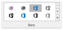
Structurally, a gallery consists of gallery items (GalleryItem) combined into gallery groups (GalleryItemGroup). Gallery groups and items have captions, which can be hidden if required. This layout is demonstrated in the image above, where the gallery only displays images.
Gallery items provide options that specify an item’s image, hover image, hint, caption, description, checked state, etc. The gallery object contains options that specify the layout and behavior of gallery items (e.g., item checking availability, image size, distance between items, column count, etc.)
To respond to clicking and double-clicking a gallery item, handle the BaseGallery.ItemClick and BaseGallery.ItemDoubleClick event, respectively.
If the item checking feature is enabled, handle the BaseGallery.ItemCheckedChanged event to perform actions on item selection/deselection.
See the Gallery Controls and Gallery Items topics to learn more.
Expanding an In-Ribbon Gallery
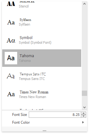
An In-Ribbon gallery contains a Dropdown button. A click on this button invokes an automatically generated or custom gallery popup window (GalleryDropDown control).

See Dropdown Galleries for more information on these galleries and their customizations.