Date Navigator
- 4 minutes to read
The DateNavigator control allows the end-user to select a date or several date ranges to show them in the bound Scheduler control.
The document includes the following sections:
Overview
The following image illustrates the visual elements of the DateNavigator control:
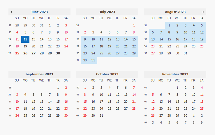
The DateNavigator control can function as a standalone control or in bound mode. It automatically binds itself to the Scheduler control if both controls are on the form. When bound to the Scheduler control, the DateNavigator behaves differently, since it synchronizes the range and selected dates with the other control, and may change the font style for the dates with appointments and holidays.
The DateNavigator class enables you to access the control’s features in code.
Date Ranges
The control can display dates in the range specified by its CalendarControlBase.MinValue and CalendarControlBase.MaxValue. Dates outside that range are hidden.
Today’s date for the DateNavigator is the system date by default. However, it can be specified arbitrarily using the CalendarControlBase.TodayDate property.
Tip
You can implement custom actions when the end-user clicks the Today button by handling the CalendarControl.TodayClick event.
Scheduler Control Interaction
When dropped onto a form with a SchedulerControl, the DateNavigator binds itself to the scheduler by setting the DateNavigator.SchedulerControl property. You can bind it to another scheduler by changing this property.
Certain dates are highlighted because they either contain appointments or they are specified as holidays. The rules for highlighting dates are specified by the DateNavigator.BoldAppointmentDates property (which displays the dates with appointments with bold font), and the DateNavigator.HighlightHolidays property (which changes the font color to Red for holidays). Holidays contained in the HolidayBaseCollection can be added to the Scheduler from the SchedulerControl.WorkDays property.
Display
The following table lists properties, methods and events which affect the display of dates.
| How to display: | Property |
|---|---|
| Cell styles | CalendarControlBase.CellStyleProvider |
| Selected range | CalendarControlBase.HighlightSelection |
| Current date | CalendarControlBase.HighlightTodayCell |
| Dates with appointments | DateNavigator.BoldAppointmentDates |
| Holidays | DateNavigator.HighlightHolidays |
| Disabled dates | CalendarControlBase.DisableCalendarDate |
| Custom draw cell content | CalendarControlBase.CustomDrawDayNumberCell |
Selection
Click the number to select a date in the DateNavigator. By holding CTRL you can select several non-consecutive days. Click and drag to extend the selection. When you click and drag to select more than a week, the selection is automatically extended to fill entire weeks by default. To change this behavior, use the DateNavigator.SelectionBehavior property.
When the DateNavigator control is bound to SchedulerControl , any selection made in the Date Navigator is synchronized with the scheduler control.
Selecting one day or several non-consecutive days results in a scheduler displaying them using the Day View. If selected successive days do not comprise a full week, they are displayed using the Day View. If the entire week is selected, the scheduler control displays it using the Full Week View. Selecting consecutive days that form more than a week results in scheduler control being switched to the Month View. This behavior is by default. To avoid switching the view you can disable the unneeded views in the scheduler (SchedulerViewBase.Enabled), or handle the SchedulerControl.DateNavigatorQueryActiveViewType event to specify the type of the view or cancel switching.
Selected ranges are available using the CalendarControlBase.SelectedRanges property.
The user can be required to select a single date by setting the DateNavigator.SelectionMode property to CalendarSelectionMode.Single.
Appearance
The visual appearance of the DateNavigator can be customized via the corresponding appearance objects for the header and calendar area. The control supports standard Appearance and Look And Feel and Skinning mechanisms.
The following table contains the properties which affect the appearance of DateNavigator’s visual elements.