Tutorial: View and Column Appearance
- 2 minutes to read
This walkthrough is a transcript of the View and Column Appearance video, available on the DevExpress YouTube Channel.
In this tutorial, you’ll learn about appearance settings used to change the look of grid elements, where to find these settings for Views or individual columns and how to change the View’s paint style so that you can customize theme-drawn elements.
View Appearance
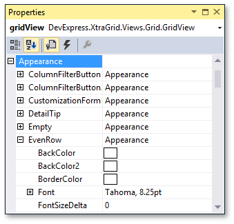
Each View type provides a set of appearance settings objects that specify how to paint its elements. To access the list, expand the View’s GridView.Appearance property in the Properties window. Every sub-property corresponds to a particular element and has the same type, which allows you to specify background and foreground colors, font style and so on.
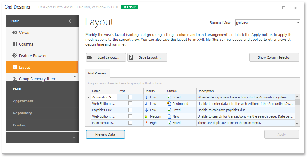
You can also use the Appearances Page in the Grid Designer. This page lets you find style objects that apply to a particular grid element by selecting that element in a live grid preview.
Specify the grid row background color. Click a row in the preview section and change the corresponding appearance setting in the Property grid. The preview section immediately reflects the changes.
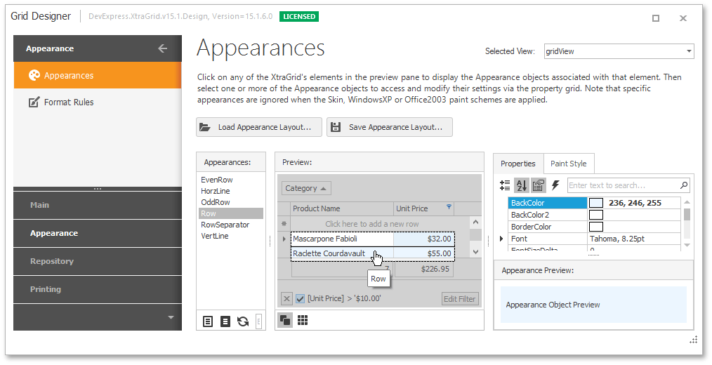
Change appearance settings for data cells in even rows and the changes aren’t reflected by the preview. To enable this style, switch the Enable Appearance EvenRow check box.
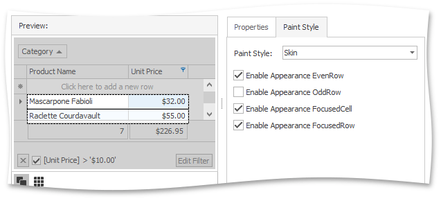
You can preview the grid’s data by switching to the Layout Page and clicking the Preview Data button. Even and odd rows are painted using the specified colors.
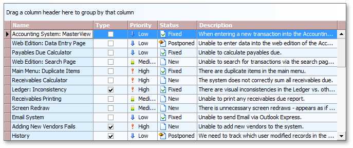
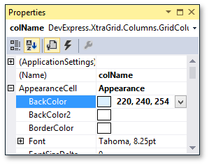
Column Appearance
The GridControl allows you to specify appearance settings for data cells and headers of individual columns. Change the background color of data cells in the Name column using the GridColumn.AppearanceCell property. Note that the column appearance settings have a higher priority than row appearance settings applied at the grid View level.
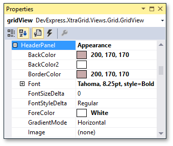
Header Panel Appearance
Specify the background and foreground colors and font settings for the header panel.
After that, you can also change the group panel’s background color. Run the application to see the appearance customization results at runtime.