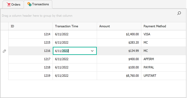
Tab Control
- 5 minutes to read
An XtraTabControl container allows you to organize other controls into pages.
Use Cases and Alternatives
Use XtraTabControl containers to create a tabbed UI in limited, local areas of a form. Users cannot undock or rearrange XtraTabControl pages.
If you need to implement an MDI (multi-document interface) rather than organize controls into pages, use the following components instead:
- Tabbed Form
- The replacement for standard Visual Studio Forms that embeds page headers into its title bar. This component allows you to create browser-like Forms.
- Application UI Manager (with Tabbed View)
- The most powerful DevExpress WinForms component for building MDI apps. This component allows you to load page content on-demand, supports interaction with Dock Panels, supports floating pages, and more.
- Tabbed MDI Manager
- The simplified version of the Application UI Manager, designed for light setups when you do not need the full range of Application UI Manager’s functionality.
How to Add and Remove Pages
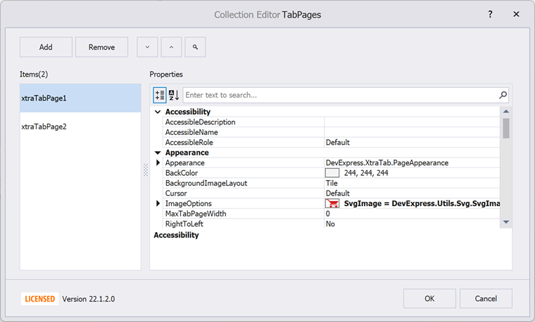
At design time, invoke the control’s smart tag menu and click the “Tab Pages” link. This link opens the Collection Editor dialog that allows you to add, rearrange, and remove pages, and set their settings.
To add or remove pages in code, modify the XtraTabControl.TabPages collection.
// Add a new page
XtraTabPage newPage = new XtraTabPage();
newPage.Text = "New Page";
xtraTabControl1.TabPages.Add(newPage);

// Remove the 2nd tab
xtraTabControl1.TabPages.RemoveAt(1);
How to Populate Pages with Controls
At design time, you can drag controls directly onto XtraTabControl pages. You can use the TablePanel or other layout managers to create a virtual grid, and place controls into cells of this grid.
In code, add controls to the page’s Controls collection.
newPage.Controls.Add(new SimpleButton() {
    Text = "Button #1",
    Size = new Size(200, 50),
    Location = new Point(10, 10)
});

newPage.Controls.Add(new SimpleButton() {
    Text = "Button #2",
    Size = new Size(200, 50),
    Location = new Point(10, 50)
});
Main Settings
XtraTabPage.ImageOptions — Allows you to set raster or vector icons for page headers. Note that if you use vector images from the DevExpress Image Gallery, they are added with the default 32x32 size. Set up the
ImageOptions.SvgImageSizesetting to scale down vector icons.HeaderOrientation and HeaderLocation — Use these settings to specify the orientation and position of tab headers, respectively.

- XtraTabControl.MultiLine — Allows you to display more than one row of page headers if these headers do not fit into a single line. In the figure below, headers occupy three lines. Note that you can use the TabPageWidth property to manually control header widths.

Header Buttons
Header Buttons allow your users to navigate between pages when there’s not enough space to display all headers at once, and the MultiLine setting is off.
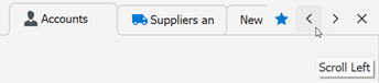
To enable these buttons, use the XtraTabControl.HeaderButtons property. This property accepts flag enumeration values.
To control header button visibility, change the HeaderButtonsShowMode property.
The star button next to the standard Previous-Next-Close set in the image above is a custom button. You can modify the XtraTabControl.CustomHeaderButtons collection to add your own buttons.
using DevExpress.XtraTab;
using DevExpress.XtraTab.Buttons;
using DevExpress.XtraTab.ViewInfo;

CustomHeaderButton btnFavorites = new CustomHeaderButton();
btnFavorites.Caption = "Go to Favorite";
btnFavorites.ImageOptions.SvgImage = svgImageCollection[5];
btnFavorites.ImageOptions.SvgImageSize = new Size(16, 16);
btnFavorites.Kind = DevExpress.XtraEditors.Controls.ButtonPredefines.Glyph;
btnFavorites.Tag = "btnFavorite"; // Unique button ID
xtraTabControl1.CustomHeaderButtons.Add(btnFavorites);

xtraTabControl1.CustomHeaderButtonClick += OnCustomHeaderButtonClick;

void OnCustomHeaderButtonClick(object sender, CustomHeaderButtonEventArgs e) {
    if (e.Button.Tag == "btnFavorite") {
        // Process user clicks
    }
}
Custom Tab Page Navigation
The following example hides tab headers and implements navigation between tab pages using buttons:

using System;
using DevExpress.Utils;
using DevExpress.XtraTab;

namespace DXApplication42 {
    public partial class Form1 : DevExpress.XtraEditors.XtraForm {
        public Form1() {
            InitializeComponent();
            xtraTabControl1.ShowTabHeader = DefaultBoolean.False;
        }

        private void simpleButton1_Click(object sender, EventArgs e) {
            if(xtraTabControl1.SelectedTabPageIndex != 0)
               xtraTabControl1.SelectedTabPageIndex--;
        }

        private void simpleButton2_Click(object sender, EventArgs e) {
            if (xtraTabControl1.SelectedTabPageIndex != xtraTabControl1.TabPages.Count - 1)
                xtraTabControl1.SelectedTabPageIndex++;
        }

        private void xtraTabControl1_SelectedPageChanged(object sender, TabPageChangedEventArgs e) {
            buttonPrev.Enabled = xtraTabControl1.SelectedTabPageIndex != 0;
            buttonNext.Enabled = xtraTabControl1.SelectedTabPageIndex != xtraTabControl1.TabPages.Count - 1;
        }
    }
}