Tile Item Structure
- 8 minutes to read
Tile items are able to display multiple text labels and images. Additionally, you can provide a background image or customize a background color(s). Text can be formatted using HTML tags. In addition, tiles support animation. Combined together, all these features create unmatched capabilities for customizing your tiles.

In this section:
- What are tile elements?
- Arranging elements across the tile
- Additional element customization
- Tile background
- Tile templates
- Example
Tile Item Elements
Each tile provides a collection of elements (the TileItemElement class objects) accessed with the TileItem.Elements property. An element is the simplest block from which tile content is built. Each element can display a text string (the TileItemElement.Text property) and an image (the TileItemElement.Image property). However, it is recommended that each element stores only one type of content (either an image or a text string). Such elements are easier to arrange across their parent tiles (see the Arranging Elements section below).
If you need to display a single text label and/or image within the tile, use the TileItem.Text and/or TileItem.Image properties respectively. In this case the control will automatically create a tile item element and specify this element’s text and image properties. In fact, all tile properties that affect this item’s content (alignment, orientation, appearance settings etc.) are the exposed properties of the very first element that belongs to this tile. This feature allows you to quickly customize simple tiles without the necessity to create and tweak individual elements.
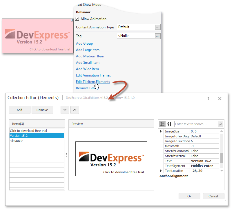
To have more than one content block for a tile, modify the TileItem.Elements collection. To add, modify or remove elements at design time, invoke the target tile’s smart-tag and click the ‘Edit TileItem Elements’ link. This will open the Elements Collection Editor, as the following figure illustrates. Buttons on this dialog’s top allow you to add, remove and re-arrange elements. The list on the left shows all currently existing elements. Clicking an element allows the property grid on the dialog’s right display the selected element’s properties. The central dialog area is a live preview that demonstrates the way your tile looks.
Each element provides its own TileItemElement.Appearance property group. Settings stored within this group have the highest priority and override both tile and tile control appearance settings (the TileItem.AppearanceItem and TileControl.AppearanceItem properties respectively).
Arranging Elements
There are various properties related to element alignment within a parent tile item. You are free to choose any approach depending on the complexity of your tile design.
TileItemElement.TextAlignment and TileItemElement.ImageAlignment properties.
These properties provide the easiest way to arrange your elements within a tile by selecting one of ten predefined locations (TopRight, MiddleCenter, BottomLeft, etc.). The eleventh value, Default, corresponds to different locations depending on the element index and content type. The first element within the TileItem.Elements collection arranges its text at the item’s top left corner. The second element places the text at the top right corner by default. The third, fourth and fifth elements align their texts to bottom left, bottom right and middle center respectively. All consequetive elements display their texts at the tile’s middle center. The following figure illustrates these default text locations for tile item elements. Images for each element are located at the tile item’s bottom left corner.

The Tile Control provides the TileControl.ItemImageAlignment property that allows you to modify the default element image alignment for all tiles at once.
TileItemElement.TextLocation and TileItemElement.ImageLocation properties.
These properties specify the offset for the text or image content within the current element. If alignment properties (TextAlignment, ImageAlignment) properties are set to Manual the offset is counted from the tile item’s top left corner. Otherwise, the offset is counted from the alignment location. This behavior allows you to align your text block or an image to a predefined position and then slightly move it. The following figure illustrates an example.

The TileItemElement.ImageToTextAlignment and TileItemElement.ImageToTextIndent properties.
This property pair allows you to align an element image relatively to this element’s text string. In this case, the text block’s own alignment setting is ignored and this text is placed according to the image alignment setting. In its turn, the image moves in the direction specified by the TileItemElement.ImageToTextAlignment property. The distance between these content blocks is specified by the TileItemElement.ImageToTextIndent property. See the following figure for an example.

Anchor properties.
Tile item elements support anchoring. Using this feature you can align one element as required and then set other element positions relative to this first element. Such a scheme proves itself useful for when a tile changes its size. Elements provide four anchoring properties.
- TileItemElement.AnchorElement - chooses an element to which the current element should be anchored. You can also choose the anchor element by using the TileItemElement.AnchorElementIndex property.
- TileItemElement.AnchorAlignment - gets or sets the anchor direction. You can choose from four directions - top, left, right and bottom.
- TileItemElement.AnchorIndent - specifies the distance between the anchor and target elements.
- TileItemElement.AnchorOffset - stores a Point structure that is the anchoring offset for this element. The total distance between target and anchor elements is then counted as anchor offset plus anchor indent, which is added to the either offset coordinate according to the anchor alignment.
The following figure illustrates two anchored elements within tiles of different sizes.

Anchor properties have a higher priority than alignment and location settings.
Tip
Elements are sized automatically depending on their content. The target alignment element uses these sizing bounds of the anchor element to position itself. If an anchor element has both text and image, it can be hard to predict where an element anchored to this element will be positioned. Thus, it is recommended that each TileItemElement use only one content type - either an image or a text string.
Additional Element Customization
HTML text formatting
If the TileItem.AllowHtmlText property equals DefaultBoolean.True, you can use HTML tags to format element text strings for this tile. The code snippet and the figure below illustrate an example. See the HTML Text Formatting topic for a list of supported HTML tags.
demoItem1.Text = "<b><Size=+3><COLOR=DodgerBlue>Dev</COLOR><Color=DeepSkyBlue>Express<br></COLOR></size></b><COLOR=White><SIZE=+6>Visual Studio<br>Controls</SIZE><COLOR>";
Image borders
The TileItemElement.ImageBorder and TileItemElement.ImageBorderColor properties allow you to draw a solid border around this element’s image.

Stretching bounds
By default, both the TileItemElement.Height and TileItemElement.Width properties are ignored and each element is auto-sized depending on the size of its content. You can set the TileItemElement.StretchHorizontal and TileItemElement.StretchVertical properties in order to force the element to occupy the entire tile width/height, respectively. In this case, you can access the element’s Apperance settings and modify its back color to turn the simple element into a stripe stretched across the tile. In the figure below, two elements containing neither text nor image are stretched in different directions and filled with custom back colors.

Background
You can either colorize tile background colors, or assign a specific background image for your tiles. In case both are set, the background image will overlap the background color.
- Background color is specified by the AppearanceObject.BackColor property of an
AppearanceObject, accessed through the TileItem.AppearanceItem property (the TileItemFrame.Appearance property for animation frames). - Background image is an image assigned to the TileItem.BackgroundImage property. When a tile has a background image, its borders are not shown.
Other DevExpress .NET Windows Forms controls support Appearances as well. Refer to this help article for more information: Application Appearance and Skin Colors.
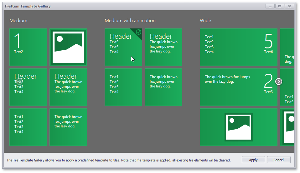
Tile Templates
The Tile Template Gallery is a set of predefined tile templates, which allow you to instantly get a desired tile layout. Instead of creating elements and manually arranging them across the tile, choose a tile template and apply it. The Gallery contains ready-to-use templates for both static and animated tile types. See the Design-Time Customization topic to learn more.
Example
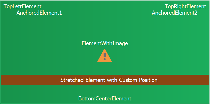
The following code illustrates how to populate a Tile Item with elements.
TileItemElement tileItemElement1 = new TileItemElement();
TileItemElement tileItemElement2 = new TileItemElement();
TileItemElement tileItemElement3 = new TileItemElement();
TileItemElement tileItemElement4 = new TileItemElement();
TileItemElement tileItemElement5 = new TileItemElement();
TileItemElement tileItemElement6 = new TileItemElement();
TileItemElement tileItemElement7 = new TileItemElement();

tileItem2.Elements.Clear();

tileItemElement1.Text = "TopLeftElement";
tileItemElement1.TextAlignment = TileItemContentAlignment.TopLeft;
tileItemElement2.Text = "TopRightElement";
tileItemElement2.TextAlignment = TileItemContentAlignment.TopRight;
tileItemElement3.Text = "BottomCenterElement";
tileItemElement3.TextAlignment = TileItemContentAlignment.BottomCenter;
tileItemElement4.AnchorElementIndex = 0;
tileItemElement4.AnchorIndent = 0;
tileItemElement4.AnchorOffset = new Point(50, 0);
tileItemElement4.Text = "AnchoredElement1";
tileItemElement5.AnchorElementIndex = 1;
tileItemElement5.AnchorIndent = 0;
tileItemElement5.AnchorOffset = new Point(-50, 0);
tileItemElement5.Text = "AnchoredElement2";
tileItemElement6.ImageOptions.ImageAlignment = TileItemContentAlignment.MiddleCenter;
tileItemElement6.ImageOptions.ImageToTextAlignment = TileControlImageToTextAlignment.Bottom;
tileItemElement6.ImageOptions.SvgImage = global::WindowsFormsApp1.Properties.Resources.bo_attention;
tileItemElement6.Text = "ElementWithImage";
tileItemElement7.Appearance.Normal.BackColor = Color.SaddleBrown;
tileItemElement7.Appearance.Normal.Options.UseBackColor = true;
tileItemElement7.Height = 40;
tileItemElement7.StretchHorizontal = true;
tileItemElement7.Text = "Stretched Element with Custom Position";
tileItemElement7.TextAlignment = TileItemContentAlignment.Manual;
tileItemElement7.TextLocation = new Point(220, 280);

tileItem2.Elements.Add(tileItemElement1);
tileItem2.Elements.Add(tileItemElement2);
tileItem2.Elements.Add(tileItemElement3);
tileItem2.Elements.Add(tileItemElement4);
tileItem2.Elements.Add(tileItemElement5);
tileItem2.Elements.Add(tileItemElement6);
tileItem2.Elements.Add(tileItemElement7);