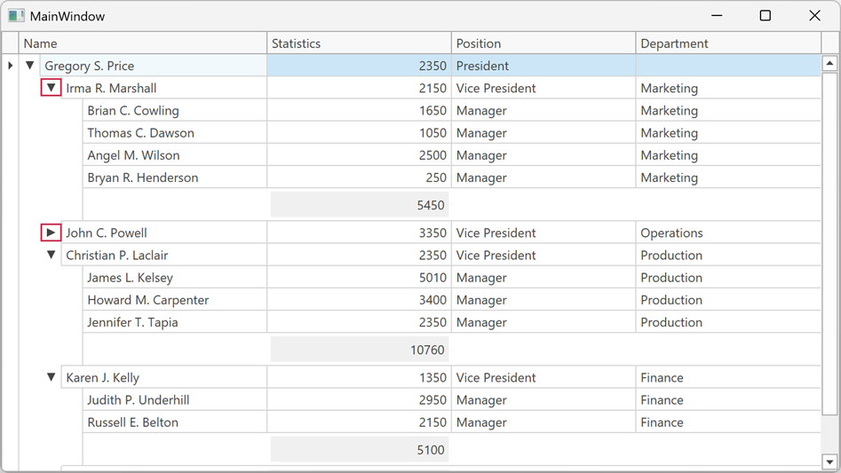
Expanding and Collapsing Nodes
Users can expand or collapse a focused node as follows:
- Click the node’s expand button.
- Press Ctrl+Right Arrow to expand the node or Ctrl+Left Arrow to collapse it.
Note
Users can also press Right Arrow / Left Arrow without Ctrl if the DataViewBase.NavigationStyle property is set to Row, or the TreeListView.ExpandCollapseNodesOnNavigation property is true. When DataViewBase.NavigationStyle is set to Cell (default), Left Arrow and Right Arrow keys move focus between adjacent cells instead.
To expand all child nodes of the focused node, press * on the numeric keypad.
Customize Expand/Collapse Glyphs
Use the TreeListView.TreeNodeExpandGlyphTemplate and TreeListView.TreeNodeCollapseGlyphTemplate properties to replace the icons displayed when a tree node is collapsed or expanded.
<Window.Resources>
    <DataTemplate x:Key="TreeNodeExpandTemplate">
        <Path Data="M 0,0 L 8,4 L 0,8 Z"
              Fill="{Binding Path=(TextBlock.Foreground), RelativeSource={RelativeSource AncestorType=ContentPresenter}}"
              HorizontalAlignment="Center" VerticalAlignment="Center"/>
    </DataTemplate>
    <DataTemplate x:Key="TreeNodeCollapseTemplate">
        <Path Data="M 0,0 L 8,0 L 4,8 Z"
              Fill="{Binding Path=(TextBlock.Foreground), RelativeSource={RelativeSource AncestorType=ContentPresenter}}"
              HorizontalAlignment="Center" VerticalAlignment="Center"/>
    </DataTemplate>
</Window.Resources>

<dxg:TreeListControl ItemsSource="{Binding Nodes}" ChildNodesPath="Children">
    <dxg:TreeListControl.View>
        <dxg:TreeListView TreeNodeExpandGlyphTemplate="{StaticResource TreeNodeExpandTemplate}"
                          TreeNodeCollapseGlyphTemplate="{StaticResource TreeNodeCollapseTemplate}"/>
    </dxg:TreeListControl.View>
</dxg:TreeListControl>
Refer to the following section for additional information: Expand and Collapse Group Rows.