LookUpEdit Class
A lookup editor.
Namespace: DevExpress.Xpf.Grid.LookUp
Assembly: DevExpress.Xpf.Grid.v23.2.dll
NuGet Package: DevExpress.Wpf.Grid.Core
Declaration
Remarks
LookUpEdit is a multi-column combo box that uses an embedded GridControl to implement the lookup functionality.
Tip
The LookUpEdit class inherits its features from the LookUpEditBase class.
Refer to the LookUpEditBase class description for information on derived features and API.
Create a LookupEdit
The LookUpEdit cannot operate without a data source. The editor can be bound to any object that implements the IEnumerable interface or its descendant (for example, IList, ICollection).
To bind the editor to a data source, use its LookUpEditBase.ItemsSource property. The LookUpEditBase.DisplayMember and LookUpEditBase.ValueMember properties specify the field names in a data source that supply display strings and item values, respectively.
Note
The ValueMember property should refer to a data property that contains unique values.
If the ValueMember property is not specified, the editor’s BaseEdit.EditValue property returns the entire data object that corresponds to the selected item.
The example below demonstrates how to bind the LookUpEdit editor to data.
using System;
using System.Collections.Generic;
using System.Windows;

namespace LookupEditDemo {
    public partial class MainWindow : Window {
        public MainWindow() {
            InitializeComponent();
        }
    }

    public class Customer {
        public int Id { get; set; }
        public string Name { get; set; }
        public string City { get; set; }
        public int Visits { get; set; }
        public DateTime? Birthday { get; set; }
    }

    public class MainWindowViewModel {
        public MainWindowViewModel() {
            ObservableCollection<Customer> people = new ObservableCollection<Customer>();
            people.Add(new Customer() { Id = 1, Name = "Gregory S. Price", City = "Hong Kong", Visits = 4, Birthday = new DateTime(1980, 1, 1) });
            people.Add(new Customer() { Id = 2, Name = "Irma R. Marshall", City = "Madrid", Visits = 2, Birthday = new DateTime(1966, 4, 15) });
            people.Add(new Customer() { Id = 3, Name = "John C. Powell", City = "Los Angeles", Visits = 6, Birthday = new DateTime(1982, 3, 11) });
            people.Add(new Customer() { Id = 4, Name = "Christian P. Laclair", City = "London", Visits = 11, Birthday = new DateTime(1977, 12, 5) });
            people.Add(new Customer() { Id = 5, Name = "Karen J. Kelly", City = "Hong Kong", Visits = 8, Birthday = new DateTime(1956, 9, 5) });
            people.Add(new Customer() { Id = 6, Name = "Brian C. Cowling", City = "Los Angeles", Visits = 5, Birthday = new DateTime(1990, 2, 27) });
            people.Add(new Customer() { Id = 7, Name = "Thomas C. Dawson", City = "Madrid", Visits = 21, Birthday = new DateTime(1965, 5, 5) });
            people.Add(new Customer() { Id = 8, Name = "Angel M. Wilson", City = "Los Angeles", Visits = 8, Birthday = new DateTime(1987, 11, 9) });
            people.Add(new Customer() { Id = 9, Name = "Winston C. Smith", City = "London", Visits = 1, Birthday = new DateTime(1949, 6, 18) });
            people.Add(new Customer() { Id = 10, Name = "Harold S. Brandes", City = "Bangkok", Visits = 3, Birthday = new DateTime(1989, 1, 8) });
            people.Add(new Customer() { Id = 11, Name = "Michael S. Blevins", City = "Hong Kong", Visits = 4, Birthday = new DateTime(1972, 9, 14) });
            people.Add(new Customer() { Id = 12, Name = "Jan K. Sisk", City = "Bangkok", Visits = 6, Birthday = new DateTime(1989, 5, 7) });
            people.Add(new Customer() { Id = 13, Name = "Sidney L. Holder", City = "London", Visits = 19, Birthday = new DateTime(1971, 10, 3) });
            Customers = people;
        }
        public ObservableCollection<Customer> Customers { get; private set; }
    }
}
<Window
        xmlns="http://schemas.microsoft.com/winfx/2006/xaml/presentation"
        xmlns:x="http://schemas.microsoft.com/winfx/2006/xaml"
        xmlns:local="clr-namespace:LookupEditDemo"
        xmlns:dxg="http://schemas.devexpress.com/winfx/2008/xaml/grid"
        x:Class="LookupEditDemo.MainWindow"
        Title="MainWindow" Height="450" Width="800">
    <Window.DataContext>
        <local:MainWindowViewModel/>
    </Window.DataContext>
    <Grid>

        <dxg:LookUpEdit
            HorizontalAlignment="Left"
            VerticalAlignment="Top"
            Width="150"
            ItemsSource="{Binding Customers}"
            DisplayMember="Name"
            ValueMember="Id"/>

    </Grid>
</Window>
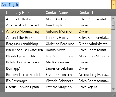
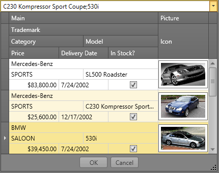
The image below illustrates the result.

The editor automatically generates columns for all the bound data object’s public properties. If you create columns manually for the embedded grid, set the AutoPopulateColumns property to false to disable automatic column generation. Otherwise, the LookupEdit substitutes your columns with the automatically generated ones.
Editor Value
Use the BaseEdit.EditValue property to get the editor’s value. The TextEditBase.Text property gets the text displayed within the lookup editor’s text box.
To respond to editor value changes, handle the BaseEdit.EditValueChanged event. To validate the new value, handle the BaseEdit.Validate event.
Customize the Edit Box
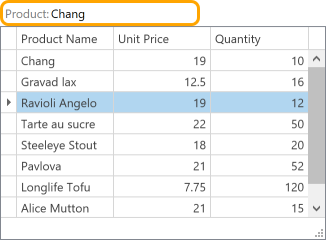
The EditTemplate property allows you to define the edit box appearance. The EditNonEditableTemplate property specifies the editor template if you set the IsTextEditable property to false:
<dxg:LookUpEdit ItemsSource="{Binding Products}"
                DisplayMember="ProductName"
                ValueMember="ID"
                IsPopupAutoWidth="False"
                IsTextEditable="False"
                ShowBorder="False"
                ShowEditorButtons="False">
    <dxg:LookUpEdit.EditNonEditableTemplate>
        <ControlTemplate>
            <Border BorderBrush="Orange" BorderThickness="3" CornerRadius="7">
                <StackPanel Orientation="Horizontal">
                    <TextBlock Margin="2"
                               VerticalAlignment="Center"
                               Foreground="Gray"
                               Text="Product:"/>
                    <TextBlock Text="{Binding Path=(dxe:BaseEdit.OwnerEdit).SelectedItem.ProductName,
                                              RelativeSource={RelativeSource Self}}"
                               VerticalAlignment="Center"/>
                </StackPanel>
            </Border>
        </ControlTemplate>
    </dxg:LookUpEdit.EditNonEditableTemplate>
</dxg:LookUpEdit>
Embedded GridControl
The GetGridControl() method returns a data grid embedded in the editor’s drop-down window.
To manually customize a data grid and embed it within the look-up editor, use the PopupBaseEdit.PopupContentTemplate property.
This example shows how to customize the GridControl displayed in the LookUpEdit‘s popup window.
- Set the LookUpEdit.AutoPopulateColumns property to
false. - Use the PopupBaseEdit.PopupContentTemplate property to specify a custom GridControl.
- Set the GridControl‘s name to PART_GridControl.
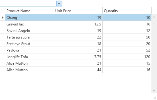
<dxg:LookUpEdit Name="lookUpEdit1"
                DisplayMember="ProductName"
                ValueMember="ID"
                AutoPopulateColumns="False"
                AutoComplete="True"
                IncrementalFiltering="True"
                ImmediatePopup="True"
                IsPopupAutoWidth="False">
    <dxg:LookUpEdit.PopupContentTemplate>
        <ControlTemplate>
            <dxg:GridControl Name="PART_GridControl">
                <dxg:GridControl.Columns>
                    <dxg:GridColumn FieldName="ProductName"/>
                    <dxg:GridColumn FieldName="UnitPrice"/>
                    <dxg:GridColumn FieldName="Quantity"/>
                </dxg:GridControl.Columns>
                <dxg:GridControl.View>
                    <dxg:TableView AutoWidth="True"/>
                </dxg:GridControl.View>
            </dxg:GridControl>
        </ControlTemplate>
    </dxg:LookUpEdit.PopupContentTemplate>
</dxg:LookUpEdit>
using System.Windows;

namespace HowToCreateLookUpEdit {
    public partial class MainWindow : Window {
        public MainWindow() {
            InitializeComponent();
            lookUpEdit1.ItemsSource = new ProductList();
        }
    }
}
The embedded GridControl is not serialized. To change this behavior, set the attached DXSerializer.Enabled property to true for the GridControl.
Operation Modes
You can fine-tune a lookup editor by using the BaseEdit.StyleSettings property. This property allows you to alter the appearance and behavior of a lookup editor by adding extra features like searching and multiple item selection. To apply specific settings, assign the lookup’s BaseEdit.StyleSettings property to one of the objects listed in the table below.
LookUpEdit mode | Corresponding settings object | Description |
|---|---|---|
Editor’s dropdown displays a grid. This is a default setting. | ||
Editor’s dropdown displays a grid and a search box. | ||
Editor’s dropdown displays a grid that allows you to select multiple items. | ||
Editor’s dropdown displays a grid that allows you to select multiple items. Selected items are represented by tokens. | ||
Editor’s dropdown displays a grid and a search box. Allows multiple item selection. Selected items are represented by tokens. |
Each of the settings objects has a number of properties that you can use to enable or disable the following grid features.
- Filtering (using the LookUpEditStyleSettings.AllowColumnFiltering property)
- Grouping (using the LookUpEditStyleSettings.AllowGrouping)
- Sorting (using the LookUpEditStyleSettings.AllowSorting)
The code example below shows a lookup editor in the SearchLookUp mode with the grouping feature disabled.
<dxg:LookUpEdit>
    <dxg:LookUpEdit.StyleSettings>
        <dxg:SearchLookUpEditStyleSettings AllowGrouping="False"/>
    </dxg:LookUpEdit.StyleSettings>
</dxg:LookUpEdit>
The following sections describe different settings provided by the LookUpEdit control in detail.
LookUpEdit Operation Mode
LookUpEdit mode is used by default.
Editor’s dropdown displays a fully-functional grid that supports the following features.
- single item selection;
- data filtering;
- data grouping;
- data sorting.
To learn more, see LookUpEditStyleSettings.
SearchLookUpEdit Operation Mode
In addition to the standard features, SearchLookUpEdit displays a search box.
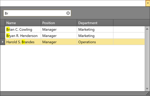
To learn more, see SearchLookUpEditStyleSettings
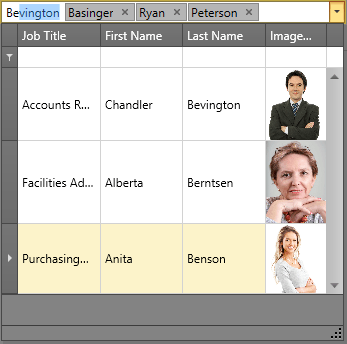
MultiSelectLookUpEdit Operation Mode
In addition to the standard features, MultiSelectLookUpEdit supports multiple item selection.
To learn more, see MultiSelectLookUpEditStyleSettings.
TokenLookUpEdit Operation Mode
TokenLookupEdit mode is inspired by modern mail clients.
In addition to the standard features, TokenLookupEdit supports the following:
- multiple items selection;
- selected items are represented by tokens.
To learn more, see TokenLookUpEditStyleSettings.
SearchTokenLookUpEdit Operation Mode
SearchTokenLookupEdit mode is inspired by modern mail clients.
In addition to the standard features, SearchTokenLookupEdit supports the following:
- data search;
- multiple items selection;
- selected items are represented by tokens.
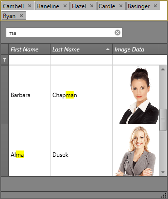
To learn more, see SearchTokenLookUpEditStyleSettings.
LookUpEdit Operation Mode Comparison
The table below compares the features of different LookUpEdit operation modes.
| Grouping | Filtering | Sorting | Single Item Selection | Multiple Item Selection[1] | Search | Tokens | Text Editing | |
|---|---|---|---|---|---|---|---|---|
| LookUpEdit |  |
|
|
|
 |
|
|
|
| SearchLookUpEdit | |
|
|
|
|
|
|
|
| MultiselectLookUpEdit | |
|
|
|
|
|
|
|
| TokenLookUpEdit | |
|
|
|
|
|
|
|
| SearchTokenLookUpEdit | |
|
|
|
|
|
|
|
Examples
- WPF LookUpEdit - Customize the Embedded Data Grid
- WPF LookUpEdit - Display a TreeList as Popup Content
- WPF LookUpEdit - Process New Values
- WPF LookUpEdit - Filter by Multiple Columns
- WPF LookUpEdit - Enable Multiple Selection Mode
- WPF LookUpEdit - Display CheckBoxes for Multiple Selection Mode
Related GitHub Examples
The following code snippets (auto-collected from DevExpress Examples) contain references to the LookUpEdit class.
Note
The algorithm used to collect these code examples remains a work in progress. Accordingly, the links and snippets below may produce inaccurate results. If you encounter an issue with code examples below, please use the feedback form on this page to report the issue.
Inheritance
-
Refer to the following KB article for more information: How to implement multi-select in DevExpress WPF Data Editors (ComboBoxEdit, LookUpEdit, ListBoxEdit).