Lesson 4 - Using Functions and Parameters
- 4 minutes to read
Carousel elements are manipulated by the control via Parameters. You bind any element property to a built-in or manually created parameter, and this binding specifies how the property value will change along the carousel path. For more information on the Parameter concept, see Functions and Parameters.
In this topic, you will learn how to specify property-parameter binding, how to use built-in parameters and how to declare custom parameters.
First, create a new page using the following XAML code.
<Page x:Class="CarouselTutorial.TutorialPage1"
    xmlns="http://schemas.microsoft.com/winfx/2006/xaml/presentation"
    xmlns:x="http://schemas.microsoft.com/winfx/2006/xaml"
    xmlns:dxca="http://schemas.devexpress.com/winfx/2008/xaml/carousel"
    xmlns:local="clr-namespace:CarouselTutorial"
    >
    <dxca:CarouselPanel AttractorPointIndex="6" VisibleItemCount="7" x:Name="myCarousel" PathSizingMode="Stretch">
        <dxca:CarouselPanel.Resources>
            <Style TargetType="{x:Type Rectangle}" BasedOn="{StaticResource {ComponentResourceKey
              TypeInTargetAssembly={x:Type dxca:CarouselPanel}, ResourceId=advancedCarouselItemStyle}}" />
        </dxca:CarouselPanel.Resources>
        <Rectangle Fill="Red"/>
        <Rectangle Fill="Green"/>
        <Rectangle Fill="Blue"/>
        <Rectangle Fill="Yellow"/>
        <Rectangle Fill="Purple"/>
        <Rectangle Fill="Red"/>
        <Rectangle Fill="Green"/>
        <Rectangle Fill="Blue"/>
        <Rectangle Fill="Yellow"/>
        <Rectangle Fill="Purple"/>
    </dxca:CarouselPanel>
</Page>
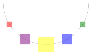
This XAML will provide default bindings for Rectangles. So, rectangles will be aligned along the path, will get smaller when reaching the ends of the path and will have 50% opacity.
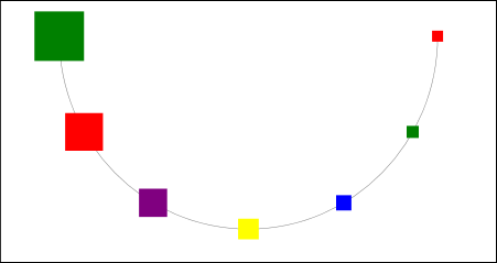
To modify how items are scaled along the path, go to the underlying code file, and declare the following FunctionBase descendants. The first will specify the scaling coefficient along the path (it will gradually increase from 0.2 to 1). Items will be small at the beginning and will enlarge as they reach the end. The second function specifies scaling for transition animation effects. The scaling coefficient will reach 1.5 (150% zoom factor) in the middle of the animation, and then will gradually change back to 1 (no zooming).
public class MyScaleDistributionFunction : DevExpress.Xpf.Carousel.FunctionBase {
    protected override double GetValueOverride(double x) {
        return x * x * 0.8 + 0.2;
    }
}
public class MyScaleAnimationFunction : DevExpress.Xpf.Carousel.FunctionBase {
    protected override double GetValueOverride(double x) {
        if (x < 0.5)
            return x + 1;
        return 2 - x;
    }
}
Now return to the XAML code and add a parameter for the CarouselPanel. Using the Parameter.DistributionFunction, Parameter.AnimationAddFunction and Parameter.AnimationMulFunction, specify this parameter’s functions. Note that the code uses a standard function as well - ZeroFunction. For the complete list of available built-in functions, see Functions and Parameters.
<dxca:CarouselPanel.ParameterSet>
    <dxca:ParameterCollection>
        <dxca:Parameter Name="MyScalingParameter">
            <dxca:Parameter.DistributionFunction>
                <local:MyScaleDistributionFunction />
            </dxca:Parameter.DistributionFunction>
            <dxca:Parameter.AnimationAddFunction>
                <dxca:ZeroFunction />
            </dxca:Parameter.AnimationAddFunction>
            <dxca:Parameter.AnimationMulFunction>
                <local:MyScaleAnimationFunction />
            </dxca:Parameter.AnimationMulFunction>
        </dxca:Parameter>
    </dxca:ParameterCollection>
</dxca:CarouselPanel.ParameterSet>
The parameter is ready and the last thing left to do is to bind element scaling transformations to this parameter’s value. This is done by replacing the default Style for Rectangles with the following:
<Style TargetType="{x:Type Rectangle}" BasedOn="{StaticResource {ComponentResourceKey TypeInTargetAssembly={x:Type dxca:CarouselPanel}, ResourceId=advancedCarouselItemStyle}}">
    <Setter Property="Opacity" Value="1" />
    <Setter Property="RenderTransform">
      <Setter.Value>
        <TransformGroup>
            <ScaleTransform
                ScaleX="{Binding Path=(dxca:CarouselPanel.Parameters).MyScalingParameter,
                    RelativeSource={RelativeSource FindAncestor, AncestorType={x:Type UIElement}}}"
                ScaleY="{Binding Path=(dxca:CarouselPanel.Parameters).MyScalingParameter,
                    RelativeSource={RelativeSource FindAncestor, AncestorType={x:Type UIElement}}}" />
            <TranslateTransform
                X="{Binding Path=(dxca:CarouselPanel.Parameters).OffsetX,
                    RelativeSource={RelativeSource FindAncestor, AncestorType={x:Type UIElement}}}"
                Y="{Binding Path=(dxca:CarouselPanel.Parameters).OffsetY,
                    RelativeSource={RelativeSource FindAncestor, AncestorType={x:Type UIElement}}}" />
            </TransformGroup>
        </Setter.Value>
     </Setter>
</Style>
As you see, the Opacity property is overridden, scaling transformation is bound to the manually created “MyScalingParameter” and the TranslateTransform properties are bound to the carousel’s internal OffsetX and OffsetY parameters that properly position elements along the path.
Now you can run the application and see the result. Try scrolling forward and backward to see the created animation effect.
The resulting XAML code should look like the following:
<Page x:Class="CarouselTutorial.TutorialPage1"
    xmlns="http://schemas.microsoft.com/winfx/2006/xaml/presentation"
    xmlns:x="http://schemas.microsoft.com/winfx/2006/xaml"
    xmlns:dxca="http://schemas.devexpress.com/winfx/2008/xaml/carousel"
    xmlns:local="clr-namespace:CarouselTutorial"
    >
    <dxca:CarouselPanel AttractorPointIndex="6" VisibleItemCount="7" x:Name="myCarousel" PathSizingMode="Stretch">
        <dxca:CarouselPanel.Resources>
        <Style TargetType="{x:Type Rectangle}" BasedOn="{StaticResource {ComponentResourceKey
                    TypeInTargetAssembly={x:Type dxca:CarouselPanel}, ResourceId=advancedCarouselItemStyle}}">
            <Setter Property="Opacity" Value="1" />
            <Setter Property="RenderTransform">
              <Setter.Value>
                <TransformGroup>
                    <ScaleTransform
                        ScaleX="{Binding Path=(dxca:CarouselPanel.Parameters).MyScalingParameter,
                    RelativeSource={RelativeSource FindAncestor, AncestorType={x:Type UIElement}}}"
                        ScaleY="{Binding Path=(dxca:CarouselPanel.Parameters).MyScalingParameter,
                    RelativeSource={RelativeSource FindAncestor, AncestorType={x:Type UIElement}}}" />
                    <TranslateTransform
                        X="{Binding Path=(dxca:CarouselPanel.Parameters).OffsetX,
                            RelativeSource={RelativeSource FindAncestor, AncestorType={x:Type UIElement}}}"
                        Y="{Binding Path=(dxca:CarouselPanel.Parameters).OffsetY,
                            RelativeSource={RelativeSource FindAncestor, AncestorType={x:Type UIElement}}}" />
                    </TransformGroup>
                </Setter.Value>
             </Setter>
        </Style>
        </dxca:CarouselPanel.Resources>
        <dxca:CarouselPanel.ParameterSet>
            <dxca:ParameterCollection>
                <dxca:Parameter Name="MyScalingParameter">
                    <dxca:Parameter.DistributionFunction>
                        <local:MyScaleDistributionFunction />
                    </dxca:Parameter.DistributionFunction>
                    <dxca:Parameter.AnimationAddFunction>
                        <dxca:ZeroFunction />
                    </dxca:Parameter.AnimationAddFunction>
                    <dxca:Parameter.AnimationMulFunction>
                        <local:MyScaleAnimationFunction />
                    </dxca:Parameter.AnimationMulFunction>
                </dxca:Parameter>
            </dxca:ParameterCollection>
        </dxca:CarouselPanel.ParameterSet>
        <Rectangle Fill="Red"/>
        <Rectangle Fill="Green"/>
        <Rectangle Fill="Blue"/>
        <Rectangle Fill="Yellow"/>
        <Rectangle Fill="Purple"/>
        <Rectangle Fill="Red"/>
        <Rectangle Fill="Green"/>
        <Rectangle Fill="Blue"/>
        <Rectangle Fill="Yellow"/>
        <Rectangle Fill="Purple"/>
    </dxca:CarouselPanel>
</Page>