Lesson 1 - Create Layout
- 4 minutes to read
Download the Template Solution
Download the solution from the following example:
This example is a draft application connected to a database. Open the RegistrationForm.BaseProject project and follow the steps in this lesson.
The RegistrationForm.Lesson1 project contains the result of this lesson.
Review the Form Design
You can use the LayoutControl suite to create compound layouts of controls.
The LayoutControl suite includes three main controls:
- LayoutControl – the root element of a layout.
- LayoutGroup – a control container that arranges its items either side-by-side (vertically or horizontally) or in tabs.
- LayoutItem - a control that has a label and a content region. The content region is a UIElement object.
Add the LayoutControl
Open the RegistrationView.xaml file located in the View folder.
Drag a LayoutControl from the Visual Studio toolbox onto the form. The following XAML is generated.
<UserControl x:Class="RegistrationForm.View.RegistrationView" ... >
    <Grid>
        <dxlc:LayoutControl/>
    </Grid>
</UserControl>
Tip
If you add the DevExpress products via a NuGet feed instead of the Unified Component Installer, the toolbox doesn’t contain DevExpress controls until you add the corresponding NuGet package.
Go to Tools | NuGet Package Manager | Manage NuGet Packages for Solution and add the DevExpress.Wpf.LayoutControl NuGet package.
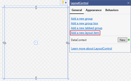
Move the cursor over the LayoutControl’s designer button to display three options: Add a new group  , Add a new item
  , and Add a new tabbed group
  .
.
Click Add a new item to add a simple editor container to the layout.
You can also select the LayoutControl and use Quick Actions to add items:
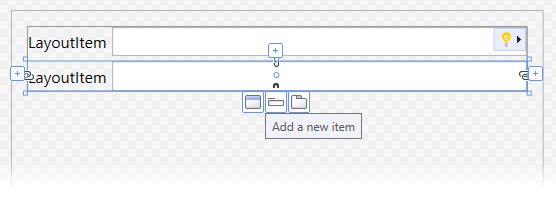
Select the created LayoutItem. The “+“ buttons are shown at the left, top, right, and bottom edges of the LayoutItem. You can hover over these buttons to invoke the options to add a layout item. New items are positioned relative to the selected element.
Add a new LayoutItem below the existing item.
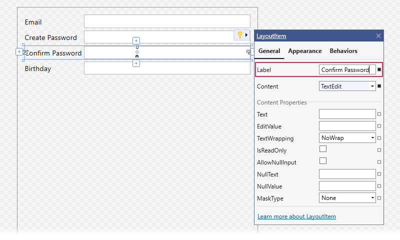
To edit a layout item’s label, open the item’s Quick Actions and set the Label property.
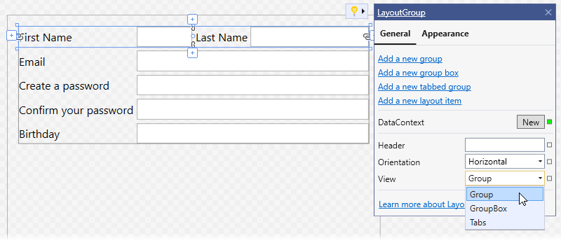
Select the topmost item and click the Add a new group button to create a new group.
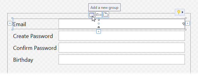
Select the created group and invoke its Quick Actions. Set the View property to Group. Add two layout items to the group.
Define Styles
You can define a style to improve readability. The following style positions the label above the editor and applies the bold font to the label’s text.
<UserControl x:Class="RegistrationForm.View.RegistrationView" ... >
    <UserControl.Resources>
        <Style x:Key="labelStyle" TargetType="dxlc:LayoutItemLabel">
            <Setter Property="FontWeight" Value="Bold"/>
        </Style>
        <Style x:Key="itemStyle" TargetType="dxlc:LayoutItem">
            <Setter Property="LabelPosition" Value="Top"/>
            <Setter Property="LabelStyle" Value="{StaticResource labelStyle}"/>
        </Style>
    </UserControl.Resources>
    <Grid>
        <dxlc:LayoutControl Orientation="Vertical" ItemStyle="{StaticResource itemStyle}">
            ...
        </dxlc:LayoutControl>
    </Grid>
</UserControl>
Add the Register button and apply the itemStyle to it.
<UserControl x:Class="RegistrationForm.View.RegistrationView"  ... >
    <Grid>
        <dxlc:LayoutControl Orientation="Vertical" ItemStyle="{StaticResource itemStyle}">
            ...
            <Button Content="Register" HorizontalAlignment="Center" VerticalAlignment="Bottom" Width="80" />
        </dxlc:LayoutControl>
    </Grid>
</UserControl>
To increase the distance between layout items, set the LayoutControlBase.ItemSpace property for the LayoutControl and for the first LayoutGroup.
<dxlc:LayoutControl Orientation="Vertical" ItemStyle="{StaticResource itemStyle}" ItemSpace="10">
    <dxlc:LayoutGroup ItemSpace="10">
         ...
     </dxlc:LayoutGroup>
     ...
</dxlc:LayoutControl>
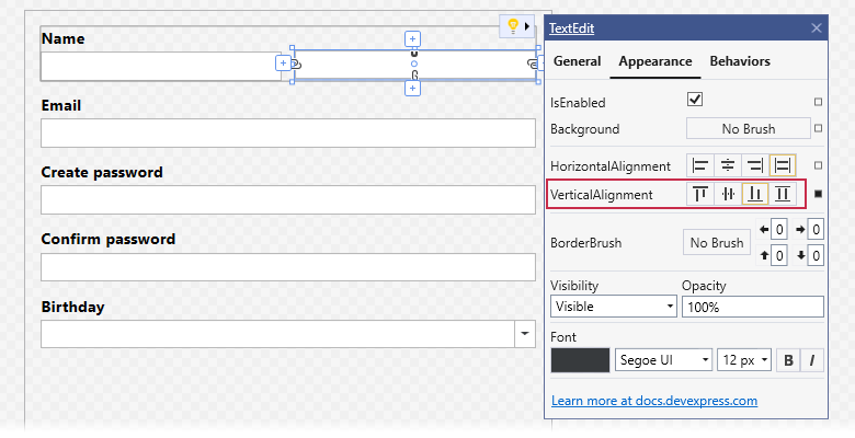
You can use a single label for the First Name and Last Name fields. Clear the Label property value for the Last Name layout item.
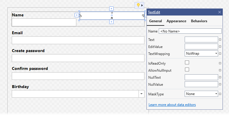
Switch to the Appearance tab of the Quick Actions menu for the Last Name layout item. Set the VerticalAlignment property to Bottom. Set the Label property of the First Name layout item to “Name”.
Specify the Editors
At the moment, each layout item contains a TextEdit control. You can replace it with editors that are better suited for the layout item’s data type:
- Email - TextEdit: Email addresses are formatted with an editor mask.
- Create password and Confirm password - PasswordBoxEdit
- Birthday - DateEdit
Refer to the following topic for more information about supported editor types: Included Components.
Select the Create password layout item and invoke its Quick Actions. Set the Content property to PasswordBoxEdit.
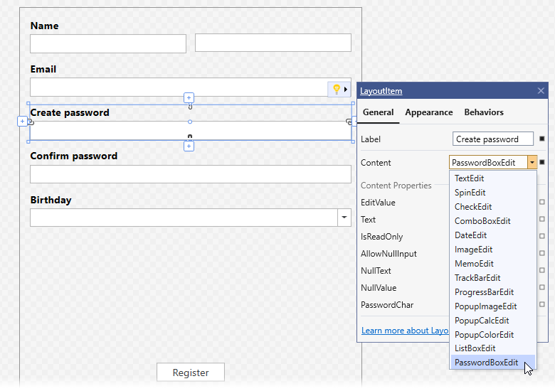
Set the editor types for the Confirm password and Birthday layout items in the same manner.
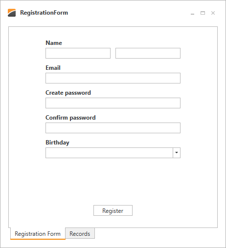
The image below shows the result.