Containers and Lists
- 3 minutes to read
Overview
You can use containers and lists to group diagram items.
DiagramContainer is a regular container.

The DiagramList class is a DiagramContainer descendant. This is a special container type that stacks child items horizontally or vertically. The Orientation property specifies the direction.

If you move, copy or delete a container, these actions also apply to its contents.
Create a Container
Users can select the corresponding ribbon item on the Insert ribbon page to add containers.

To add a container in code, create a DiagramContainer object (DiagramList for lists) and add it to the DiagramControl.Items or DiagramContainer.Items collection:
var container = new DiagramContainer() { Shape = StandardContainers.Classic };
diagram.Items.Add(container);
Content
Any item can be placed within a container, including another container. To add or remove items, drag them into or out of the container. The container adjusts its width and height to fit the contents. The DiagramContainerBase.AdjustBoundsBehavior property manages this behavior.
The DiagramContainerBase.Items property contains the collection of diagram items placed within the container.
For items within a DiagramContainer, the DiagramItem.Position property specifies the coordinates of the item’s upper left corner relative to the parent.
For items within a DiagramList, the item’s relative order corresponds to the item’s index in the DiagramList.Items collection. Users can drag the list items to rearrange them.
Items in a list uniformly fill the list’s height and width and cannot be resized individually. The list items ignore the DiagramItem.Position and DiagramItem.Anchors values.
Note
Do not add DiagramConnector items to the DiagramContainerBase.Items collection. Instead, add connector items to the DiagramControl.Items collection and use the DiagramConnector.BeginItem and DiagramConnector.EndItem properties to connect them to items that reside in a container.
Header and Styles
Each container has a header. To edit the header, double-click the container. Click the Show Header ribbon item to toggle the header visibility. This item is within the Container Tools ribbon category that appears when a container is selected. Additionally, users can customize the header and content padding (the HeaderPadding and Padding properties), select the container style, and change the list orientation.

You can use the Header property to edit the header in code. Set the ShowHeader property to false to hide the header.
Set the Shape property to a DevExpress.Diagram.Core.StandardContainers value to specify the container style in code.
Resize Items Proportionally
Users can drag the corner selection handles to resize the container. To change the aspect ratio, hold the SHIFT key and drag a corner selection handle or drag one of the side selection handles. To disable the proportional resize feature, set the DiagramControl.EnableProportionalResizing property to false.
Collapse Containers
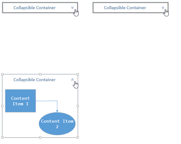
Set the AllowCollapseContainers property to true to show the Expand/Collapse button ( ) in container headers. Users can click this button to show or hide the container content. Use the CanCollapse property to control the collapse functionality for individual containers. The CollapseContainerButtonSize and CollapseContainerButtonPadding properties specify the size and padding of the expand/collapse button.

Hide Subordinate Items
The container’s DiagramItem.CanHideSubordinates property specifies whether to display the expand-collapse button below the container that is used to show/hide the container’s subordinate items. The DiagramItem.AreSubordinatesVisible property indicates whether the subordinate items are visible.
