Data Layout Control
- 7 minutes to read
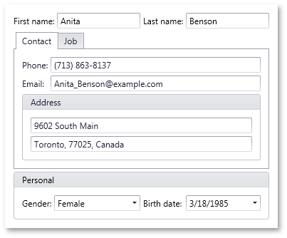
You can bind a DataLayoutControl to any object via the DataLayoutControl.CurrentItem property and the control will automatically build a layout to edit this object’s public properties.

The DataLayoutControl in the image above is bound to an object of the following class. Note the attributes applied to the properties which define the arrangement of fields:
using System.ComponentModel.DataAnnotations;

public class Person {
    // The two items below will be displayed by DataLayoutControl
    // in a borderless and titleless Name group
    [Display(GroupName = "<Name>", Name = "Last name")]
    public string LastName { get; set; }
    [Display(GroupName = "<Name>", Name = "First name", Order = 0)]
    public string FirstName { get; set; }

    //The four items below will go to a Contact tab within tabbed Tabs group.
    [Display(GroupName = "{Tabs}/Contact", Order = 2),
        DataType(DataType.PhoneNumber)]
    public string Phone { get; set; }
    [Display(GroupName = "{Tabs}/Contact", Order = 4)]
    public string Email { get; set; }
    //The two items below will go to the Address group within the Contact tab.
    [Display(GroupName = "{Tabs}/Contact/Address", ShortName = "")]
    public string AddressLine1 { get; set; }
    [Display(GroupName = "{Tabs}/Contact/Address", ShortName = "")]
    public string AddressLine2 { get; set; }

    //The two items below will go to the horizontally oriented Personal group.
    [Display(GroupName = "Personal-", Name = "Birth date")]
    public DateTime BirthDate { get; set; }
    [Display(GroupName = "Personal-", Order = 3)]
    public Gender Gender { get; set; }

    //The four items below will go to the Job tab of the tabbed Tabs group
    [Display(GroupName = "{Tabs}/Job", Order = 6)]
    public string Group { get; set; }
    [Display(GroupName = "{Tabs}/Job", Name = "Hire date")]
    public DateTime HireDate { get; set; }
    [Display(GroupName = "{Tabs}/Job"), DataType(DataType.Currency)]
    public decimal Salary { get; set; }
    [Display(GroupName = "{Tabs}/Job", Order = 7)]
    public string Title { get; set; }
}

public enum Gender { Male, Female }
The DataLayoutControl is a data-bound version of its ancestor - the LayoutControl. The Data Layout Control extends its ancestor’s layout functionality and introduces new data-aware features:
- Automatic layout generation when binding to an object.
- In-place editors for editing underlying data are chosen by a property’s data type. You can apply a specific attribute to an object’s properties to specify that this property must be edited using a multi-line text editor, password edit box, or text editor with a phone mask enabled.
- Capability to give display names to layout items via an attribute applied to an object’s properties. These names are displayed within layout item labels.
- Capability to arrange in-place editors into groups and tabbed groups, and name these groups via an attribute applied to an object’s properties.
- Capability to specify the order of generated layout items via an attribute applied to an object’s properties.
To bind a DataLayoutControl to an object, use the DataLayoutControl.CurrentItem property.
Editors used to edit the bound object’s properties are generated based on the underlying property’s data type:
| Property’s Data Type | Editor |
|---|---|
| String | Properties of the string type are edited using the TextEdit control by default. See the description of the DataTypeAttribute in the Layout Generation Attributes section below to learn more. |
| Boolean | CheckEdit |
| DateTime | DateEdit |
| Enumeration | ComboBoxEdit |
Layout Generation Attributes
The Data Layout Control recognizes specific attributes applied to a bound object’s properties. When building a layout, the Data Layout Control uses these attributes to give display names to layout items, specify the order of layout items, arrange items into groups and tabbed groups, etc.
Here is a list of supported attributes:
Attribute | Attribute’s Parameter | Description |
|---|---|---|
GroupName | This parameter allows you to place a generated layout item into a group or tabbed group. If the parameter refers to a non-existing group, it will be automatically created. Created Group Type To specify the type of the created group, enclose the group name with the following characters:
If a group name is not enclosed with any of these characters, the type of the created group is chosen as follows: If the created group’s parent is a tabbed group, the created group’s type will be of the LayoutGroupView.Group type. In all other cases, the created group’s type will be of the LayoutGroupView.GroupBox type. The type of the root group (the DataLayoutControl itself) is always LayoutGroupView.Group. Group Item Orientation You can specify the orientation of items within the created group by appending “|” and “-“ characters to a group name. These specify the vertical and horizontal orientations of items respectively. If the orientation is not specified using these characters, the orientation will be as follows: If the created group is of the LayoutGroupView.Group type and its parent group is not a tabbed group, then the orientation will be at right angles to the orientation of items in the parent group. Otherwise, the orientation of items will be vertical. The orientation of items within the root group (the DataLayoutControl itself) is always vertical. Nested Groups To place a layout item into a group that is nested in another group, the GroupName parameter must specify the full path to the target group (including all parent groups). Group names should be delimited using the “/“ character in the full path. | |
Name | If specified, this parameter defines a label for the generated layout item. If the parameter is omitted, the layout item’s label is specified by the property’s name. You can set the parameter to an empty string to hide the layout item’s label. | |
ShortName | The same as the Name parameter. | |
Order | Specifies the order of the layout item among other layout items. If this attribute parameter is omitted, the layout item is pushed to the bottom of its parent group. | |
DataType | Supported data types:
|
Refer to the following help topic for a complete list of supported attributes: Data Annotation Attributes.