TdxOfficeSearchBoxProperties.UseStrokeColorForGlyphPalette Property
Switches the assigned vector glyph between contrast and lightweight display modes.
Declaration
property UseStrokeColorForGlyphPalette: Boolean read; write; default False;Property Value
| Type | Default | Description |
|---|---|---|
| Boolean | False |
|
Remarks
SVG images consist of elements with stroke (shape outline) and fill (shape fill) attributes drawn according to a palette defined at the image level or externally. All SVG icons shipped with the DevExpress Icon Library define named colors as CSS Styles for fill and stroke attributes:

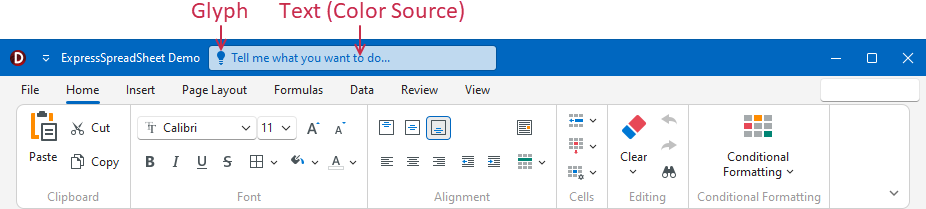
Vector Glyphs in an Office Search Box
The TdxOfficeSearchBox editor overrides a built-in palette of an SVG image assigned to the Glyph property and applies text color to all image elements with the fill attribute; image elements with stroke elements are not drawn. This predefined rendering technique maintains high glyph contrast regardless of the active skin and palette:
Property Value Examples
FalseContrast Mode. Draws a contrast glyph with multiple elements filled with text color.

TrueLightweight Mode. Draws a lightweight glyph (outlines only).

Default Value
The UseStrokeColorForGlyphPalette property’s default value is False.