Create a Dashboard Using the Designer Dialog
- 7 minutes to read
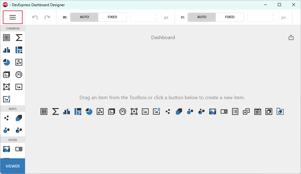
This tutorial creates a new application, sets up an in-memory data source, adds a TdxDashboardControl component, and uses the Dashboard Designer dialog to add data-bound Bubble Map and Chart dashboard items to the layout.
Step 1 — Create & Configure a RAD Studio Project
Create a new Delphi or C++Builder project. Place two components on the form (Tool Palette Category – DevExpress):
- TdxBackendDataConnectionManager
- Manages data sources for all dashboards in your application.
- TdxDashboardControl
- A VCL Dashboard control that displays and autoarranges data analysis elements such as grids, charts, maps, gauges, etc.
Create & Configure Data Connection Components
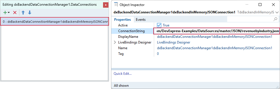
Copy the following connection string. This string points to a sample JSON data file hosted on GitHub by DevExpress:
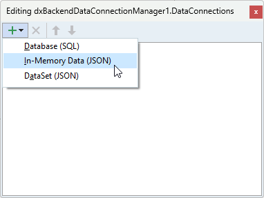
Uri=https://raw.githubusercontent.com/DevExpress-Examples/DataSources/master/JSON/revenuebyindustry.jsonDouble-click the TdxBackendDataConnectionManager component. In the Collection Editor dialog, select Add → In-Memory Data (JSON). This menu item creates a TdxBackendInMemoryJSONConnection component designed to load JSON data and bind it to dashboard items.
Select the created component in the Collection Editor dialog. Paste the copied string to the ConnectionString property editor in the Object Inspector.
Step 2 — Configure a JSON Data Source
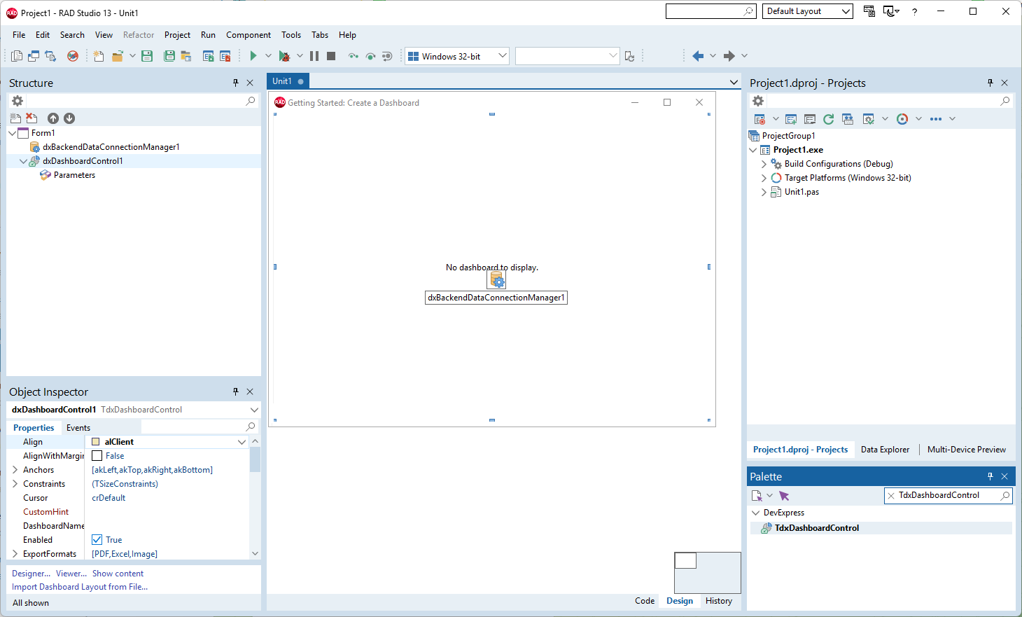
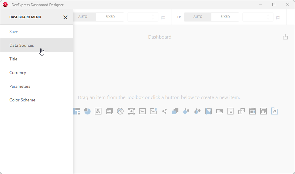
Right-click the TdxDashboardControl component and select the Designer… option[1] to display the Dashboard Designer dialog. Click the hamburger button to display the Dashboard Designer menu:
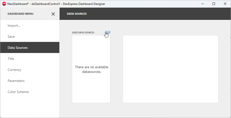
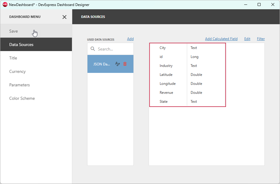
Select Data Sources to display the DATA SOURCES pane:
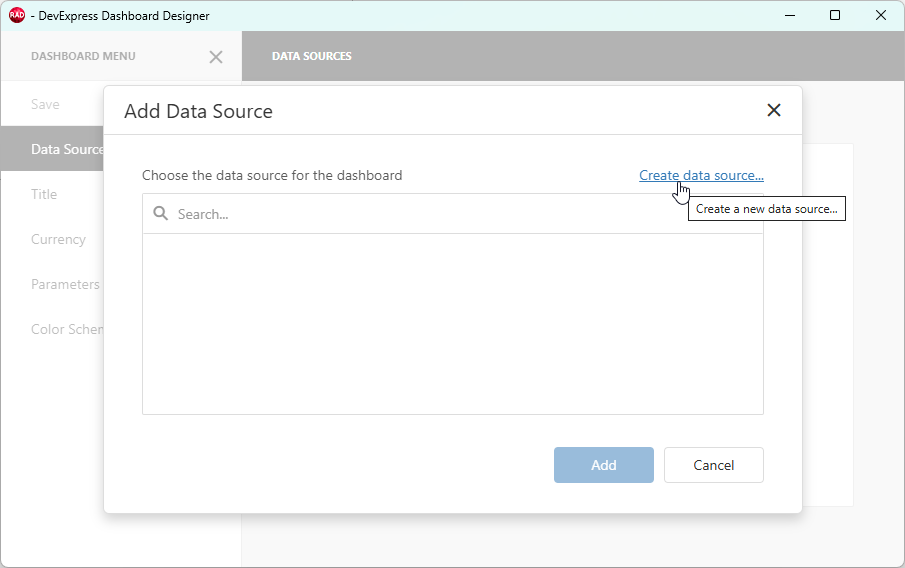
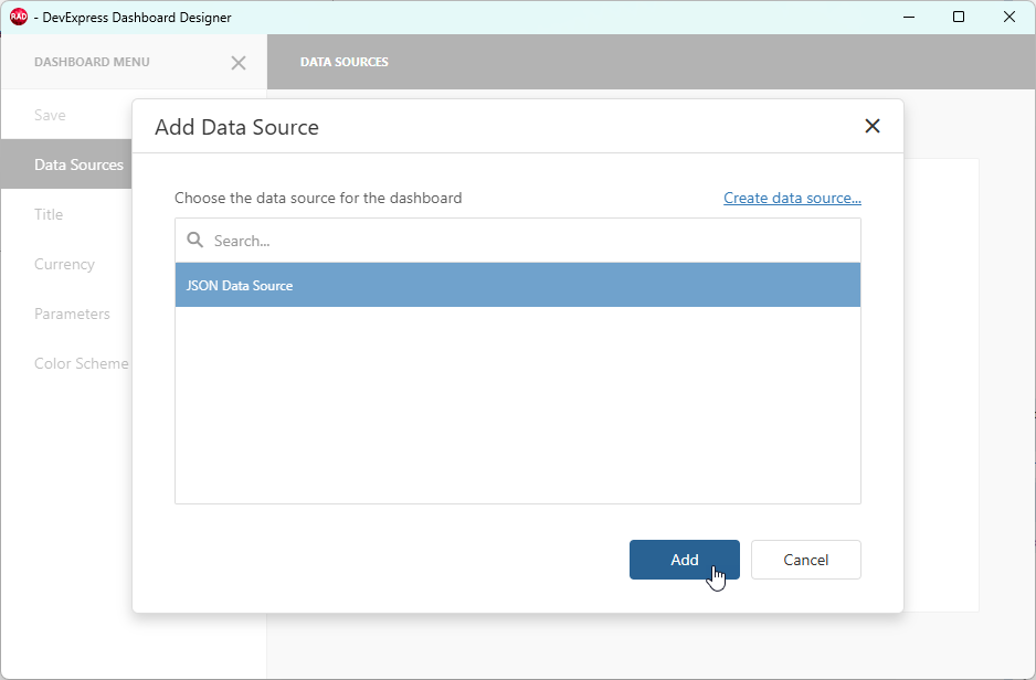
Click Add to display the Add Data Source dialog.
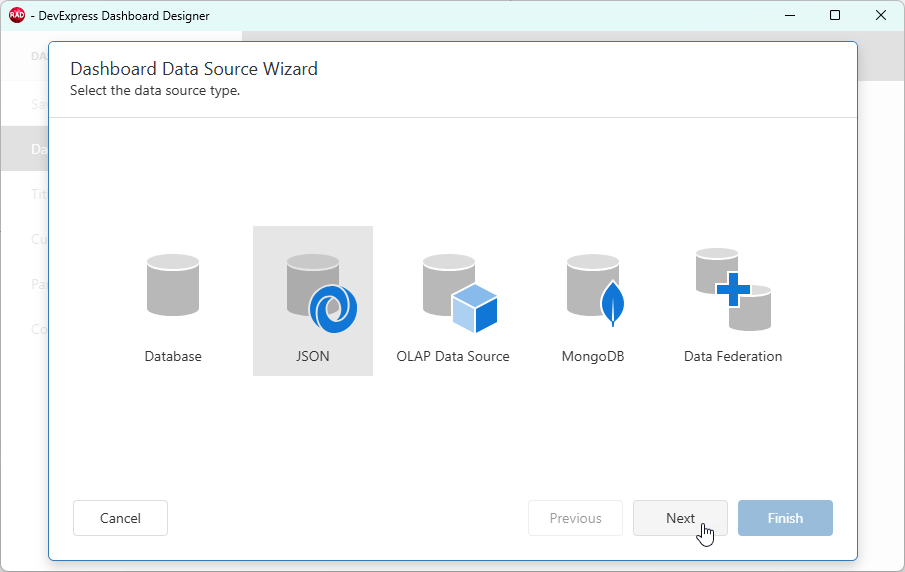
Click Create data source… in the Add Data Source dialog to display the Data Source Wizard.
Select JSON as the data source and click Next.
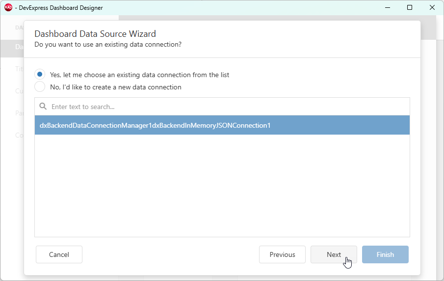
Select the previously configured JSON connection component and click Next.
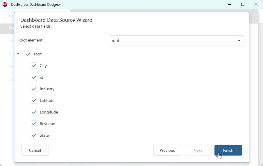
Review loaded dataset fields and click Finish.
Select the created JSON data source and click Add to close the Add Data Source dialog.
The DATA SOURCES pane lists loaded fields and corresponding data types. Click Save to complete data source configuration.
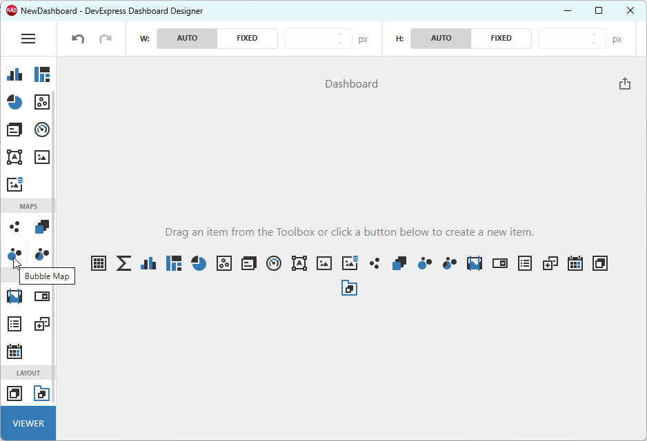
Step 3 — Create a Bubble Map Item and Bind It to Data
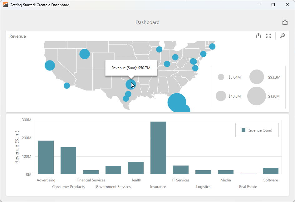
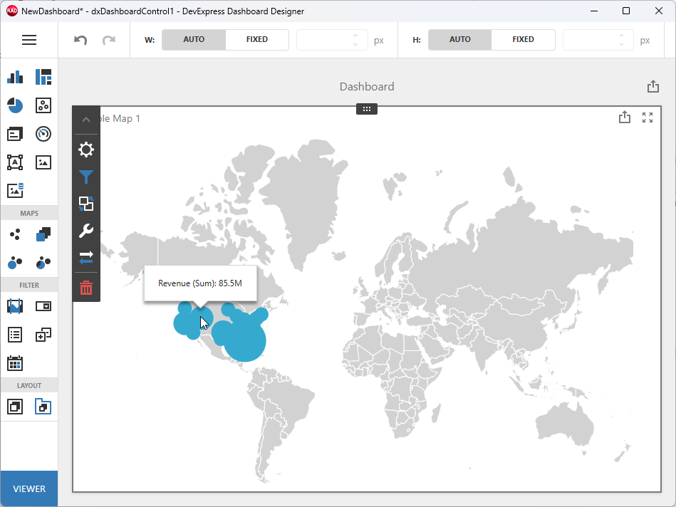
A bubble map displays values as bubbles on a map according to geopoints and associated values. Bubble sizes reflect values associated with corresponding points on the map.
Add a Bubble Map to the dashboard. Click the corresponding button on the Toolbox or in the dashboard’s empty area.
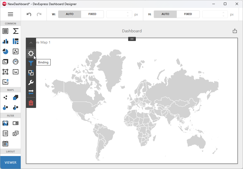
Bind the Bubble Map Item to Data
Click within the empty map area. Select the Binding (gear) button to display the data binding callout.
Click the button under LATITUDE (1) and review the list of compatible data source fields. Select the Latitude field (2).
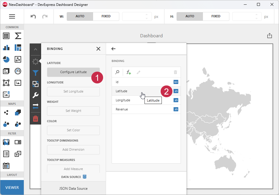
Repeat these steps to configure remaining sections. The following table lists Bubble Map sections, fields used in this tutorial, and corresponding data types:
| Section | Data Field | Data Type | Description |
|---|---|---|---|
| Latitude | Latitude | Double | The geographic latitude of the data point. |
| Longitude | Longitude | Double | The geographic longitude of the data point. |
| Weight | Revenue | Double | The bubble size. Higher values correspond to larger bubbles. |
Once you bind all fields to data, the map displays different-sized overlapping bubbles within the USA territory.
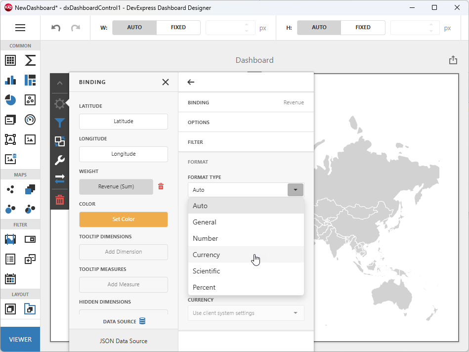
You can apply currency formatting to the Revenue data field. Click the Revenue button in the BINDING callout, expand the FORMAT group, and select Currency in the FORMAT TYPE combo box.
Configure the Bubble Map
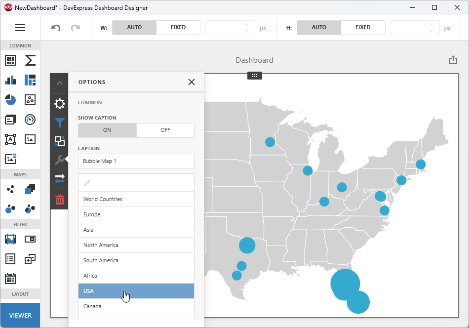
Click the Options (wrench) button to access map settings:
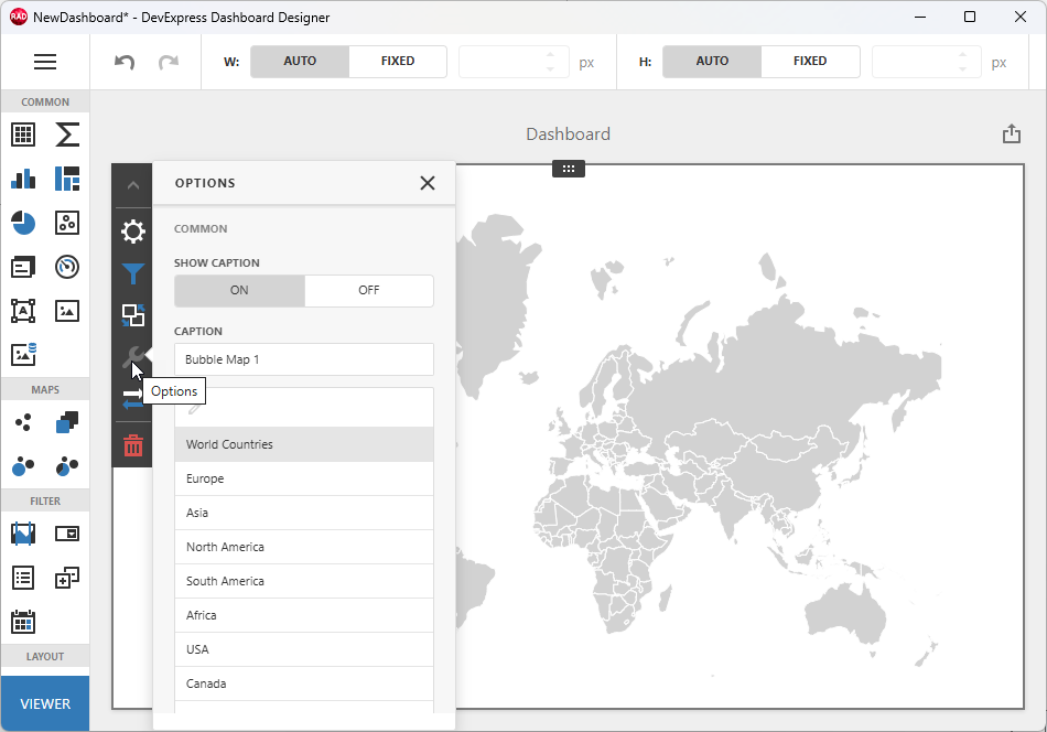
Select USA to display all data points on a smaller-scale map.
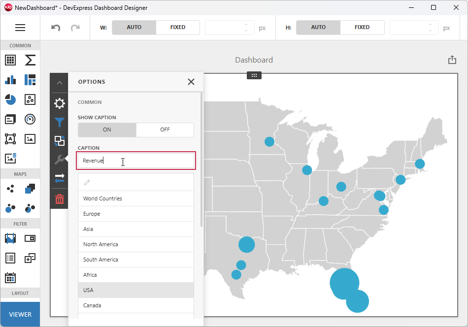
Change the automatically generated map name to Revenue:
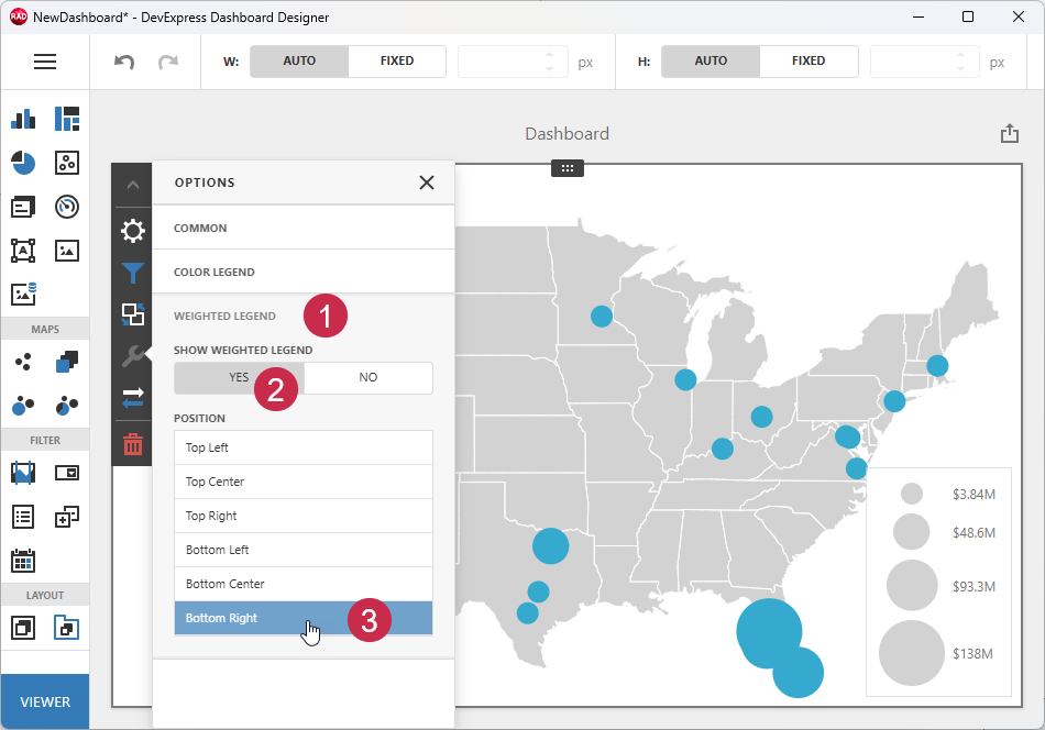
To display a legend pane for bubble sizes, scroll the OPTIONS pane down, expand the WEIGHTED LEGEND group (1), click YES (2), and select a position (3 – BOTTOM RIGHT, for example).
Step 4 — Create a Chart Item and Bind It to Data
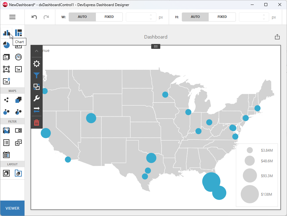
Click the Chart toolbox button to add a chart dashboard item under the bubble map.
Bind the Chart Item to Data
Select the Binding button (1) for the chart item, click Add Values (2), and select the Revenue field in the expanded pane.
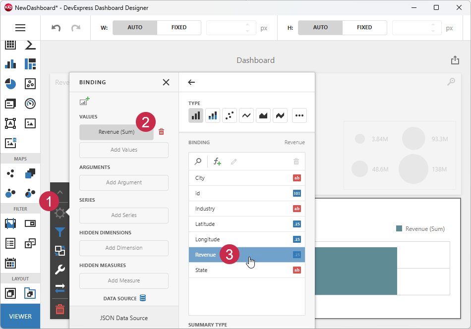
Click the Add Argument button (1) and select the Industry field (2).
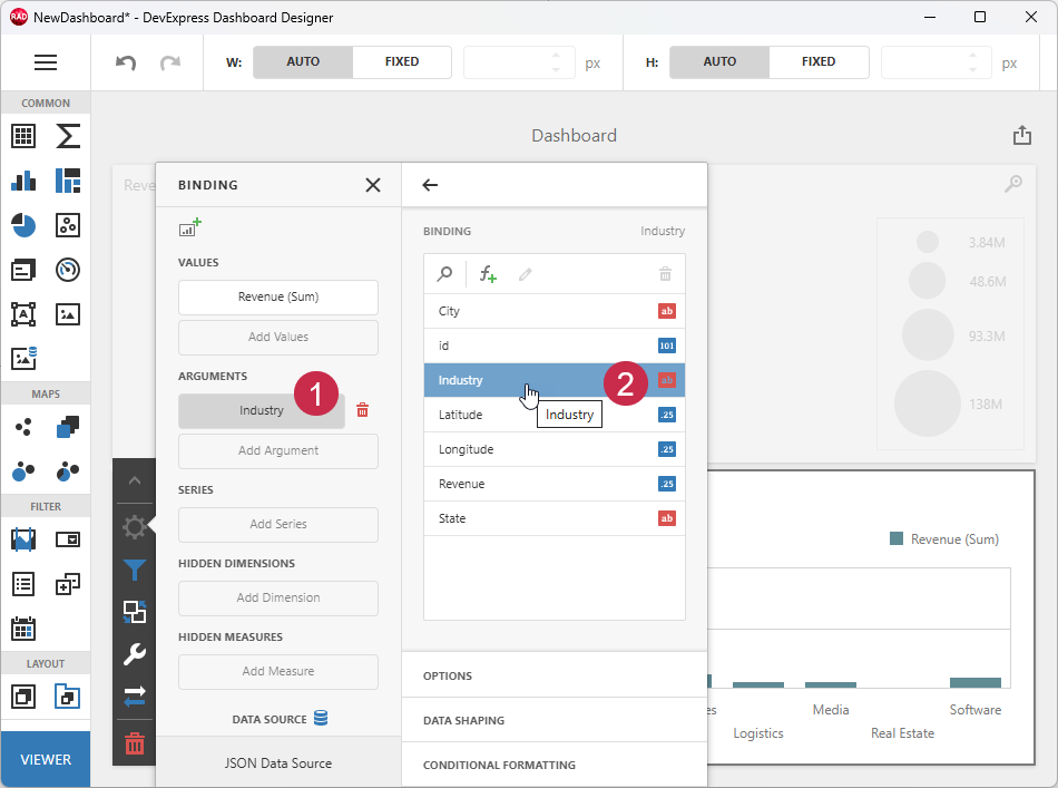
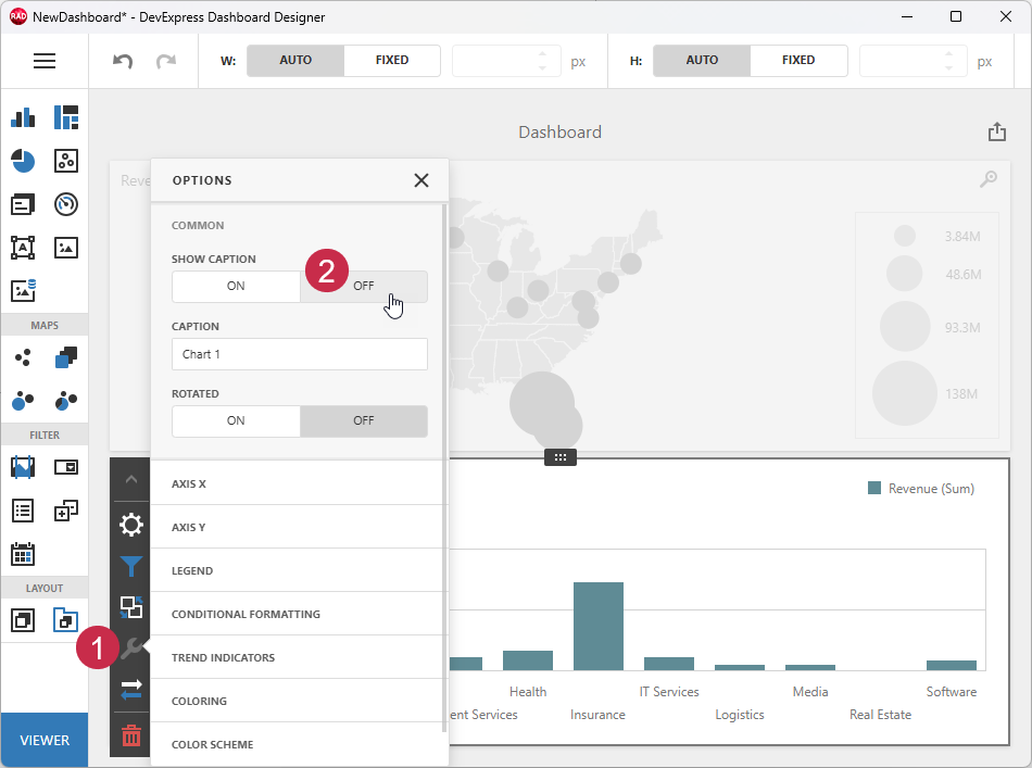
Configure the Chart
Click the Options (wrench) button (1) to access chart settings. Hide the chart caption (2):
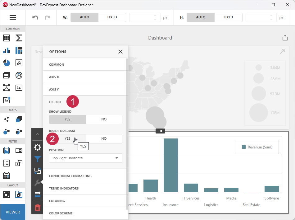
You can change the legend position within the chart area. Expand the LEGEND group (1) and enable the INSIDE DIAGRAM option (2):
Click the hamburger button and select the Save option.
Close the Dashboard Designer dialog.
Step 5 — Build & Run Your First App
Post-Build Events for WebView2 Loader DLL Deployment
To automatically copy a 32- or 64-bit WebView2Loader.dll file to the target build folder, do the following:
- Open the Project Options dialog. Select the Project → Options… item in the RAD Studio menu or press Ctrl + Shift + F11).
Select Build → Build Events in the tree view pane on the left and select the following option in the Target combo box:
'All Configurations - All Platforms'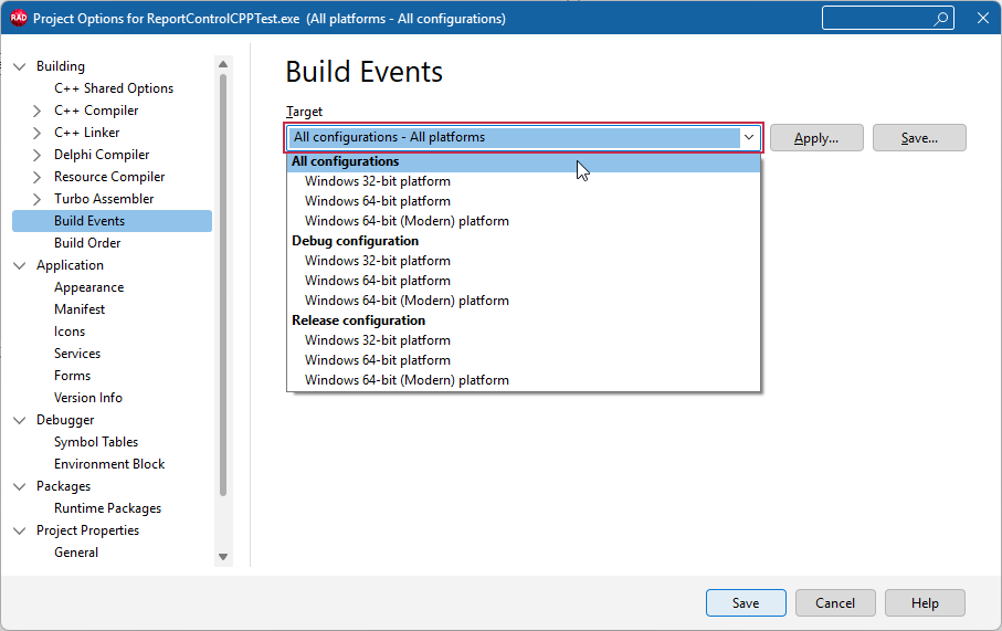
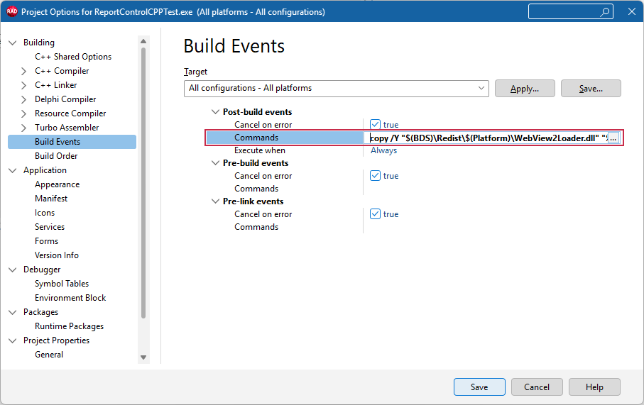
Copy the command line for the target compiler and platform:
copy /Y "$(BDS)\Redist\$(Platform)\WebView2Loader.dll" "$(OUTPUTDIR)"Paste the DLL deployment command line into the Commands box:
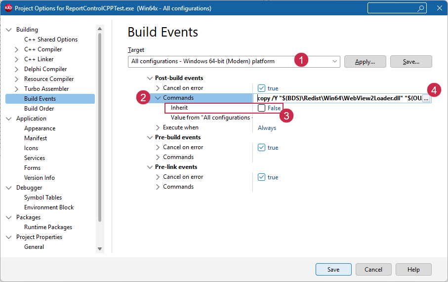
Optional. This step is required only for the Modern C++ RAD Studio compiler.
If you use Windows 64-bit (Modern) as a build target, select the Windows 64-bit (Modern) platform (1), expand the Post-build events → Commands node (2), uncheck the Inherit option (3), and paste the Modern compiler-specific command into the Commands box (4):
Click Save to apply pending changes and close the Project Options dialog.
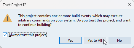
Build the project. Confirm that the configured post-build event is trusted in the following dialog:
All build operations in the current RAD Studio project now ensure that the platform-specific WebView2Loader.dll file version is available in the target build folder (for both Debug and Release configurations).
Run & Test the App
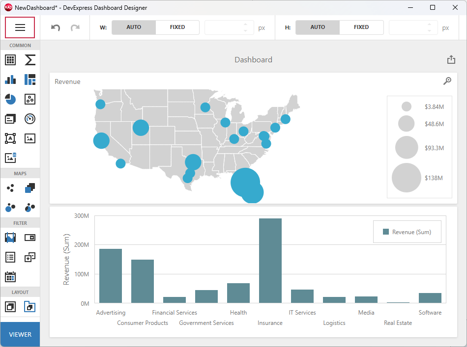
Run the app and move the mouse pointer between map bubbles and chart bars to display corresponding hints.
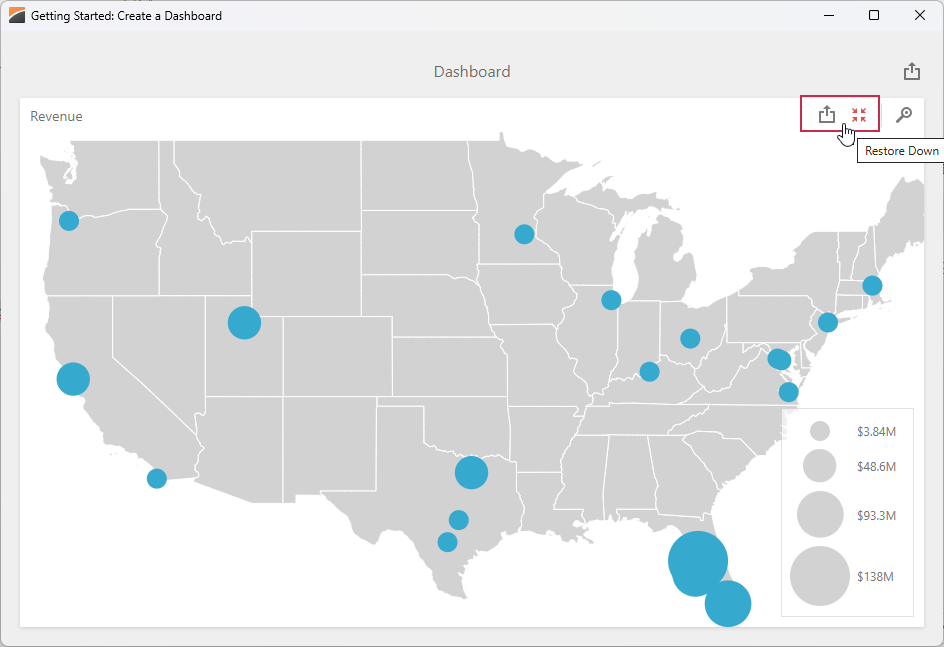
Note that all dashboard items display predefined service buttons. Use Maximize/Restore Down buttons to temporarily expand an item (and hide others):
Click the Export button to export dashboard content to any supported format.
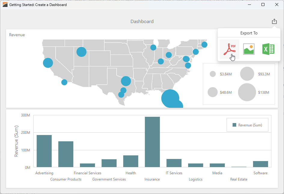
Click the Export button for an individual dashboard item to export its content as a separate document.
Other Tutorials
- Follow this tutorial to create a dashboard and bind it to data using standard FireDAC components (TFDQuery and TFDConnection) shipped with the RAD Studio IDE.
- Follow this tutorial to create a dashboard, bind it to a parametrized stored procedure, and pass dashboard parameters to that procedure using the Dashboard Designer dialog at design time.
-
Alternatively, you can double-click the TdxDashboardControl component while content is hidden or unavailable at design time.
If you display dashboard content at design time, right-click the green selector at the bottom-right corner of the TdxDashboardControl area.