DxButton.RenderStyle Property
Specifies the button’s predefined style.
Namespace: DevExpress.Blazor
Assembly: DevExpress.Blazor.v20.2.dll
NuGet Package: DevExpress.Blazor
Declaration
[DefaultValue(ButtonRenderStyle.Primary)]
[Parameter]
public ButtonRenderStyle RenderStyle { get; set; }
Property Value
| Type | Default | Description |
|---|---|---|
| ButtonRenderStyle | **Primary** | One of the ButtonRenderStyle values. |
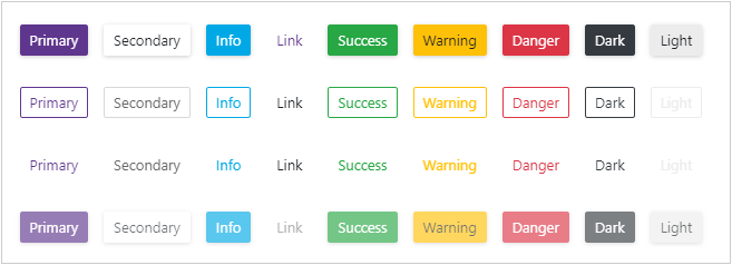
Available values:
| Name | Description |
|---|---|
| None | Resets the button’s style. |
| Primary | Applies the primary style to the button. |
| Secondary | Applies the secondary style to the button. |
| Info | Applies the info style to the button. |
| Link | Applies the link style to the button. |
| Success | Applies the success style to the button. |
| Warning | Applies the warning style to the button. |
| Danger | Applies the danger style to the button. |
| Dark | Applies the style to the button. |
| Light | Applies the light style to the button. |
Remarks
Use the following properties to specify the <DxButton>‘s style:
- RenderStyle — Specifies the button’s predefined style.
- RenderStyleMode — Specifies the button’s color filling type.
<DxButton RenderStyle="ButtonRenderStyle.Primary" RenderStyleMode="ButtonRenderStyleMode.Contained" Text="Primary" />
See Also