DxButton.IconPosition Property
Specifies the icon’s position.
Namespace: DevExpress.Blazor
Assembly: DevExpress.Blazor.v20.2.dll
NuGet Package: DevExpress.Blazor
Declaration
[DefaultValue(ButtonIconPosition.BeforeText)]
[Parameter]
public ButtonIconPosition IconPosition { get; set; }
Property Value
| Type | Default | Description |
|---|---|---|
| ButtonIconPosition | **BeforeText** | The icon’s position. |
Available values:
| Name | Description |
|---|---|
| BeforeText | The icon is placed before the button’s text. |
| AfterText | The icon is placed after the button’s text. |
Remarks
Connect an icon library to your project to add an icon to a <DxButton> component. Use the IconPosition property to specify the icon’s position. Assign the icon’s CSS class to the IconCssClass property.
DevExpress Blazor components support pre-defined icon sets (such as Iconic or Bootstrap-recommended libraries) and custom icon libraries. Refer to Icons for more information.
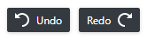
<DxButton RenderStyle="ButtonRenderStyle.Dark" Text="Undo" Title="Undo the last action."
    IconCssClass="undo" style="margin-right: 0.5em;"/>
<DxButton RenderStyle="ButtonRenderStyle.Dark" Text="Redo" Title="Restore the previously undone action."
    IconCssClass="redo" IconPosition="ButtonIconPosition.AfterText" />
Leave the Text property empty to show an icon without text.
See Also