Nodes
- 9 minutes to read
Tree List nodes are data rows organized into a tree-like hierarchy.
Add New Nodes
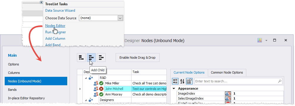
If a Tree List has a data source, nodes (TreeListNode class objects) are generated automatically. To add nodes in Unbound Mode, invoke the Tree List Designer dialog and switch to its “Nodes” tab .
Add New Nodes in Code
Use the TreeList.AppendNode method to add a new node to the Tree List.
using DevExpress.XtraTreeList;
using DevExpress.XtraTreeList.Nodes;

TreeListNode parentForRootNodes = null;
// Create a root node.
TreeListNode rootNode = tl.AppendNode(new object[] { "Alfreds Futterkiste", "Germany, Obere Str. 57", "030-0074321" }, parentForRootNodes);
// Create the root node's child node.
tl.AppendNode(new object[] { "Suyama, Michael", "Obere Str. 55", "030-0074263" }, rootNode);
Note
The data source must not be read only. If you use business objects to store data, the class must expose a parameterless constructor.
Use the following parameters to specify the new node’s cell values and its position in the tree hierarchy:
- nodeData - an Array of values or a DataRow object used to initialize the new node’s cell values. The array’s value types must match the column types in the data source; otherwise, an exception is thrown.
parentNode - a TreeListNode object that specifies the new node’s parent node. This value is assigned to the ParentNode property. To append a root node, use null (Nothing in VB).
If you specified the parent node in the corresponding field of the nodeData parameter, the parentNode parameter should specify the same node.
- parentNodeId - an integer value that specifies the new node’s parent node by its Id property value.
Use the parameters below to specify the images displayed in the new node. To specify an image, use the image’s index in the SelectImageList collection.
- imageIndex - the image displayed when the node is not focused. This value is assigned to the ImageIndex property.
- selectImageIndex - the image displayed when the node is focused. This value is assigned to the SelectImageIndex property.
Use the checkState parameter to specify whether the node is checked. If the AllowRecursiveNodeChecking option is enabled, the method updates parent and child nodes.
Use the childrenCheckBoxStyle parameter to specify whether the new node’s child nodes display check boxes, radio buttons, or neither. This value is assigned to the ChildrenCheckBoxStyle property.
Use the tag parameter to associate custom data with the new node. This value is assigned to the Tag property.
Access Nodes
You can use the TreeList.Nodes property to access nodes at the control’s root level.
//get the second node by its index
TreeListNode node = treeList1.Nodes[1];
//get all nodes that contain the "R&D" caption
var nodes = treeList1.Nodes.Where(n => n.GetDisplayText("Department").Contains("R&D"));
Every node has a TreeList.Nodes collection that stores child nodes. You can use the nodes iterator or the following API to retrieve nodes in these collections:
- TreeList.FocusedNode - Gets or sets the focused node.
TreeList.FindNodeByFieldValue - Returns a node by its field value.
- TreeList.FindNodeByKeyID - Returns the node by its key field value.
- TreeList.FindNodeByID - Returns the node specified by its identifier.
Node Icons
A node cell can contain an icon. This section describes various approaches that you can use to display an image in a cell.
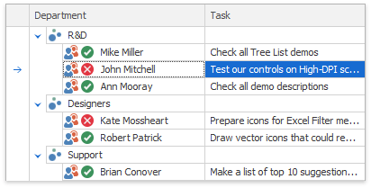
Select and State Icons
You can apply select and state icons to nodes.
Icon | Image | Description |
|---|---|---|
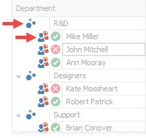
Select icon |
| The main node image. Use the TreeListNode.ImageIndex property to choose an icon from the TreeList.SelectImageList collection assigned to the Tree List. To specify the icon displayed when the node is focused, use the optional TreeListNode.SelectImageIndex property. |
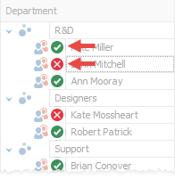
State icon |
| State icons are shown next to select icons and indicate a node’s state. These icons are stored in a separate TreeList.StateImageList collection. Use the TreeListNode.StateImageIndex property to choose a state image from this collection. |
If the TreeListOptionsView.RowImagesShowMode property is set to InCell, icons are shown inside node cells.
See the following help topic for more information: Node Image.
Conditional Formatting
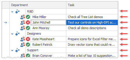
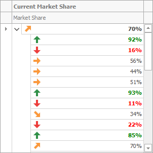
Use this approach when you have a set of icons that display different values or value ranges. In the image below, icons that indicate market share growth are displayed next to cell values.
Tip
For a complete example, run the following DevExpress Demo: Conditional Formatting (MS Excel style) module in the XtraTreeList Main Demo. To view the source code, click Open Solution.
See the following help topic for more information: Conditional Formatting.
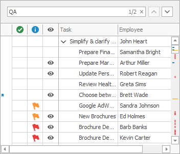
Combo Box with Images
You can use this approach to supply cell values with images or completely replace text entries with these images. The code below replaces check boxes with icons in columns that contain Boolean values.
using DevExpress.XtraEditors.Repository;

RepositoryItemImageComboBox repositoryItemDescriptionComboBox;
repositoryItemDescriptionComboBox = new RepositoryItemImageComboBox();
repositoryItemDescriptionComboBox.AutoHeight = false;
repositoryItemDescriptionComboBox.GlyphAlignment = DevExpress.Utils.HorzAlignment.Center;
repositoryItemDescriptionComboBox.SmallImages = svgImageCollection;
repositoryItemDescriptionComboBox.Items.Add("", true, 3);

treeList1.RepositoryItems.Add(repositoryItemDescriptionComboBox);
descriptionColumn.ColumnEdit = repositoryItemDescriptionComboBox;
Tip
For a complete example, run the following DevExpress Demo: Hierarchy Column module in the XtraTreeList Main Demo. To view the source code, click Open Solution in the ribbon.
Context Icons in Text Box
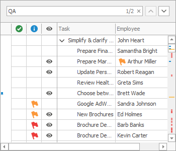
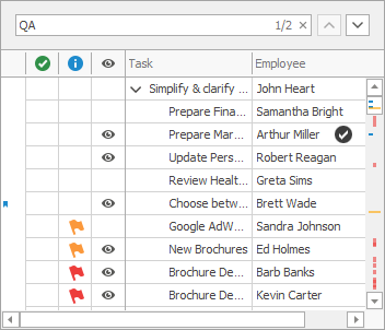
RepositoryItemTextEdit.ContextImageOptions specify a raster or vector icon assigned to the text box. You can display the same icon in all cells that utilize this repository item. To display different icons in individual cells, create multiple RepositoryItemTextEdit objects and handle the TreeList.CustomNodeCellEdit event to assign these repository items to cells. In the example below, a text box with a context image is assigned to the cell that contains “Arthur Miller”.
using DevExpress.XtraEditors.Repository;

RepositoryItemTextEdit repositoryItemTextEdit2;
repositoryItemTextEdit2 = new RepositoryItemTextEdit();
repositoryItemTextEdit2.ContextImageOptions.SvgImage = svgImageCollection[0];
treeList1.RepositoryItems.Add(repositoryItemTextEdit2);

private void treeList1_CustomNodeCellEdit(object sender, GetCustomNodeCellEditEventArgs e) {
    TreeList treeList = sender as TreeList;
    if(e.Node.Id != TreeList.NewItemNodeId && e.Column == employeeColumn && treeList.GetRowCellValue(e.Node, e.Column).ToString() == "Arthur Miller") {
        e.RepositoryItem = repositoryItemTextEdit2;
    }
}
Unbound Columns
If you need a column (with images) that is not associated with specific data source values, create an unbound column with a RepositoryItemPictureEdit object as an in-place editor. Handle the TreeList.CustomUnboundColumnData event to supply this column with images.
HTML Formatting
Use the TreeList.HtmlImages collection and the Image HTML tag to embed images into cells. Note that this approach makes a cell non-editable.
treeList1.HtmlImages = svgImageCollection1;
treeList1.RowHeight = 60;
TreeListColumn unbound = new TreeListColumn();
unbound.UnboundDataType = typeof(string);
unbound.FieldName = "unboundImageColumn";
unbound.Visible = true;
unbound.Caption = "Icon";
treeList1.Columns.Add(unbound);
RepositoryItemHypertextLabel htLabel = new RepositoryItemHypertextLabel();
htLabel.HtmlImages = svgImageCollection1;
treeList1.RepositoryItems.Add(htLabel);
unbound.ColumnEdit = htLabel;
treeList1.CustomUnboundColumnData += TreeList1_CustomUnboundColumnData;

private void TreeList1_CustomUnboundColumnData(object sender, DevExpress.XtraTreeList.TreeListCustomColumnDataEventArgs e) {
    if (e.Column.Caption == "Icon") {
        //image from a collection
        e.Value = "<image=add_32x32.png>";
        //image from resources
        //e.Value = "<image=#_589812_200>";
    }
}
Draw a Cell
Handle the CustomDrawNodeCell event to repaint cells, and draw custom images and shapes. In this example, an image is drawn in the cell that contains “Arthur Miller”.
private void treeList1_CustomDrawNodeCell(object sender, CustomDrawNodeCellEventArgs e) {
    TreeList treeList = sender as TreeList;
    if (e.Node.Id != TreeList.NewItemNodeId && e.Column == employeeColumn && treeList.GetRowCellValue(e.Node, e.Column).ToString() == "Arthur Miller") {
        e.Cache.DrawImage(imageCollection1.Images[0], e.Bounds.X + offsetX, e.Bounds.Y + offsetY);
    }
}
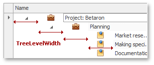
Node Indents
A node indent is the distance between the control’s border and the border of the node’s first cell. The TreeList.TreeLevelWidth property specifies this distance for root nodes.
Node Checkboxes and Radio Buttons
You can add check boxes or radio buttons to TreeList nodes at certain tree levels.
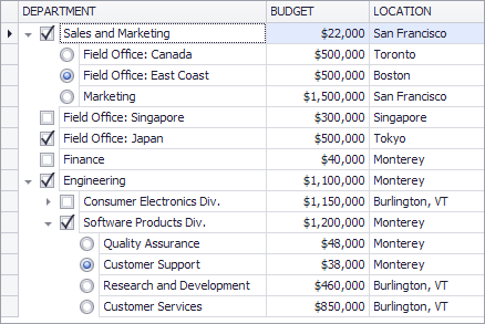
To set or retrieve node check states, use the TreeList control’s methods. In bound mode, you can sync node check states with a data source field. See the following help topic for more information: Node Checking - Checkboxes and Radio Buttons.
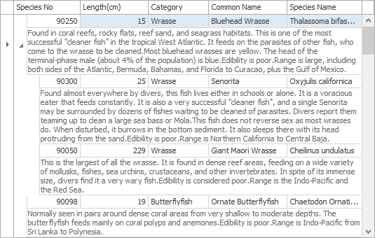
Preview Sections
A preview section is a non-editable note displayed across all columns under a node.
Refer to the following help topic for more information: Preview Sections.
Examples
- How to: Iterate through nodes and calculate the number of nodes at a specific level
- How to: Iterate through nodes and collapse specific nodes
- How to: Create custom nodes and specify height for individual nodes
- How to: Enable automatic height adjustment