Touch Support
- 2 minutes to read
The Ribbon Control fully supports touch-input devices. This not only means that end-users can use touch gestures to operate the Ribbon, but the control itself can be switched to Touch UI mode. In this mode, more space is added around the ribbon items, to make them easier to tap on touchscreen devices. The following image illustrates the same Ribbon Control with Touch UI mode enabled and disabled.

Touch UI mode also modifies the appearance of Gallery Controls: instead of three buttons (scroll up, scroll down, open pop-up), only one drop-down button is displayed. In Touch UI mode, end-users can drag gallery content to scroll it up or down. The image below shows the difference in appearance.

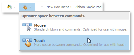
To specify whether or not Touch UI mode is enabled on application start-up, use the RibbonOptionsTouch.TouchUI property. Your end-users can also choose between Mouse and Touch UI modes at runtime via a corresponding selector in the Quick Access Toolbar (QAT) (see the image below).

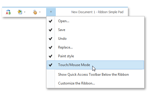
The RibbonOptionsTouch.ShowTouchUISelectorInQAT property specifies whether or not this selector is currently visible. If the RibbonOptionsTouch.ShowTouchUISelectorVisibilityItemInQATMenu property equals true, end-users can manually display or hide the Touch UI selector within the QAT. To do so, invoke the QAT menu and check or uncheck the corresponding menu item, as shown in the image below.

The Touch UI mode for the Ribbon Control is available for all DevExpress Skins.