Office View
- 7 minutes to read
| The Office View emulates settings panels available in Microsoft Office applications. This view type supports the following features:
To activate the Office View, set the PropertyGridControl.ActiveViewType property to Office. |
Important
The Office View does not support multi-editor rows. If the control contains multi-editor rows and you change the ActiveViewType property from Classic to Office in the Windows Forms Designer, the control automatically converts multi-editor rows into multiple single-editor rows. This operation is irreversible.
Tip
Run the following demo to see the Office View: Property Grid module in the XtraVerticalGrid MainDemo.
Organize Properties into Tabs
The default Office View displays properties without tabs. To organize properties into tabs, you should create these tabs and assign properties to them. The images below display the same object with and without tabs.

To create tabs, follow the steps below:
Assign an object to the PropertyGridControl.SelectedObject property.
In the control’s smart tag, click Run Designer. Switch to the Tabs page.
Click Create Tab. Select the created tab and use the check boxes on the right to add properties to the tab. Note that the Property Grid does not display a property if you do not assign it to a tab.
Use the Tab Properties section to specify the tab’s caption and icon.
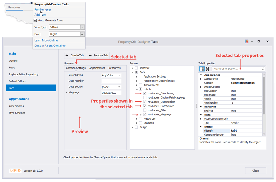
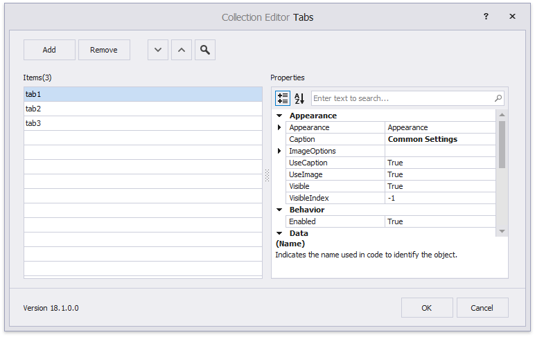
You can also click the PropertyGridControl.Tabs property’s ellipsis button in the Properties window to invoke a dialog that creates tabs.
Organize Properties into Tabs in Code
Handle the PropertyGridControl.TabPanelCustomize event as follows to create tabs in code and populate them with properties and categories:
- Create DevExpress.XtraVerticalGrid.Tab objects.
- Add property names to the tab’s FieldNames collection.
- Add category names (see CategoryAttribute) to the tab’s CategoryNames collection. If a category name has a space symbol, replace it with an underscore. For example, replace Window Style with Window_Style.
- Add tabs to the Tabs collection.
- Use the PropertyGridControl.SelectedTab property to specify the selected tab (optional).
Example
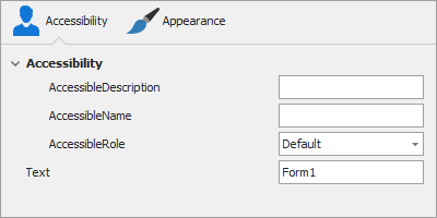
The code sample below organizes properties into the following tabs:
- Accessibility — contains the Accessibility category and the Text property.
- Appearance — contains the Appearance category.
using DevExpress.XtraVerticalGrid;
using DevExpress.Utils.Svg;

private void propertyGridControl1_TabPanelCustomize(object sender, DevExpress.XtraVerticalGrid.Events.TabPanelCustomizeEventArgs e) {
    //Tab #1.
    Tab tab1 = new Tab();
    tab1.Caption = "Accessibility";
    tab1.ImageOptions.Image = SvgBitmap.FromFile(@"D:\Images\Pages.svg").Render(null, 1);
    //Add a property.
    tab1.FieldNames.Add("Text");
    //Add a category.
    tab1.CategoryNames.Add("Accessibility");

    //Tab #2.
    Tab tab2 = new Tab();
    tab2.Caption = "Appearance";
    tab2.ImageOptions.Image = SvgBitmap.FromFile(@"D:\Images\Medium.svg").Render(null, 1);
    tab2.CategoryNames.Add("Appearance");

    e.Tabs.Add(tab1);
    e.Tabs.Add(tab2);

    propertyGridControl1.SelectedTab = propertyGridControl1.Tabs[0];
}
Display Trackbars for Numeric Properties
To display a trackbar editor for a numeric property, enable the ShowTrackBar option. Use the MinValue and MaxValue to specify the trackbar’s minimum and maximum values, respectively.
If you generate rows at design time, you can also set these properties in the designer.
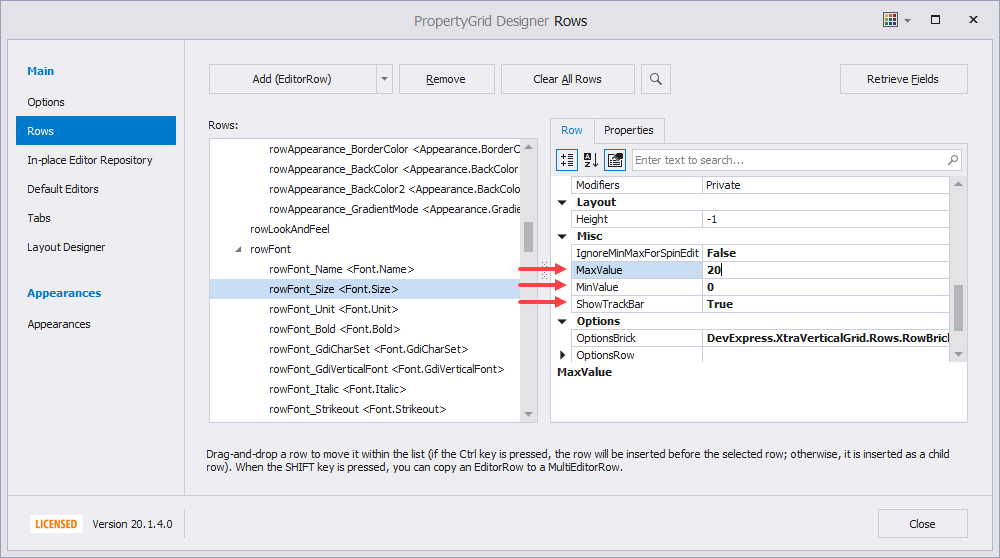
You can also use the ShowTrackBar event argument in a PropertyGridControl.CustomRowCreated event handler.
The code below displays a trackbar editor for the Font.Size property. The event handler also specifies the minimum and maximum editor values.
private void PropertyGridControl1_CustomRowCreated(object sender, DevExpress.XtraVerticalGrid.Events.CustomRowCreatedEventArgs e) {
    if (e.Row.Properties.FieldName == "Font.Size") {
        PGridNumericEditorRow row = e.Row as PGridNumericEditorRow;
        row.MinValue = 8;
        row.MaxValue = 72;
        row.ShowTrackBar = true;
        row.IgnoreMinMaxForSpinEdit = true;
    }
}
Customize Rows Dynamically
The Property Grid fires the PropertyGridControl.CustomRowCreated event when it generates rows. You can handle this event to customize created rows.
The following example displays properties of an AppSettings object in a Property Grid in OfficeView mode. The code handles the PropertyGridControl.CustomRowCreated event to hide editors for the SystemSettings and ReportSettings properties.
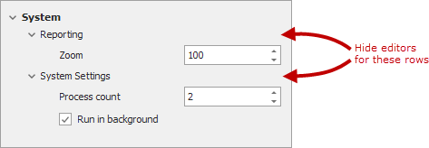
public partial class Form1 : Form {
    public AppSettings Settings { get; set; } = new AppSettings();
    public Form1() {
        InitializeComponent();
        propertyGridControl1.ActiveViewType = DevExpress.XtraVerticalGrid.PropertyGridView.Office;
        propertyGridControl1.CustomRowCreated += PropertyGridControl1_CustomRowCreated;
        propertyGridControl1.SelectedObject = Settings;
    }
    private void PropertyGridControl1_CustomRowCreated(object sender, DevExpress.XtraVerticalGrid.Events.CustomRowCreatedEventArgs e) {
        // Hide editors for "SystemSettings" and "ReportSettings" properties.
        if (e.Row.Properties.FieldName == "SystemSettings" || e.Row.Properties.FieldName == "ReportSettings") {
            e.Row = new PGridEmptyRow();
            e.Handled = true;
        }
    }
}

public class AppSettings {
    [Category("System")]
    [DisplayName("System Settings")]
    [TypeConverter(typeof(ExpandableObjectConverter))]
    public SystemSettings SystemSettings { get; } = new SystemSettings();

    [Category("System")]
    [DisplayName("Reporting")]
    [TypeConverter(typeof(ExpandableObjectConverter))]
    public ReportSettings ReportSettings { get; set; } = new ReportSettings();
}

public class SystemSettings {
    [DisplayName("Run in background")]
    [Category("System")]
    [DefaultValue(true)]
    public bool RunInBackground { get; set; } = true;

    [DisplayName("Process count")]
    [Category("System")]
    [DefaultValue(2)]
    public int ProcessCount { get; set; } = 2;
}

public class ReportSettings {
    [DisplayName("Zoom")]
    [DefaultValue(100)]
    public decimal ZoomFactor { get; set; } = 100;
}
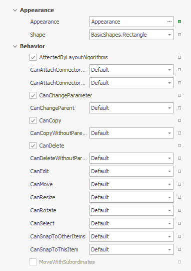
Row Bricks (Property Markers)
The Office View can display property markers — small rectangles displayed next to property editors. A property marker shows whether a property is set to its default value and allows a user to invoke a context menu.
Enable Property Markers and Populate the Context Menu
To display property markers, enable the ShowRowBrick option. The default context menu contains the Reset command that sets the property to its default value. To populate the context menu with custom commands, handle the PropertyGridControl.RowBrickMenuShowing event.
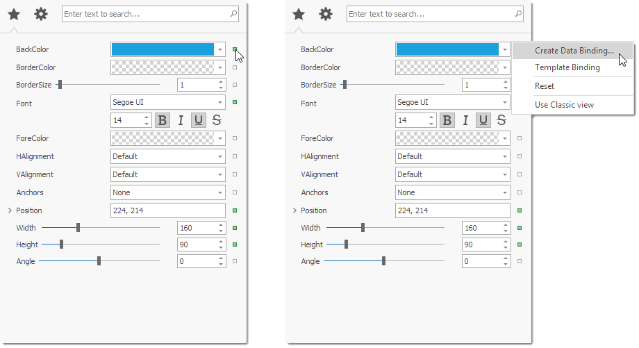
using DevExpress.Utils.Menu;

DXMenuItem createDataBindingItem;
protected DXMenuItem CreateDataBindingItem {
    get {
        if (createDataBindingItem == null) {
            DXMenuItem item = new DXMenuItem("Create Data Binding...");
            item.Click += (s, ee) => MessageBox.Show("'Create Data Binding...' is clicked.");
            createDataBindingItem = item;
        }
        return createDataBindingItem;
    }
}
private void Grid_RowBrickMenuShowing(object sender, Events.PopupMenuShowingEventArgs e) {
    if(e.Row.Properties.FieldName == "Appearance.BackColor")
        e.Menu.Items.Add(CreateDataBindingItem);
}
Note
When a user right-clicks a property (not a property marker), the context menu does not contain commands added in a RowBrickMenuShowing event handler.
Property Marker Colors
A property marker color depends on whether the property is set to its default value. The default colors depend on the applied skin. You can handle the PropertyGridControl.CustomDrawRowBrick event to customize property marker colors.
private void propertyGridControl1_CustomDrawRowBrick(object sender, DevExpress.XtraVerticalGrid.Events.CustomDrawRowBrickEventArgs e) {
    e.Handled = true;
    Size size = new Size(7, 7);
    Rectangle bounds = RectangleHelper.GetCenterBounds(e.RowBrickInfo.BrickArea, size);
    if (e.RowBrickInfo.State == DevExpress.Utils.Drawing.ObjectState.Normal)
        e.Cache.FillRectangle(Color.Transparent, bounds);
    if (e.RowBrickInfo.State == DevExpress.Utils.Drawing.ObjectState.Hot)
        e.Cache.FillRectangle(Color.LightGray, bounds);
    e.Cache.DrawRectangle(bounds, Color.DarkGray, e.RowBrickInfo.BorderThickness);
}
Data Editing in Office View
The Property Grid control with active Office View posts changes to a data source immediately. Use the OptionsBehavior.AutoPostEditorDelay property to specify the delay between changing a value in the editor and posting it to the data source.