Fluent Design Form
- 9 minutes to read
The FluentDesignForm is a Windows 10-inspired form that features:
- An embedded Hamburger Menu (AccordionControl)
- Adaptive Layout mode for the Hamburger Menu
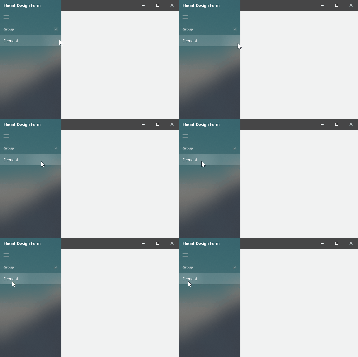
- Acrylic Material effect (a partially transparent texture)
- Reveal Highlight visual effect
Important
Fluent Design Forms cannot be used as MDI containers.
Add Fluent Design Forms
To create a new project with a FluentDesignForm. Use the Template Kit for WinForms to quickly create a Fluent Design application that targets .NET 8+, or use the DevExpress Project Template Gallery if your project targets .NET Framework.
Convert Standard Forms to Fluent Design Forms
To convert an existing form to a FluentDesignForm, use the Convert to Fluent Design Form command, which is available from:
- The form’s smart-tag menu
- The FormAssistant component (see Form Assistant)
Change your form’s base class to FluentDesignForm to convert the form manually in code. You also need to add the DevExpress.XtraBars library to your project. See the complete code sample at the end of this help topic.
namespace DXApplication1 {
    public partial class Form1 : DevExpress.XtraBars.FluentDesignSystem.FluentDesignForm {
        public Form1() {
            InitializeComponent();
        }
    }
}
Form Elements
A Fluent Design Form creates three controls when it is added to a project using the Template Gallery and Convert to Fluent Design Form commands:
AccordionControl with the HamburgerMenu view type enabled — Allows you to implement a menu (a navigation control) with custom commands arranged in a simple or hierarchical list.
HamburgerMenu is one of the two AccordionControl view types (switch the AccordionControl.ViewType property to HamburgerMenu to activate it). This view type features:
The Hamburger button (expands/collapses the menu).
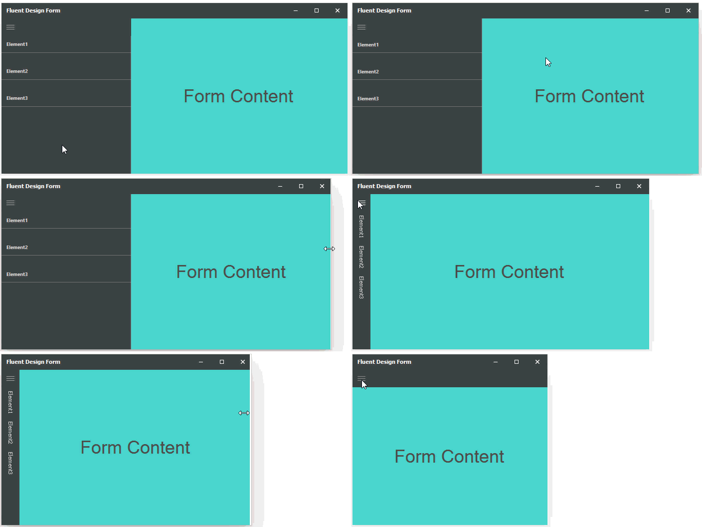
Three display modes (Inline, Overlay, and Minimal). The Fluent Design Form automatically switches between these modes when you resize the form. See the Adaptive Layout section below.
- FluentDesignFormControl — The form’s header, which displays the form’s caption and allows you to show custom commands (bar item links) on its surface.
- FluentDesignFormContainer — Add custom controls to this container to display them in the form’s client region.

Drop the BarAndDockingController component onto a Form and assign it to the FluentDesignFormControl.Manager.Controller property to enable the customization of bar items.
Acrylic and Reveal Highlight Effects
The SurfaceMaterial setting enables the Acrylic Material (a semi-transparent texture) and Reveal Highlight effects for an embedded Accordion Control (Hamburger Menu). Note that the Accordion Control supports this visual effect in Inline mode only (see the “Adaptive Layout” section below).

Note
Both effects are enabled only if the application runs under Windows 10 Version 1803 (OS build 17134) or newer. Due to the recent changes in Windows API, these effects are temporarily disabled in Windows 10 Build 1903.
Adaptive Layout
When the Adaptive Layout functionality is enabled (the default setting), the Fluent Design Form automatically switches the Hamburger Menu’s display mode between Inline, Overlay, and Minimal when you expand or shrink the form.

The table below describes the Hamburger Menu’s display modes (AccordionOptionsHamburgerMenu.DisplayMode) and form widths that trigger display mode switching.
Hamburger Menu’s Display Mode | Form Width |
|---|---|
Inline
| Wide Width is greater than OptionsAdaptiveLayout.InlineModeThreshold. The default property value is 650 pixels. |
Overlay
| Normal The width of the Hamburger Menu is between OptionsAdaptiveLayout.OverlayModeThreshold (default value is 450 pixels) and OptionsAdaptiveLayout.InlineModeThreshold (default value is 650 pixels). |
Minimal
| Compact The width of the Hamburger Menu is less than OptionsAdaptiveLayout.OverlayModeThreshold. The default property value is 450 pixels. |
The OptionsAdaptiveLayout.AdaptiveLayout option is hidden at design time. You can modify it in code as follows.
public partial class Form1 : DevExpress.XtraBars.FluentDesignSystem.FluentDesignForm {
    public Form1() {
        InitializeComponent();
        this.OptionsAdaptiveLayout.AdaptiveLayout = false;
    }
...
}
The Adaptive Layout functionality is not supported when the AccordionControl.ViewType property is set to Standard.
Hamburger Menu Overlaps Title Bar
The Accordion Control (Hamburger Menu) occupies the entire form height in certain skins, so that it overlaps the title bar.

When required, you can disable this behavior by overriding the ExtendNavigationControlToFormTitle virtual property.
public partial class Form1 : FluentDesignForm {
    //...
    protected override bool ExtendNavigationControlToFormTitle {
        get { return false; }
    }
}
Note
The title overlap feature is supported when:
Your form uses one of the following skins:
The Bezier
Office 2019 Colorful
Office 2016 Black
Office 2016 Dark
Office 2016 Colorful
- The application runs on Windows 10 Version 1803 (OS build 17134) or newer.
Create Fluent Design Form with Side Navigation
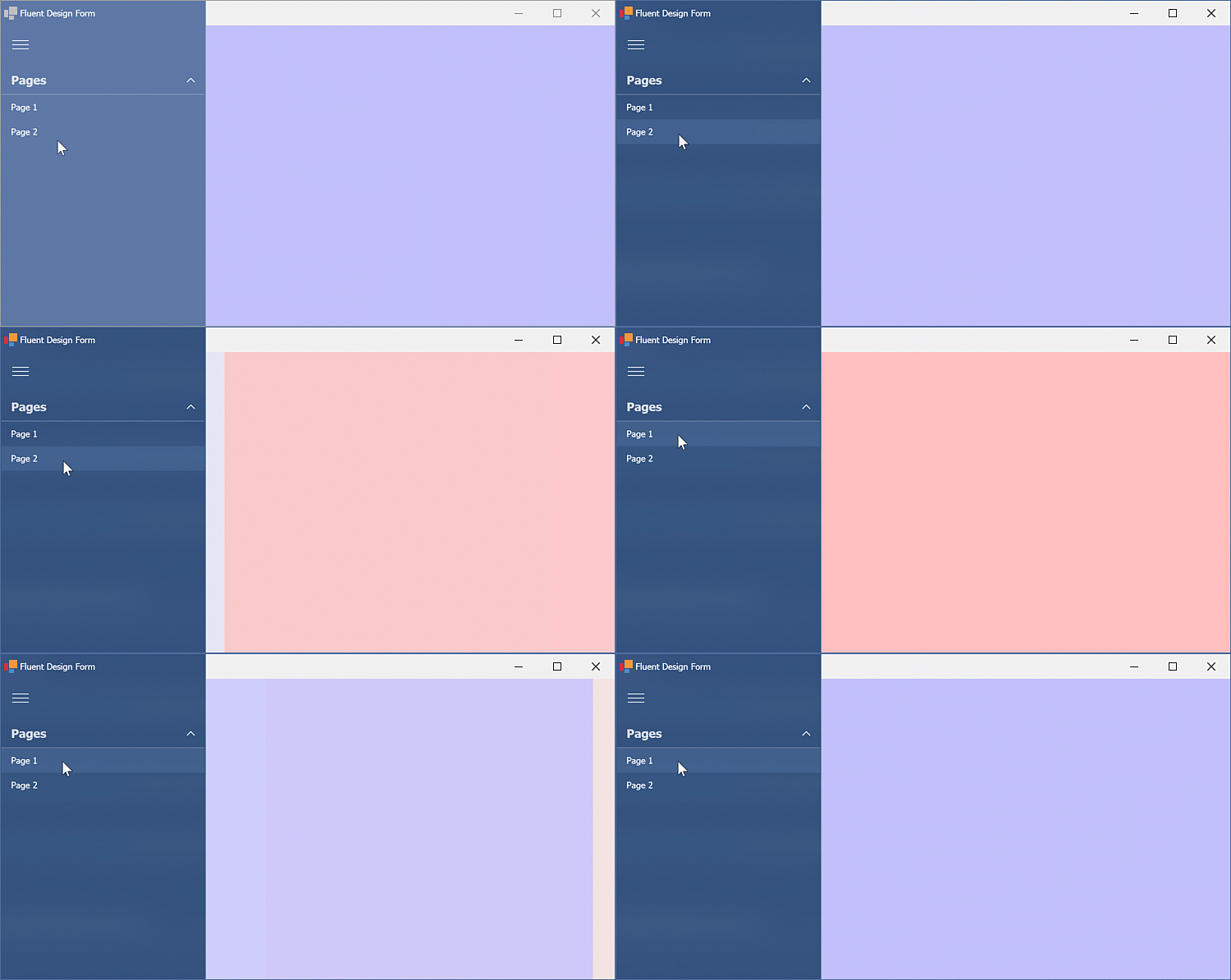
This example demonstrates how to implement a side navigation. Create a Fluent Design Form with the WinForms Accordion and Navigation Frame controls.

Use the following code to create the accordion elements, customize their settings, and implement the navigation between frames/pages.
using System;
using DevExpress.XtraBars.Navigation;

namespace DXFluentDesignApp {
    public partial class Form1 : DevExpress.XtraBars.FluentDesignSystem.FluentDesignForm {
        public Form1() {
            InitializeComponent();
            InitAccordion(accordionControl1);
        }
        void InitAccordion(AccordionControl accordion) {
            accordion.Elements.Clear();
            AccordionControlElement group = new AccordionControlElement(ElementStyle.Group) {
                Name = "accordionGroup1",
                Text = "Pages",
                Expanded = true
            };
            AccordionControlElement item1 = new AccordionControlElement(ElementStyle.Item) {
                Name = "accordionItem1",
                Text = "Page 1"
            };
            AccordionControlElement item2 = new AccordionControlElement(ElementStyle.Item) {
                Name = "accordionItem2",
                Text = "Page 2"
            };

            item1.Click += new EventHandler(this.accordionElement_Click);
            item2.Click += new EventHandler(this.accordionElement_Click);

            group.Elements.AddRange(new AccordionControlElement[] { item1, item2 });
            accordion.Elements.Add(group);
        }
        void accordionElement_Click(object sender, EventArgs e) {
            AccordionControlElement item = sender as AccordionControlElement;
            navigationFrame1.SelectedPage = item.Text == "Page 1" ? navigationPage1 : navigationPage2;
        }
    }
}
The animation below illustrates the result:

Create a Fluent Design Form with Header Buttons
The sample below shows how to add and set up the main Fluent Design Form elements in code, and populate the header control with buttons.
using DevExpress.XtraBars;
using DevExpress.XtraBars.FluentDesignSystem;
using System.Windows.Forms;

namespace DXApplication16 {
    public partial class Form1 : FluentDesignForm {
        public Form1() {
            InitializeComponent();
            // Create header control that contains buttons
            FluentDesignFormControl fdfControl = new FluentDesignFormControl();
            // Create buttons
            BarSubItem bsiMain = new BarSubItem() { Caption = "Main" };
            BarButtonItem biNew = new BarButtonItem() { Caption = "New" };
            BarButtonItem biOpen = new BarButtonItem() { Caption = "Open" };
            BarButtonItem biClose = new BarButtonItem() { Caption = "Close" };
            SkinDropDownButtonItem skinItem = new SkinDropDownButtonItem();
            SkinPaletteDropDownButtonItem paletteItem =
                new SkinPaletteDropDownButtonItem();
            // Call BeginInit-EndInit methods to make sure
            // the header control is set up correctly
            fdfControl.BeginInit();
            this.FluentDesignFormControl = fdfControl; // Bind header control with form
            this.Controls.Add(fdfControl); // Add header control to form
            bsiMain.AddItems(new BarItem[] { biNew, biOpen, biClose }); // Fill sub-item
            // BarItems require a BarManager to operate
            // Every FluentDesignFormControl has an internal BarManager
            // Add bar items to the Items collection to assign them to this manager
            fdfControl.Items.AddRange(new BarItem[] {
                skinItem, paletteItem, bsiMain, biNew, biOpen, biClose
            });
            // Items that the header control should display
            fdfControl.TitleItemLinks.AddRange(new BarItem[] {
                bsiMain, skinItem, paletteItem
            });
            fdfControl.EndInit();

            // FluentDesignFormContainer fills the entire client area
            // of a form and hosts all form controls
            FluentDesignFormContainer fdfContainer = new FluentDesignFormContainer();
            this.ControlContainer = fdfContainer;
            this.Controls.Add(fdfContainer);
            fdfContainer.Dock = DockStyle.Fill;
            fdfContainer.Controls.AddRange(new Control[] {
                // Client area controls
            });
        }
    }
}
