Hints and Tooltips
- 5 minutes to read
This document defines a tooltip, explains how to use it and lists its main features. Note that the tooltip is available for all diagram types.
If you wish to use an alternative tool to interact with chart data, you can use a crosshair cursor instead. See the Crosshair Cursor topic to learn more.
This topic consists of the following sections.
Overview
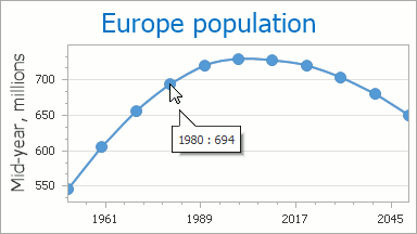
A tooltip is a small pop-up rectangle that shows information for a hovered series and series points.
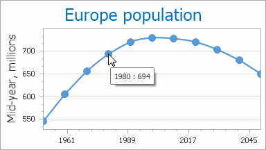
A tooltip can contain a beak that points to a series point, directing your attention to this hovered element.
To display a beak, do the following:
- drop a ToolTipController component onto a Windows Form from the DX.25.2: Components toolbox tab;
- assign a ToolTipController object to the chart control using the ChartControl.ToolTipController property;
- set the ToolTipController.ShowBeak property to true.
For more information on the tooltip controller for Windows Forms, see the Hints and Super Tooltips section.
By default, a tooltip displays series point arguments and values, but it is possible to specify custom content as well.
See the Format Tooltip Data section to learn more.
Using Tooltips
Enable tooltips
To start using tooltips, you need to set the ChartControl.ToolTipEnabled property to true.
Note
For a series that supports data point markers, a tooltip appears for a series data point when these markers are visible, so make sure the MarkerVisibility property is set to true for the corresponding series (e.g.,LineSeriesView.MarkerVisibility).
It is also possible to enable/disable tooltips for a particular series via the SeriesBase.ToolTipEnabled property.
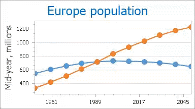
For instance, the following image shows a chart with tooltips disabled for the Spline series.
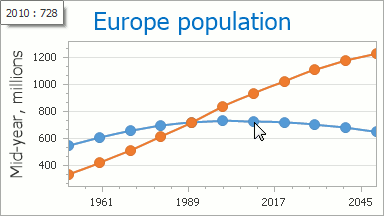
Note
Because the crosshair cursor is enabled by default, you can see it on a chart together with a tooltip.
To hide the default crosshair cursor, set the ChartControl.CrosshairEnabled property to false.
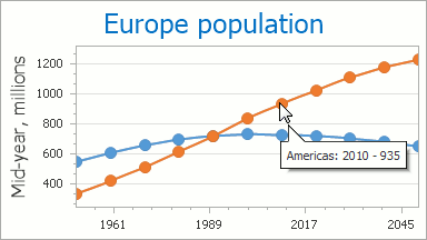
Show tooltips for series
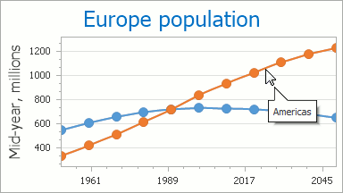
When you interact with a multiple series chart, it is useful to obtain information about a particular series name. Tooltips provide this functionality.
To accomplish this, you first need to specify the desired name to be displayed in the tooltip for each series from the Series.Name property.
Then set the ToolTipOptions.ShowForSeries property to true.
In the image below, a series tooltip is shown for the first Line series.
Tooltip Customization
A ToolTipOptions object contains properties that allow you to customize the displayed data format in a tooltip, as well as specify the tooltip position on a chart.
Formatting Tooltip Text
By default, a tooltip displays an argument and value for each series point.
Use the SeriesBase.ToolTipPointPattern and SeriesBase.ToolTipSeriesPattern properties to change the default text displayed within a tooltip, as well as to format series point values.
You can also specify a pattern using the Pattern Editor (the editor is invoked by clicking the ellipsis button of the specific property in the Properties window).
A full list of available placeholders is detailed below.
| Pattern | Description |
|---|---|
| {A} | Displays a series point argument. |
| {V} | Displays series point values. |
| {VP} | Displays series point values as percentages (for a Pie series and Full-Stacked series). |
| {S} | Displays the name of the series. |
| {G} | Displays the name of a stacked group. |
| {W} | Displays the weight (for a Bubble series). |
| {V1} | Displays the first value (for range series). |
| {V2} | Displays the second value (for range series). |
| {VD} | Displays the duration between the first and second data point values (for range series). |
| {HV} | Displays the high value (for a Financial series). |
| {LV} | Displays the low value (for a Financial series). |
| {OV} | Displays the open value (for a Financial series). |
| {CV} | Displays the close value (for a Financial series). |
| {HINT} | Displays a hint for a series point. |
The image below shows the {S}: {A} - {V} pattern specified for the series points.
Note
The tooltip series pattern only allows you to specify a string in addition to the {S} default placeholder.
The Format Specifiers topic explains which standard and custom formats can be used together with placeholders to format a series point’s numeric and date-time values within a tooltip.
Specify Tooltip Position
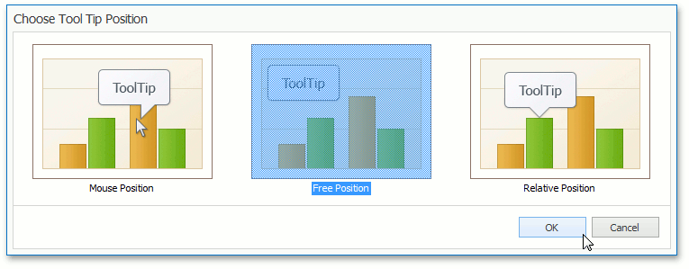
A tooltip has three modes that define its position on a chart.
- ToolTipMousePosition - the tooltip is placed near the mouse pointer.
- ToolTipRelativePosition - the tooltip is placed near the invoked chart element (e.g., on the bar’s top).
- ToolTipFreePosition - the tooltip is placed unbound to any invoked chart element and its position is defined by the current offset, dock target and dock corner.
The following image shows the last tooltip mode with the CrosshairFreePosition.DockCorner property set to TopRight.
You can gain access to the above tooltip modes via the ToolTipOptions.ToolTipPosition property.
To do this at design time, click the ellipse button in the Properties window.
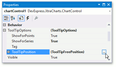
This invokes the Choose Tool Tip Position dialog.
In the ToolTipFreePosition and ToolTipRelativePosition modes, you can specify tooltip position by utilizing the ToolTipPositionWithOffset.OffsetX and ToolTipPositionWithOffset.OffsetY properties.
For additional information on chart interaction, refer to the End-User Capabilities section.