Gantt Appearance Customization
- 2 minutes to read
This topic describes properties and techniques that you can use to customize the appearance of Gantt UI elements.

Gantt Area
Rows
The Gantt Area uses the GanttRowControl elements to display rows with tasks. Create a custom implicit style for the GanttRowControl type to customize rows.
The following code snippet customizes the selected row background color:
<Style TargetType="dxgn:GanttRowControl">
    <Style.Triggers>
        <DataTrigger Binding="{Binding IsFocused}" Value="True">
            <Setter Property="Background" Value="Red"/>
        </DataTrigger>
    </Style.Triggers>
</Style>
Working and Non-Working Days
Use the following properties to specify the display of non-working time intervals within the timeline:
Tasks
The image below illustrates task types.

The table below lists the style properties that affect tasks.
| Characteristics | Members |
|---|---|
| Task Content | GanttView.TaskContentTemplate, GanttView.UseResourcesAsTaskContent |
| Task Content Indent and Position | GanttView.TaskContentIndent, GanttView.TaskContentPosition |
| Row Indent | TreeListView.RowIndent |
| Expand Button Visibility | TreeListNode.IsExpandButtonVisible |
| Milestone | GanttView.MilestoneStyle, GanttView.MilestoneBaselineStyle |
| Summary Task | GanttView.SummaryTaskStyle, GanttView.SummaryTaskBaselineStyle |
| Task | GanttView.TaskStyle, GanttView.TaskBaselineStyle |
The following example colors all unfinished tasks that are behind schedule:
<dxgn:GanttView.TaskStyle>
    <Style TargetType="dxgn:GanttTaskControl">
        <Style.Triggers>
            <DataTrigger Binding="{DXBinding 'Node.FinishDate lt $sys:DateTime.Now and Node.Progress lt 1'}" Value="True">
                <Setter Property="Background" Value="LightCoral" />
                <Setter Property="ProgressBackground" Value="DarkRed" />
            </DataTrigger>
        </Style.Triggers>
    </Style>
</dxgn:GanttView.TaskStyle>
The XAML snippet below customizes the task content:
<dxgn:GanttView.TaskContentTemplate>
    <DataTemplate>
        <TextBlock Text="{Binding Node.Progress, StringFormat=p0}" />
    </DataTemplate>
</dxgn:GanttView.TaskContentTemplate>
Connectors

The table below lists the main properties that affect element behavior and appearance.
| Characteristics | Members |
|---|---|
| Style | GanttView.ConnectorStyle |
| Link Type | GanttPredecessorLink.LinkType |
Resources

Use the GanttView.ResourceStyle property to customize the style applied to resources.
Timescale Rulers
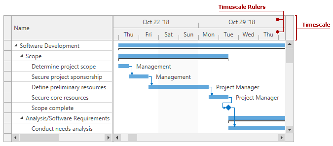
Use the GanttView.TimescaleRulerStyle property to customize the style applied to timescale rulers.
Treelist Area
The Gantt Control is a TreeListControl descendant. You can use the techniques listed in the Data Grid Appearance Customization section to change the look and feel of the Gantt’s treelist area.
Use the GanttControl.Columns property to access the collection of GanttColumn objects.
The following code snippet formats cell values:
<dxgn:GanttControl.Columns>
    <dxgn:GanttColumn BindTo="StartDate">
        <dxgn:GanttColumn.EditSettings>
            <dxe:DateEditSettings ShowWeekNumbers="True"
                DisplayFormatString="dd.MM.yyyy HH:mm" Mask="dd.MM.yyyy HH:mm" />
        </dxgn:GanttColumn.EditSettings>
    </dxgn:GanttColumn>
    <dxgn:GanttColumn BindTo="FinishDate">
        <dxgn:GanttColumn.EditSettings>
            <dxe:DateEditSettings ShowWeekNumbers="True"
                MaskUseAsDisplayFormat="True" Mask="dd.MM.yyyy HH:mm" />
        </dxgn:GanttColumn.EditSettings>
    </dxgn:GanttColumn>
</dxgn:GanttControl.Columns>