ComboBoxEdit Operation Modes
The ComboBoxEdit supports the following operation modes:
- default
- checked
- radio
- token
- checked token
To specify the mode, set the StyleSettings property to the corresponding mode object.
Combobox (Default)
The mode object: ComboBoxStyleSettings.
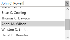
<dxe:ComboBoxEdit ItemsSource="{Binding Customers}">
    <dxe:ComboBoxEdit.StyleSettings>
        <dxe:ComboBoxStyleSettings />
    </dxe:ComboBoxEdit.StyleSettings>
</dxe:ComboBoxEdit>
Checked Combobox
The mode object: CheckedComboBoxStyleSettings.
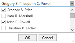
<dxe:ComboBoxEdit ItemsSource="{Binding Customers}">
    <dxe:ComboBoxEdit.StyleSettings>
        <dxe:CheckedComboBoxStyleSettings />
    </dxe:ComboBoxEdit.StyleSettings>
</dxe:ComboBoxEdit>
Radio Button Combobox
The mode object: RadioComboBoxStyleSettings.
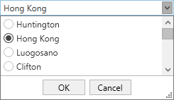
<dxe:ComboBoxEdit ItemsSource="{Binding Cities}">
    <dxe:ComboBoxEdit.StyleSettings>
        <dxe:RadioComboBoxStyleSettings />
    </dxe:ComboBoxEdit.StyleSettings>
</dxe:ComboBoxEdit>
Token Combobox
The mode object: TokenComboBoxStyleSettings.
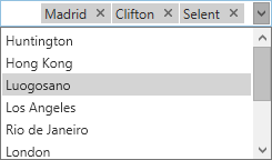
<dxe:ComboBoxEdit ItemsSource="{Binding Cities}">
    <dxe:ComboBoxEdit.StyleSettings>
        <dxe:TokenComboBoxStyleSettings />
    </dxe:ComboBoxEdit.StyleSettings>
</dxe:ComboBoxEdit>
Checked Token Combobox
The mode object: CheckedTokenComboBoxStyleSettings.
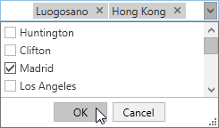
<dxe:ComboBoxEdit ItemsSource="{Binding Cities}">
    <dxe:ComboBoxEdit.StyleSettings>
        <dxe:CheckedTokenComboBoxStyleSettings />
    </dxe:ComboBoxEdit.StyleSettings>
</dxe:ComboBoxEdit>
Refer to the following help topic for more information: Multiple Selection in ComboBoxEdit, LookUpEdit, and ListBoxEdit.
See Also