Date Navigator (legacy)

  • 5 minutes to read

Note

You are viewing documentation for the legacy WPF Scheduler control. If you’re starting a new project, we strongly recommend that you use a new control declared in the DevExpress.Xpf.Scheduling namespace. If you decide to upgrade an existing project in order to switch to the updated scheduler control, see the Migration Guidelines document.

This document introduces the Date Navigator, along with describing its main features and capabilities. The table below lists the control’s main members, exposes its main functionality and allows you find the necessary APIs.

What Is the Date Navigator?

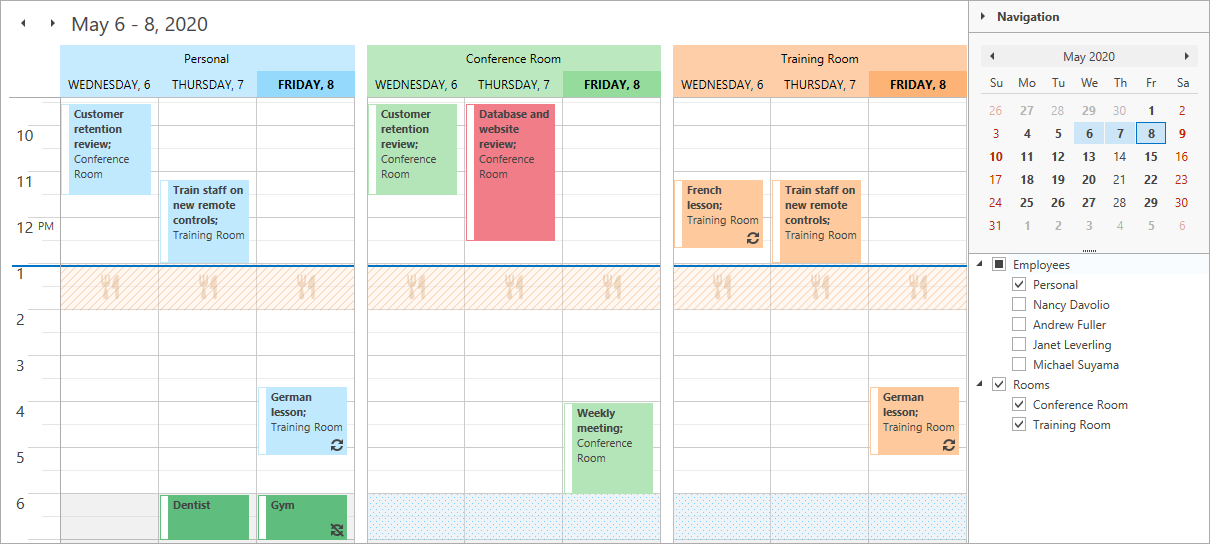
Date Navigator is a control of the DXEditors Suite for WPF. It is represented by the DateNavigator class instance. This control can function in a standalone mode allowing end-users to navigate in a calendar, and choose a day or range of days. It can also be bound to SchedulerControl to let your end-users easily navigate through the dates in the Scheduler Control. Date Navigator automatically switches scheduler views when there is a more appropriate view to display the selected date or date range. In short, this control performs the same function as the corresponding control in Microsoft® Outlook®. A scheduling application can be created without using Date Navigator; use this control, however, if you wish to deliver the Microsoft Outlook style to your scheduling application interface.

How Does the Date Navigator Look?

Date Navigator usually shows dates for one or more months at a time (if the DateNavigator.CalendarView property is set to DateNavigatorCalendarView.Month). In this case, Date Navigator includes a navigation pane (including a range of currently shown months, year and navigation arrows used to move backwards and forwards through months), calendars each of which corresponds to a particular month, and a Today button that can be optionally displayed at the bottom of the DateNavigator control. Each monthly calendar consists of a month header (displaying month and year) and days (within week days and week numbers).

DXDateNavigator

The DateNavigator control can display not only month or several months. It allows you to display date ranges of different scope using different calendar views (DateNavigatorCalendarView). End-users can quickly change calendar views by clicking the navigation pane of the Date Navigator. To specify a calendar view in code, use the DateNavigator.CalendarView property. Note that by default the number of calendars shown at a time in the DateNavigator control is selected automatically according to the control’s current size and changes every time a control is resized. To set a fixed number and layout of calendars displayed within the Date Navigator, use the DateNavigator.RowCount and DateNavigator.ColumnCount properties.

When the DateNavigator control is bound to SchedulerControl (DateNavigator.StyleSettings), any selection made in the Date Navigator is synchronized with the scheduler control.

Selecting one day or several non-consecutive days results in a scheduler displaying them using the Day View. If selected successive days do not comprise a full week, they are displayed using the Day View. If the entire week is selected, the scheduler control displays it using the Full Week View. Selecting consecutive days that form more than a week results in scheduler control being switched to the Month View. This behavior is by default, and to avoid switching the view you can only disable the unneeded views in the scheduler (SchedulerViewBase.Enabled).

The DateNavigator control indicates days with appointments by displaying them in bold, while holidays are highlighted with red. You can set the DateNavigator.HighlightSpecialDates property value to false to force the control not to paint days with appointments using the bold font.

In a bound mode, the day from which the Date Navigator week starts is specified via the OptionsView.FirstDayOfWeek property. If the DateNavigator control functions in a standalone mode, use the DateNavigator.FirstDayOfWeek property to set the first day of the week in Date Navigator.

What Are the Main Members of the Date Navigator?

The following table lists the main properties of the DateNavigator class, which implement its basic functionality.

Member Name Description
DateNavigator.StyleSettings Gets or sets an object that defines the DateNavigator control’s appearance and behavior. This is a dependency property.
DateNavigator.ShowWeekNumbers Gets or sets a value indicating whether week numbers will be shown in the Date Navigator. This is a dependency property.
DateNavigator.ShowTodayButton Gets or sets a value which specifies whether the Today button is visible. This is a dependency property.
DateNavigator.WeekNumberRule Gets or sets the rule which specifies the first week of the year. This is a dependency property.
DateNavigator.HighlightHolidays Gets or sets a value indicating if holiday dates should be highlighted in red. This is a dependency property.
DateNavigator.HighlightSpecialDates Gets or sets a value indicating whether the special dates should be shown bold. This is a dependency property.
DateNavigator.IsMultiSelect Gets or sets a value indicating if end-users can select several dates at the same time in the Date Navigator. This is a dependency property.
DateNavigator.CalendarView Gets or sets the calendar display mode. This is a dependency property.

To get a step-by-step tutorial on how to bind DateNavigator to SchedulerControl, refer to the Lesson 4 - Use the DateNavigator Control (legacy) document.

See Also