Floating Containers
- 10 minutes to read
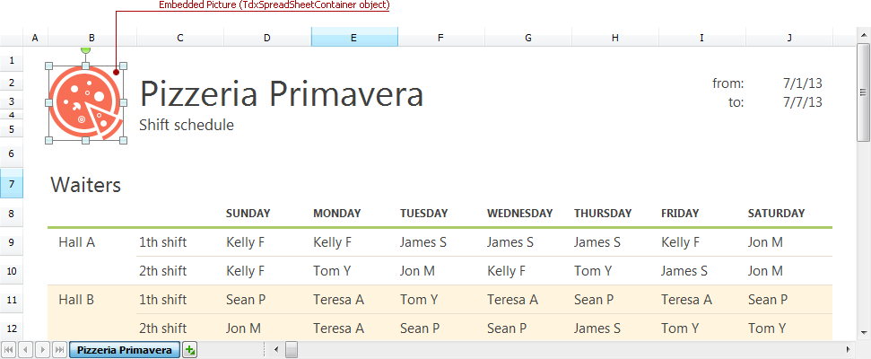
The Spreadsheet control provides the floating container object functionality, which allows you to embed bitmap images, shapes, text boxes, and comments into your spreadsheet documents. These embedded objects float over the worksheet table layer and are anchored to specific cell objects and/or points within the sheet’s area. All floating containers have multiple customization and management options, including, but not limited to, operations such as creation, destruction, moving, resizing, rotation, and layer rearrangement. Most of these options are available for end-users out-of-the-box via the container object context menu and drag-and-drop operations.
The floating containers are arranged in layers from bottom to top, according to the order of their creation. If the containers do not overlap each other, and there is no visual difference between the topmost and underlying embedded objects. You can rearrange floating containers by invoking their BringToFront and SendToBack procedure while an end-user can do the same by clicking the corresponding menu items in the container context menu.
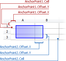
Both the position and dimensions of all floating containers are determined by their anchoring points within a Custom View worksheet. Each container has two anchor points located in the upper-left (specifies the container’s origin) and bottom-right (specifies the container’s width and height) corners of the container’s bounding box. The Spreadsheet control supports three container anchoring modes:
Absolute (offset) position anchoring. The upper-left container corner’s position is specified as an absolute offset value (in pixels) from the worksheet’s point of origin, the bottom-right container corner’s position is specified as an absolute offset (in pixels) from the upper-left container corner’s position;
Cell object anchoring. Both the upper-left and bottom-right container corners are anchored to the upper-left corners of specified cell objects. Additionally, you can adjust the anchor point’s position by specifying a positive or negative absolute offset value (in pixels) from the anchor cell‘s upper-left corner;
Mixed position anchoring. The container upper-left corner is anchored to a cell object and supports assigning an optional positive or negative offset from the cell’s upper-left corner. Like the absolute anchoring mode, the position of the bottom-right container corner is specified as an absolute offset (in pixels) from the container’s upper-left corner.
Currently, the Spreadsheet control provides four floating container types:
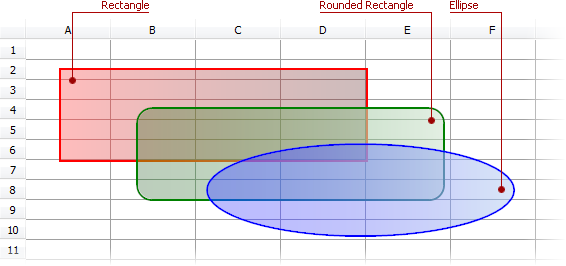
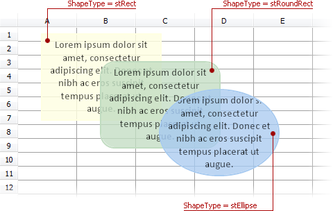
- The simple shape container which allows you to insert specific geometric shapes with transparency support. The list of currently available container shapes includes rectangle (square), rounded rectangle (rounded square) and ellipse (circle):
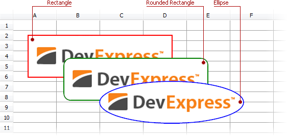
- The picture container that allows you to decorate a spreadsheet document with images. An end-user can add a picture container by pasting a bitmap image from the clipboard to a document. Picture containers simply extend the shape container functionality with bitmap support:
- The text box container that allows you to place simple notes within a spreadsheet document. A text box container extends the shape container functionality with text box support. Like picture containers, floating text boxes support all shape types currently available for floating containers.
- The comment container that allows you to attach notes to specific cells in a worksheet. Unlike other container types, comments do not support any geometric transformations and can have only the rectangular shape.

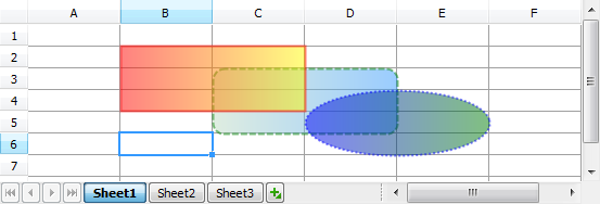
The following code example demonstrates how to create three overlapping shapes floating over the worksheet, each anchored to two different cells.
//...
uses
  ..., dxCoreGraphics, dxGDIPlusClasses;  // Add these modules to make this code work
//...
implementation
//...
var
  AContainer: array[0..2] of TdxSpreadSheetShapeContainer;
  AAnchorPoint1, AAnchorPoint2: array[0..2] of TdxSpreadSheetCell;
  ATableView: TdxSpreadSheetTableView;
  I: Integer;  // the counter of shapes
begin
  ATableView := dxSpreadSheet1.ActiveSheetAsTable;
  for I := 0 to 2 do
  begin
    // Fill the anchoring points with appropriate cells...
    // The respective anchor points of subsequent shapes are shifted both down and right by one cell
    AAnchorPoint1[I] := ATableView.CreateCell(1 + I, 1 + I);  // Create the cell for anchoring.
    AAnchorPoint2[I] := ATableView.CreateCell(4 + I, 3 + I);  // Create the cell for anchoring.
    ATableView.Containers.Add(TdxSpreadSheetShapeContainer);  // Create the shape container object
    AContainer[I] := TdxSpreadSheetShapeContainer(ATableView.Containers.Items[I]);  // Obtain the shape container objects from created container objects...
    AContainer[I].AnchorType := catTwoCell;  // Each shape is anchored to two cells within the spreadsheet
    // The top-left corner of a created shape
    AContainer[I].AnchorPoint1.Cell := AAnchorPoint1[I];
    // The bottom-right corner of a created shape
    AContainer[I].AnchorPoint2.Cell := AAnchorPoint2[I];
    AContainer[I].Shape.Pen.Width := 2;  // Shape outline width (2 pixels)
    AContainer[I].Shape.Brush.Style := gpbsGradient;  // We use the gradient fill for every shape
  end;
  // Setting up shape outline colors
  AContainer[0].Shape.Pen.Brush.Color := dxColorToAlphaColor(clRed, 127);
  AContainer[1].Shape.Pen.Brush.Color := dxColorToAlphaColor(clGreen, 127);
  AContainer[2].Shape.Pen.Brush.Color := dxColorToAlphaColor(clBlue, 127);
  // Different outline drawing styles for different shapes...
  // The first container has a solid outline
  AContainer[0].Shape.Pen.Style := gppsSolid;
  // The second container has a dashed outline
  AContainer[1].Shape.Pen.Style := gppsDash;
  // The third container has a dotted outline
  AContainer[2].Shape.Pen.Style := gppsDot;
  // Different shapes for different container objects...
  AContainer[0].Shape.ShapeType := stRect;  // The rectangle
  AContainer[1].Shape.ShapeType := stRoundRect;  // The rectangle with rounded angles
  AContainer[2].Shape.ShapeType := stEllipse;  // The ellipse
  // Set up two different fill gradient points for each container
  AContainer[0].Shape.Brush.GradientPoints.Add(1, dxColorToAlphaColor(clYellow, 127));
  AContainer[0].Shape.Brush.GradientPoints.Add(0, dxColorToAlphaColor(clRed, 127));
  AContainer[1].Shape.Brush.GradientPoints.Add(1, dxColorToAlphaColor(clHighlight, 127));
  AContainer[1].Shape.Brush.GradientPoints.Add(0, dxColorToAlphaColor(clMoneyGreen, 127));
  AContainer[2].Shape.Brush.GradientPoints.Add(1, dxColorToAlphaColor(clGreen, 127));
  AContainer[2].Shape.Brush.GradientPoints.Add(0, dxColorToAlphaColor(clBlue, 127));
end;
An End-User Embedded Object Management Options
End-users are able to create, move, rotate, resize, and rearrange floating containers by using the keyboard and the mouse. The mouse can be used for the following click and drag-and-drop operations with the containers:
Focusing a container by clicking on it.
Move a container using the simple drag-and-drop operation.
Clone a container by using drag-and-drop while holding down the Ctrl key.
Resize and rotate containers by performing drag-and-drop operations on their sizing and rotation handles (holding down the Ctrl, Alt, and/or Shift keys extends the list of available options).
The keyboard also provides container management options if one of the floating containers is focused:
The Tab key moves focus from one visible container to the next (the Shift+Tab key combination moves focus between containers in reverse order).
The arrow keys move the container within the worksheet content area.
The Right and Left keys rotate the container when the Alt key is held down.
The arrow keys resize the container when the Shift key is held down.
The Del key destroys the container.
The Esc key moves focus to the last selected cell.
Both these and additional container management options are available using the container’s context menu.
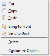
This context menu provides access to the following operations without using additional controls within your application:
The Cut, Copy, and Paste menu items perform clipboard operations with the focused floating object, emulating the Ctrl+X Ctrl+C and Ctrl+V key combinations.
The Delete menu item emulates the Delete key pressed by an end-user with the focused container.
The Bring to Front and Send to Back menu items provide access to the container layer management functionality. These options are active when more than one container object exists within the same worksheet and allow an end-user to reorder overlapping objects.
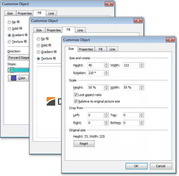
The Customize Object menu item invokes the Customize Object dialog window.
Customize Object dialog
The Customize Object dialog allows end-users to customize the multiple appearance and positioning settings of floating picture, shape, text box, and comment containers without using any additional controls in your application:
In addition to the Customize Object… item in the container context menu, you can display the Customize Object dialog window by calling the ShowContainerCustomizationDialog global function declared in the dxSpreadSheetContainerCustomizationDialog unit.
The list of settings provided by this dialog is grouped into six tabs. The Customize Object dialog can display up to six tabs depending on the floating container type:
Size
Properties
Fill
Line
Text
Text Box
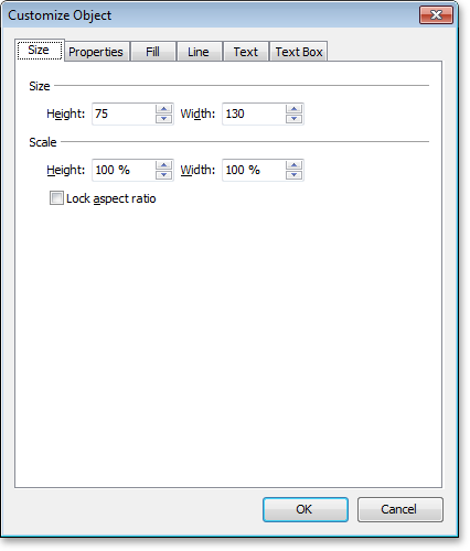
The Size tab
This tab contains options that allow you to resize, rotate, scale and crop the original image. The Reset button returns the container into the original state;
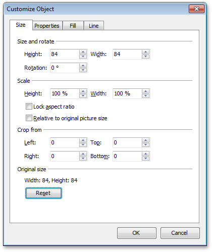
Image-related options, including the Reset button, are not displayed for the shape, text box, and comment containers.
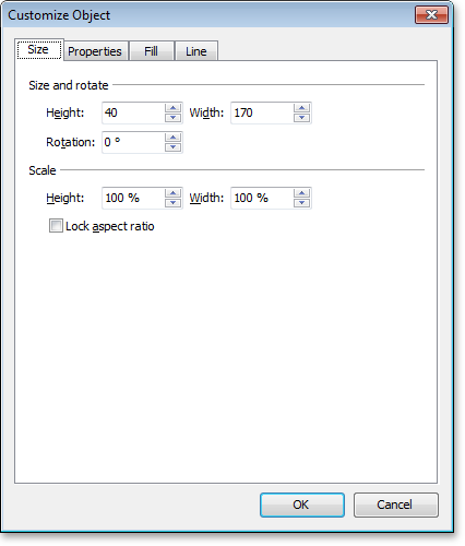
In the case of text box-based containers, the Rotation spin editor is also hidden:
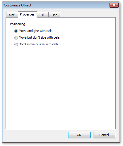
The Properties tab
This tab contains positioning settings that allow you to change the way the container is sized and positioned in relation to the worksheet cells;
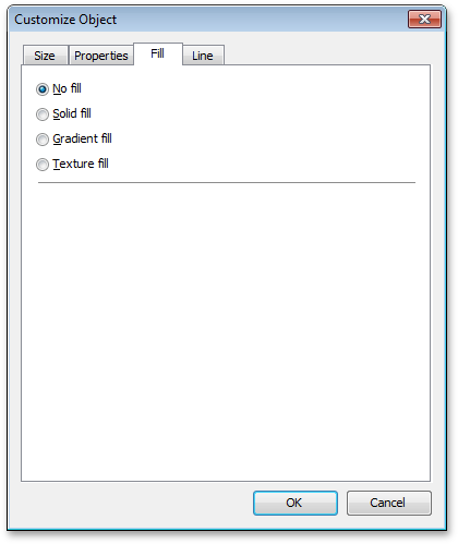
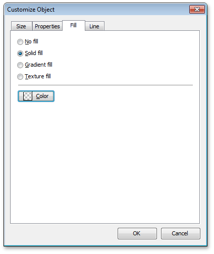
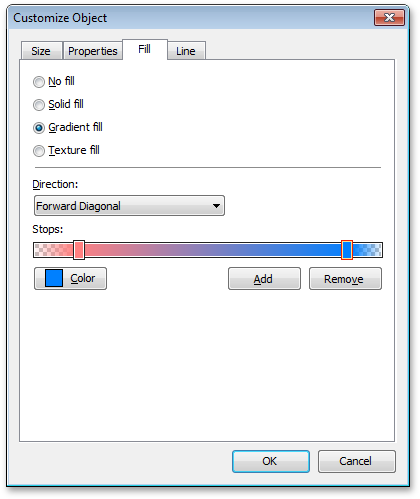
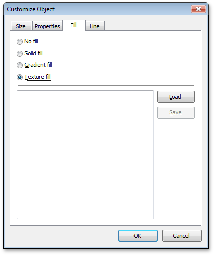
The Fill tab
This tab provides four radio buttons allowing you to switch between different container fill configurations:
- The “No fill” configuration leaves the container’s background transparent without any additional settings.
- The “Solid fill” configuration allows you to pick a color for a simple solid fill of the container’s background. The Color button invokes the DevExpress Color Editor dialog window where you can pick any color you need with full transparency support;
- The “Gradient fill” configuration provides more options, such as gradient direction, multiple colors and gradient stops you can use;
- The “Texture fill” configuration allows you to fill the container’s inner area with a texture instead of solid or gradient fill.
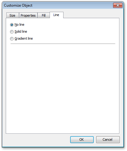
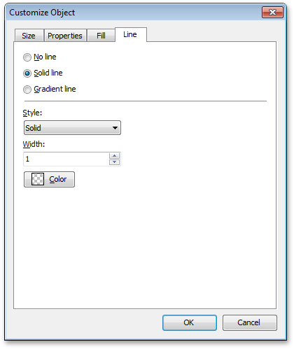
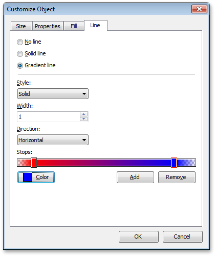
The Line tab
This tab contains three radio buttons allowing you to switch between possible configurations of the container’s outline:
- The “No line” configuration leaves the container without an outline and provides no additional settings;
- The “Solid line” configuration allows you to specify the container outline’s color, line style and width (in pixels). The Color button invokes the DevExpress Color Editor dialog window where you can pick any color you need with full support of transparency;
- The “Gradient” outline configuration, in addition to the style and width settings, provides such options such as gradient direction, multiple colors and gradient stops.
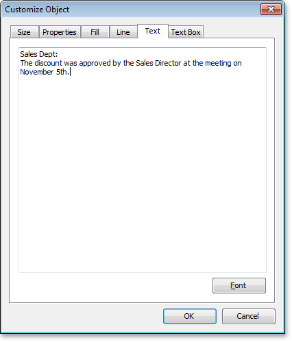
The Text tab
This tab is displayed only for the text box and comment containers and provides only two UI elements:
Memo for editing the contents displayed by a container.
The Font button, that invokes the standard Font dialog window for customizing the font used to display the text box content.
The Text Box tab
Like the Text, the Text Box tab is displayed only for the text box and comment containers. This tab allows an end-user to customize text positioning in a container.
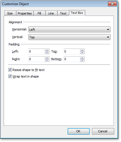
Note that unlike text boxes, comment containers do not provide the “Wrap text in shape” checkbox option.